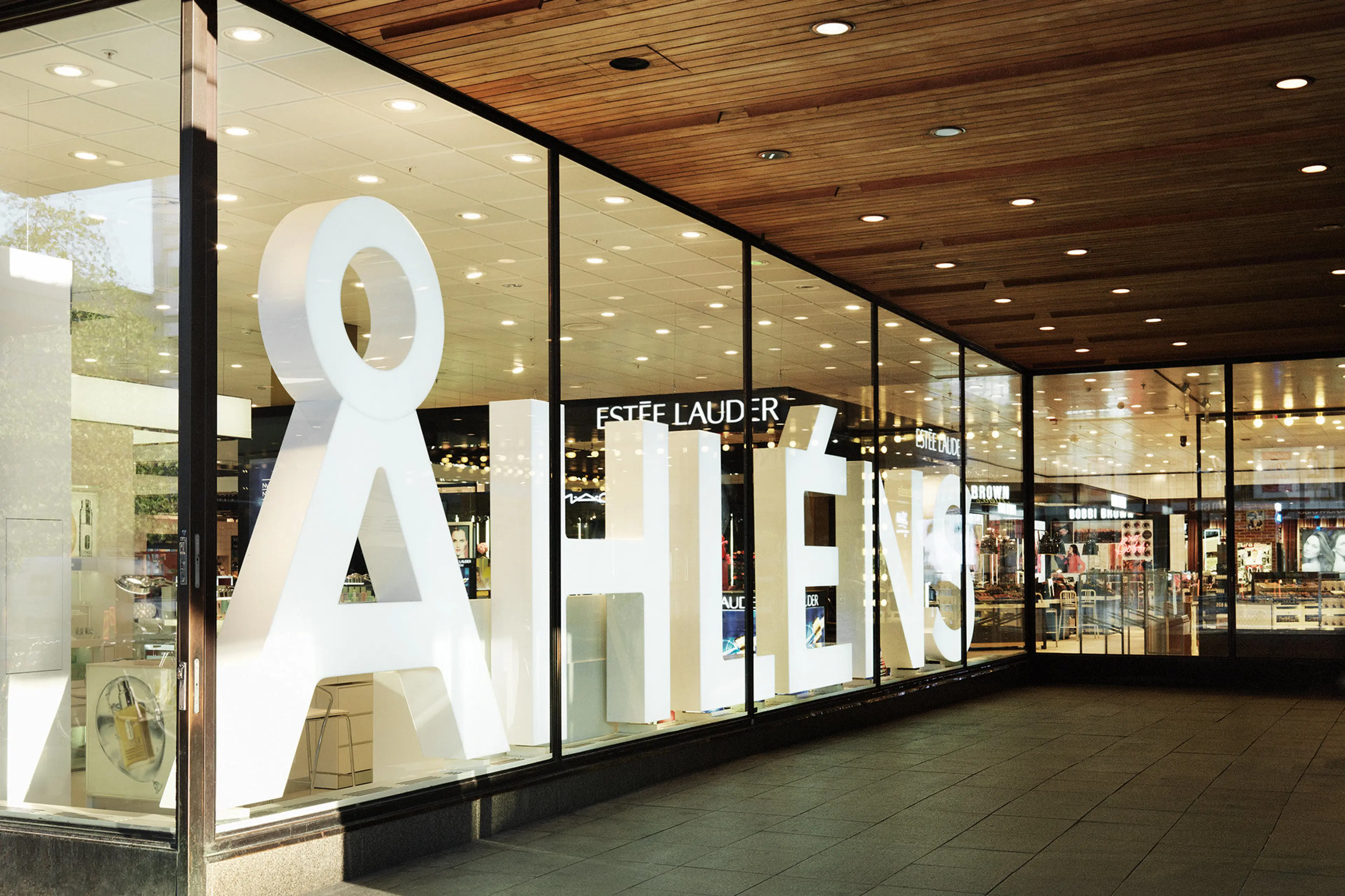
Åhléns had become known as a large-scale trading-post-style retailer: a supplier of everything from TVs and towels to toys and food. The change it had in mind was to become a more modern and refined department store, that focused on just a small number of selected, premium areas: beauty, fashion, homewares and media. Our role in this was to develop a design programme to revitalise and restore pride in the Åhléns brand.
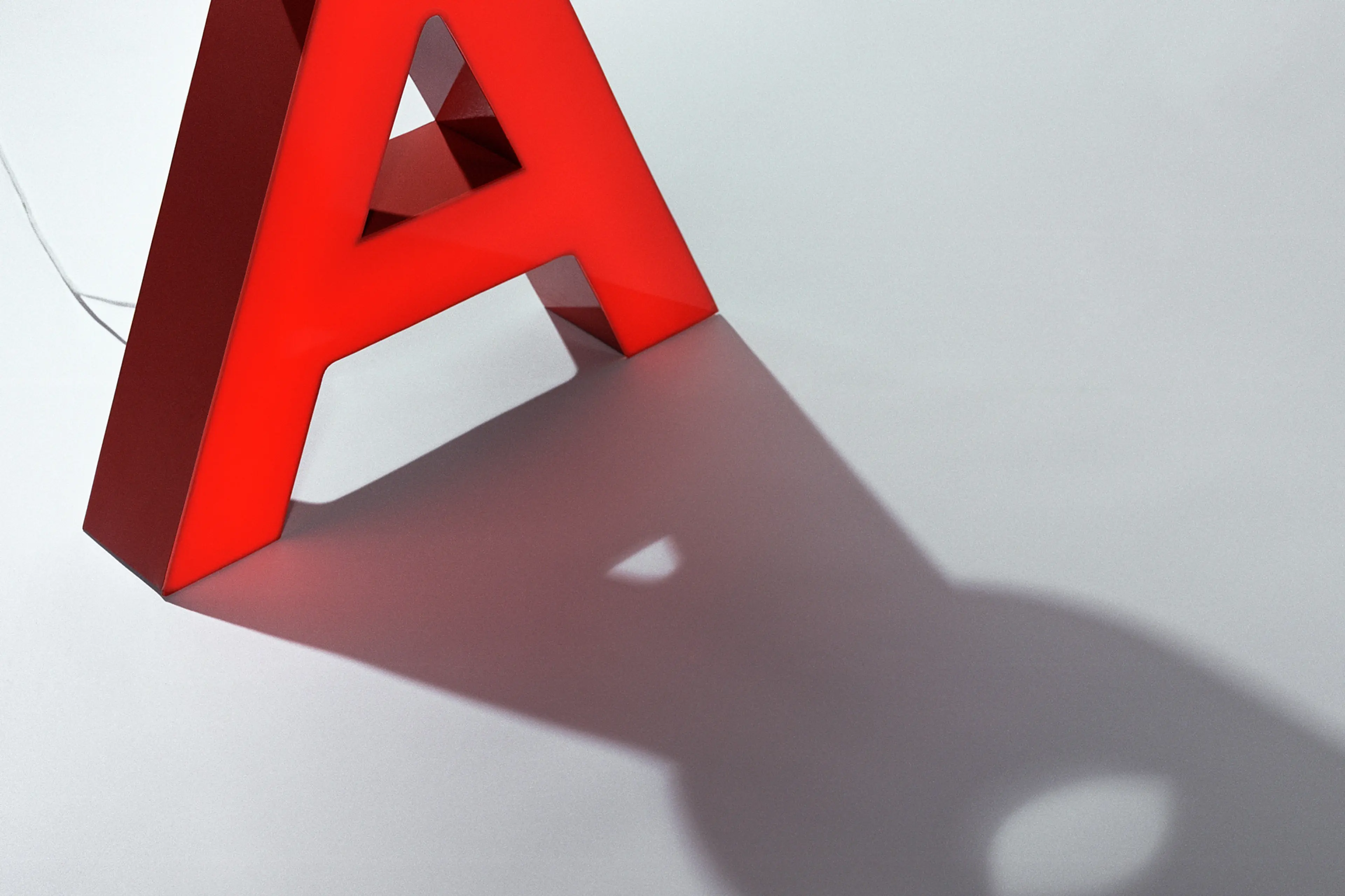
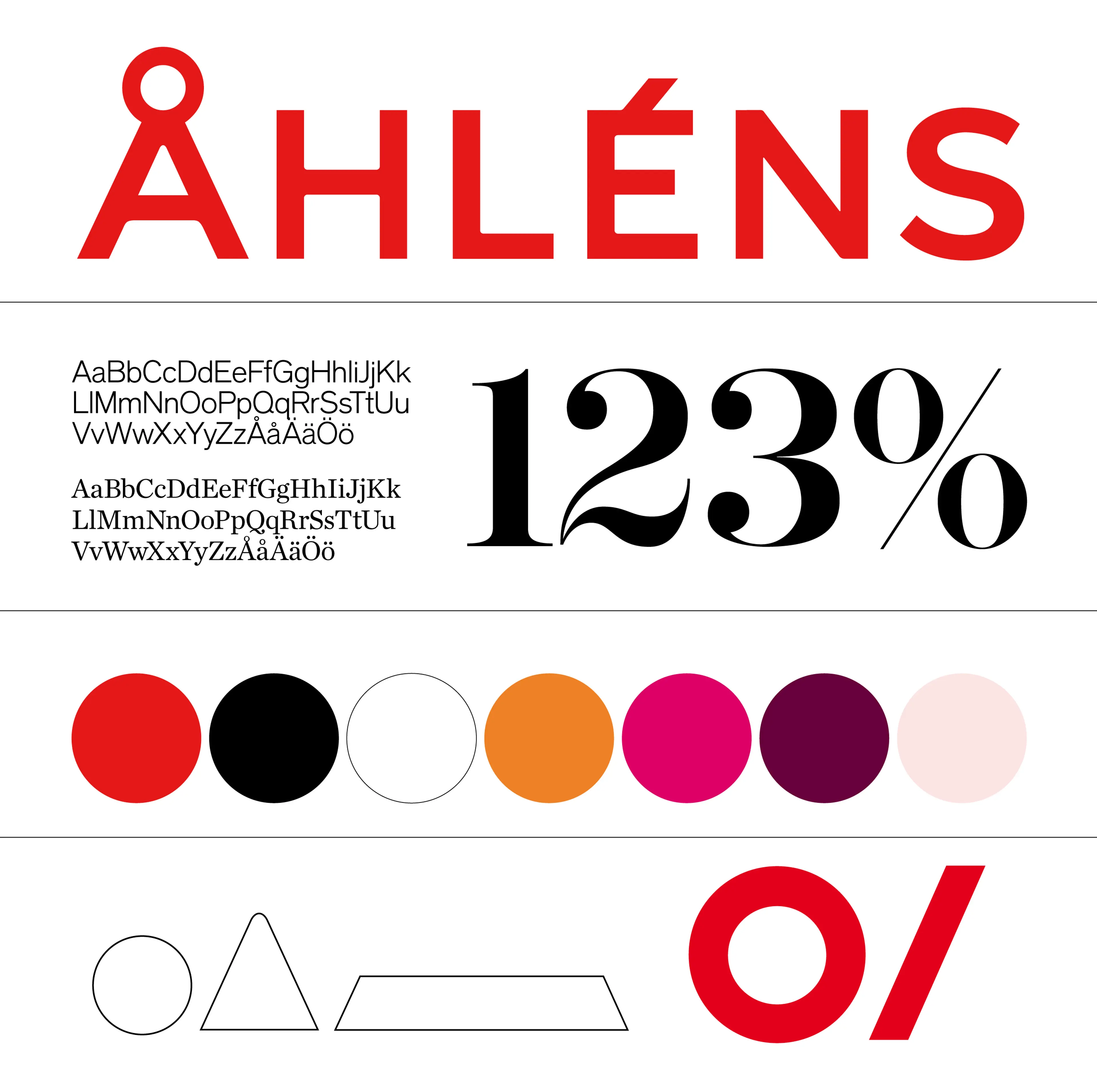
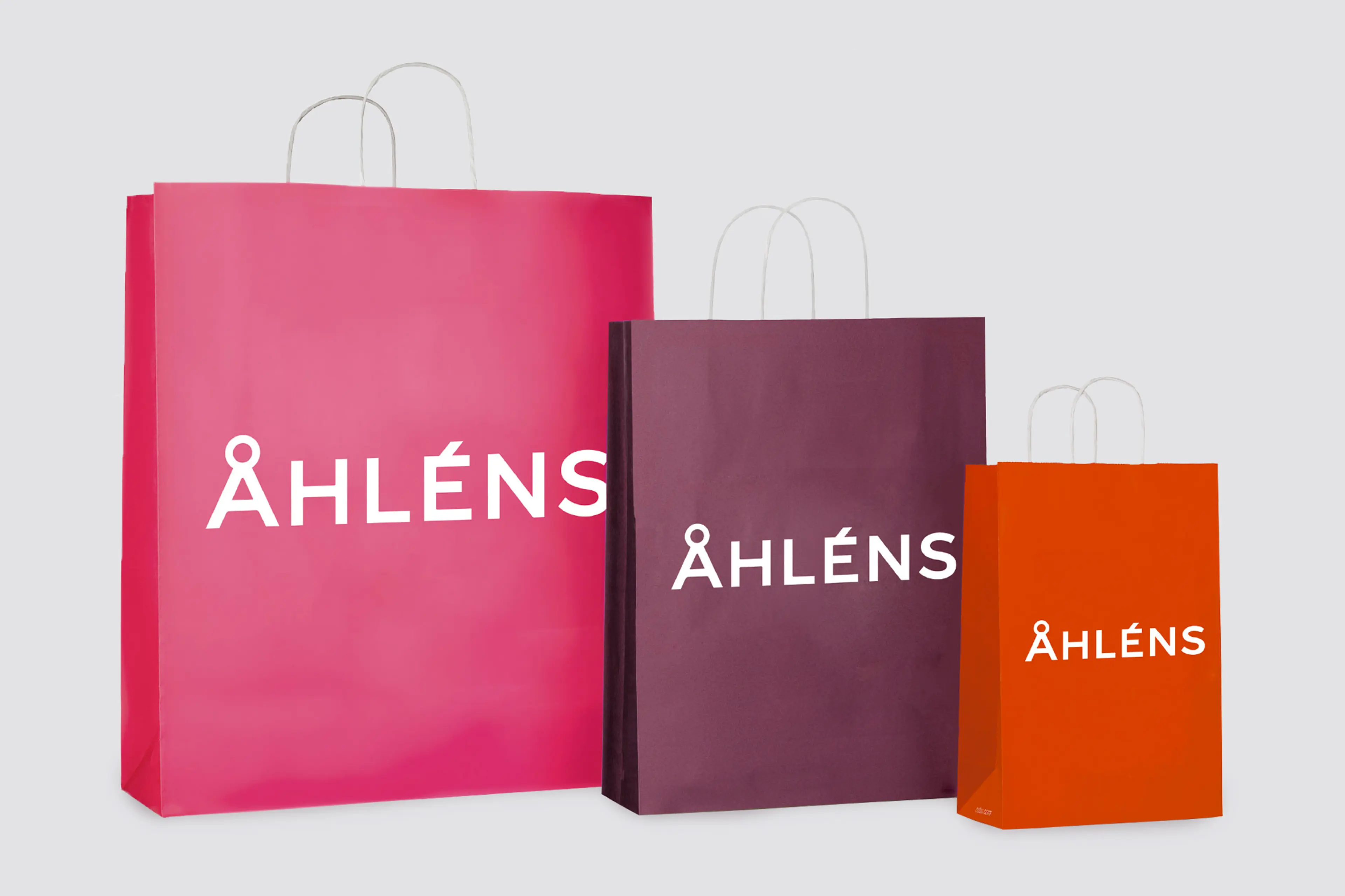
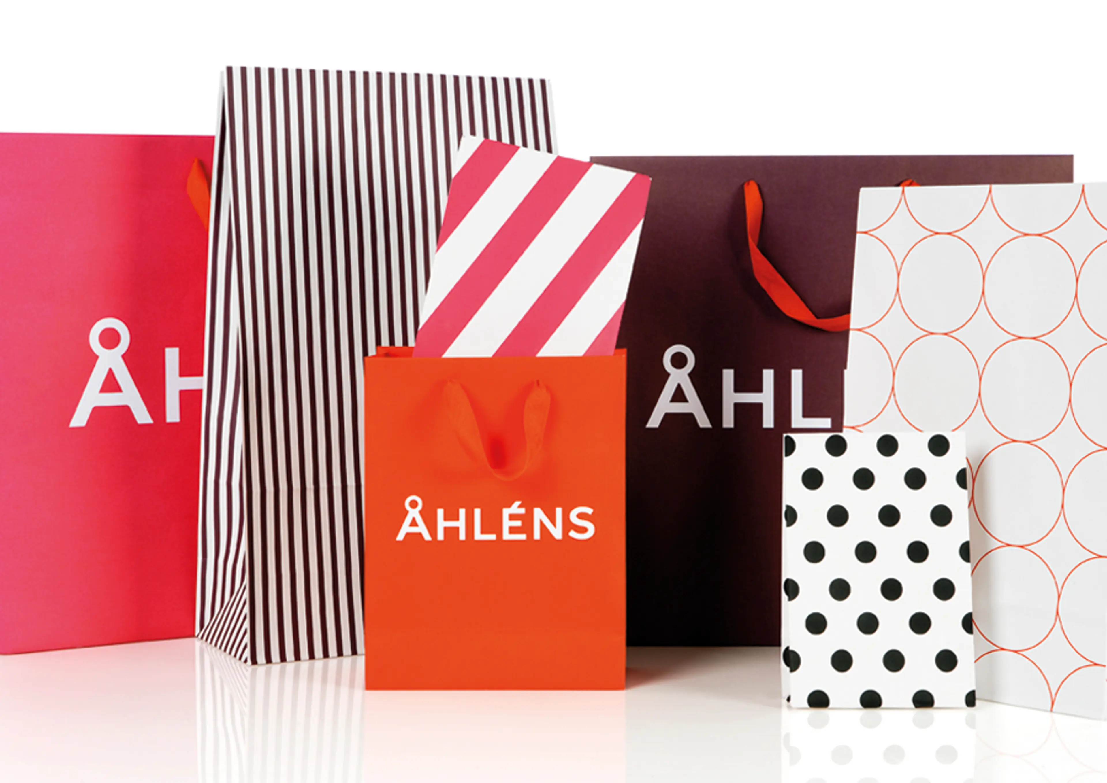
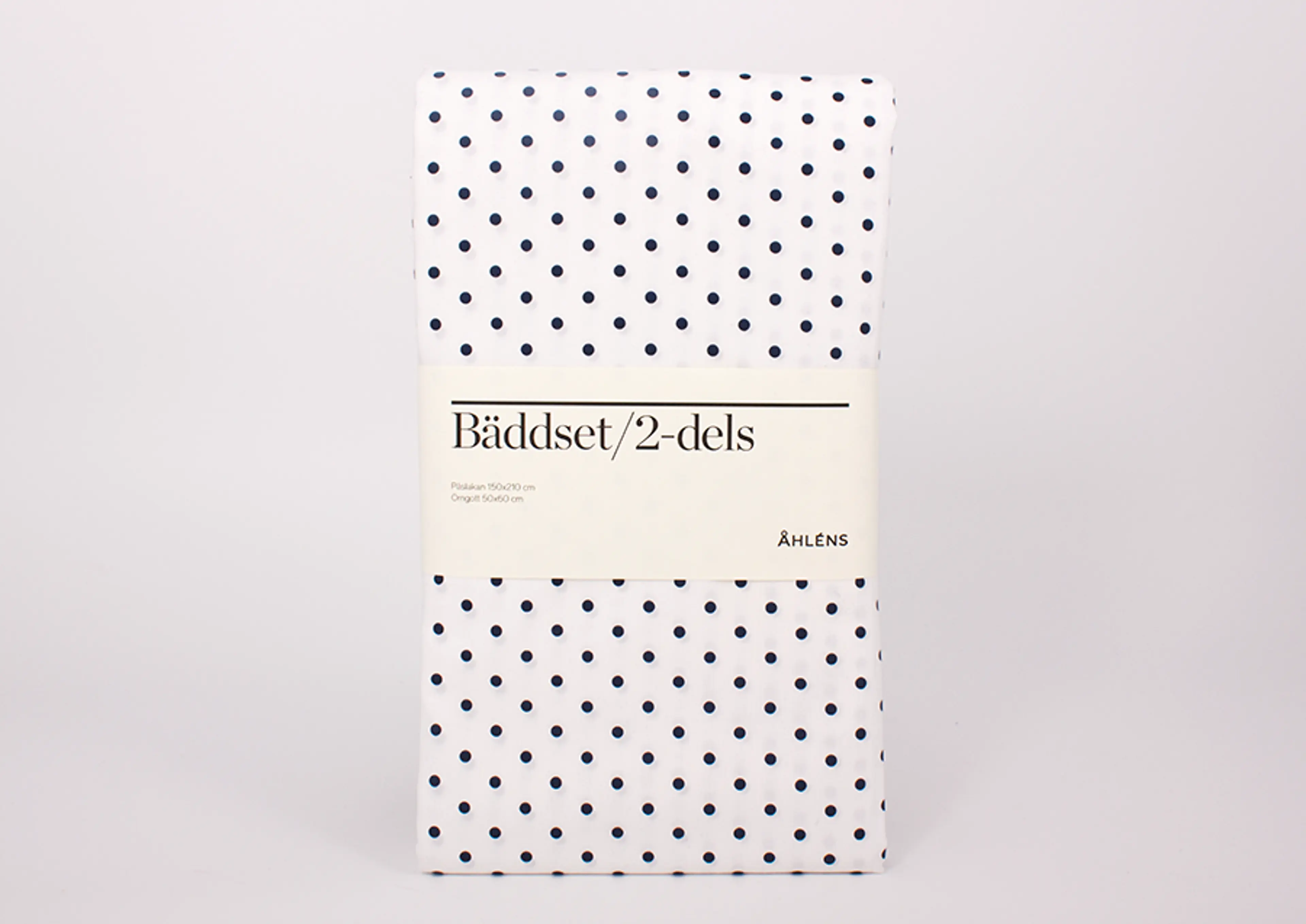
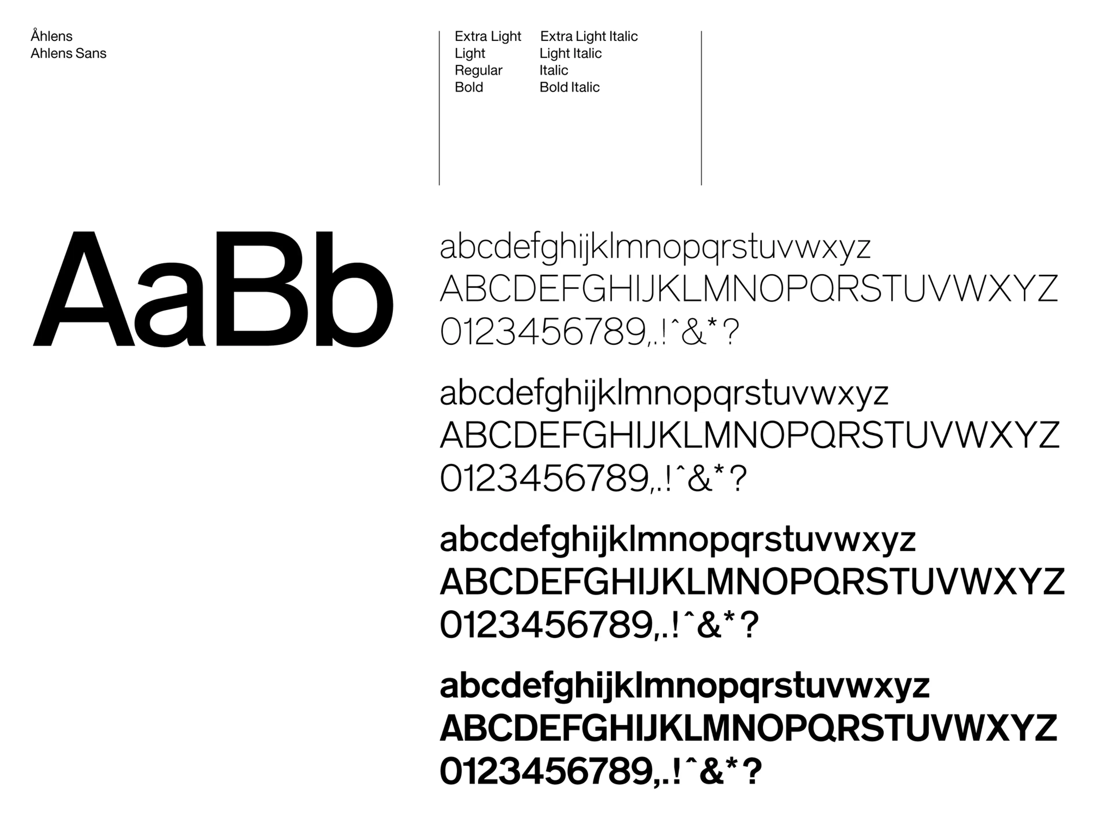
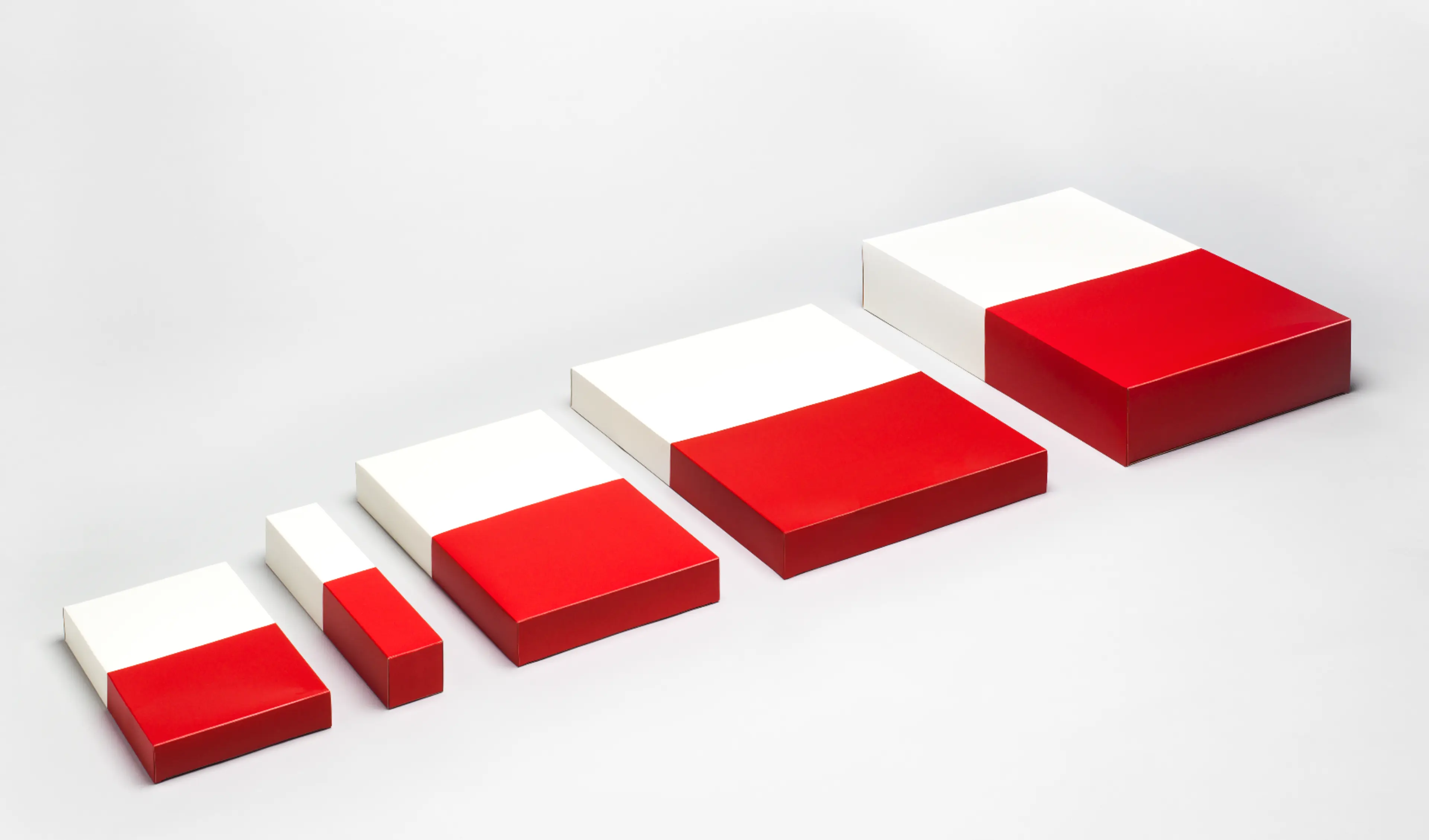
On the advice of other identity consultants, the brand had been assuming a more generic, European image. Our strategy advised the opposite. Åhléns’ identity was getting lost: it was time for the retailer to reclaim its Nordic-ness, with pride and confidence. The key was in its name: the anthropomorphic, uniquely Scandinavian letter, Å (pronounced like the ‘a’ in ‘called’). We devised a design programme, logotype, typography, colour palette, photography, store environments, signage system and packaging design strategy around this single, simple mark of Swedishness.


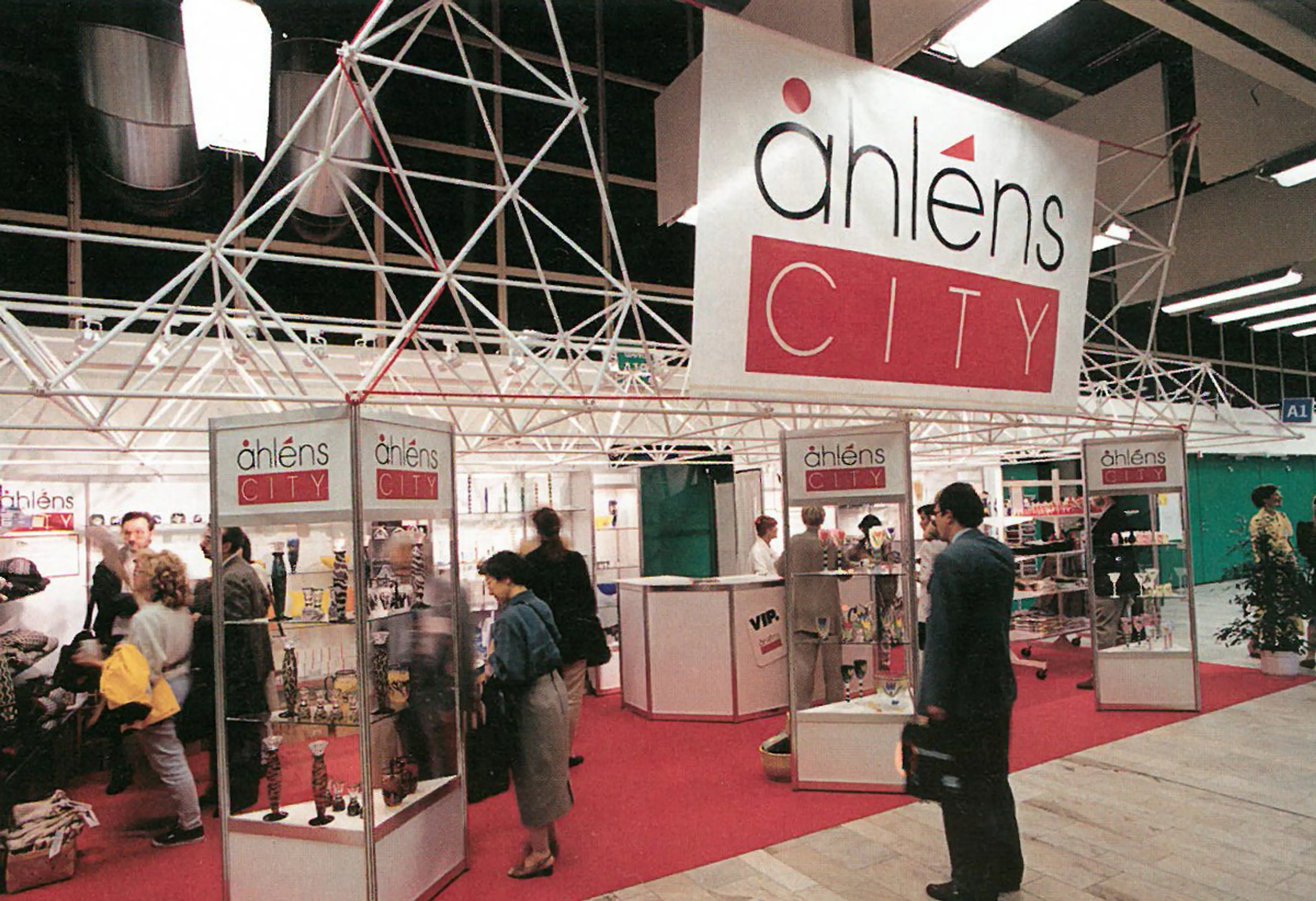
Åhlens prior to rebrand