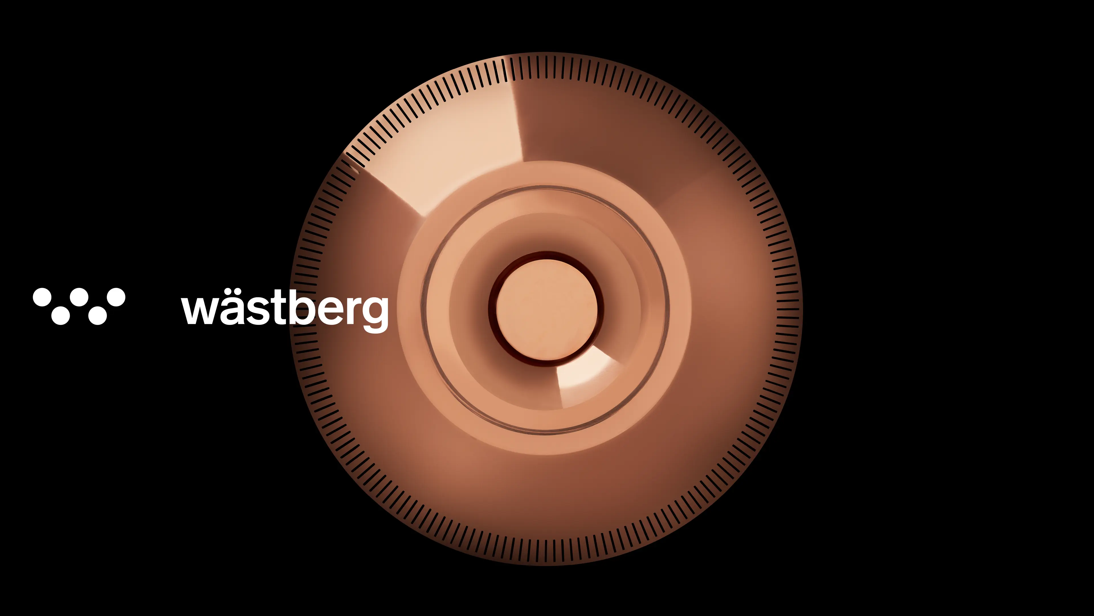
Lighting company Wästberg emerged from a young Swedish man’s precocious insight — that man had been deprived of private spheres in a misguided pursuit of efficiency and standardisation. Wästberg wanted to bring back light to human proximity. After ten years of activity, Wästberg has now left its own private sphere — to be considered as an established player in, and for, the public eye. Expressed through the combination of aesthetics, cutting-edge technology and resource conservation. Photography by Johan Kalen.
“One eye sees, the other feels" – Paul Klee
Positioned to blend technology with accessible aesthetics, the identity expresses attention to innovation and a genuine intention to create well-being.
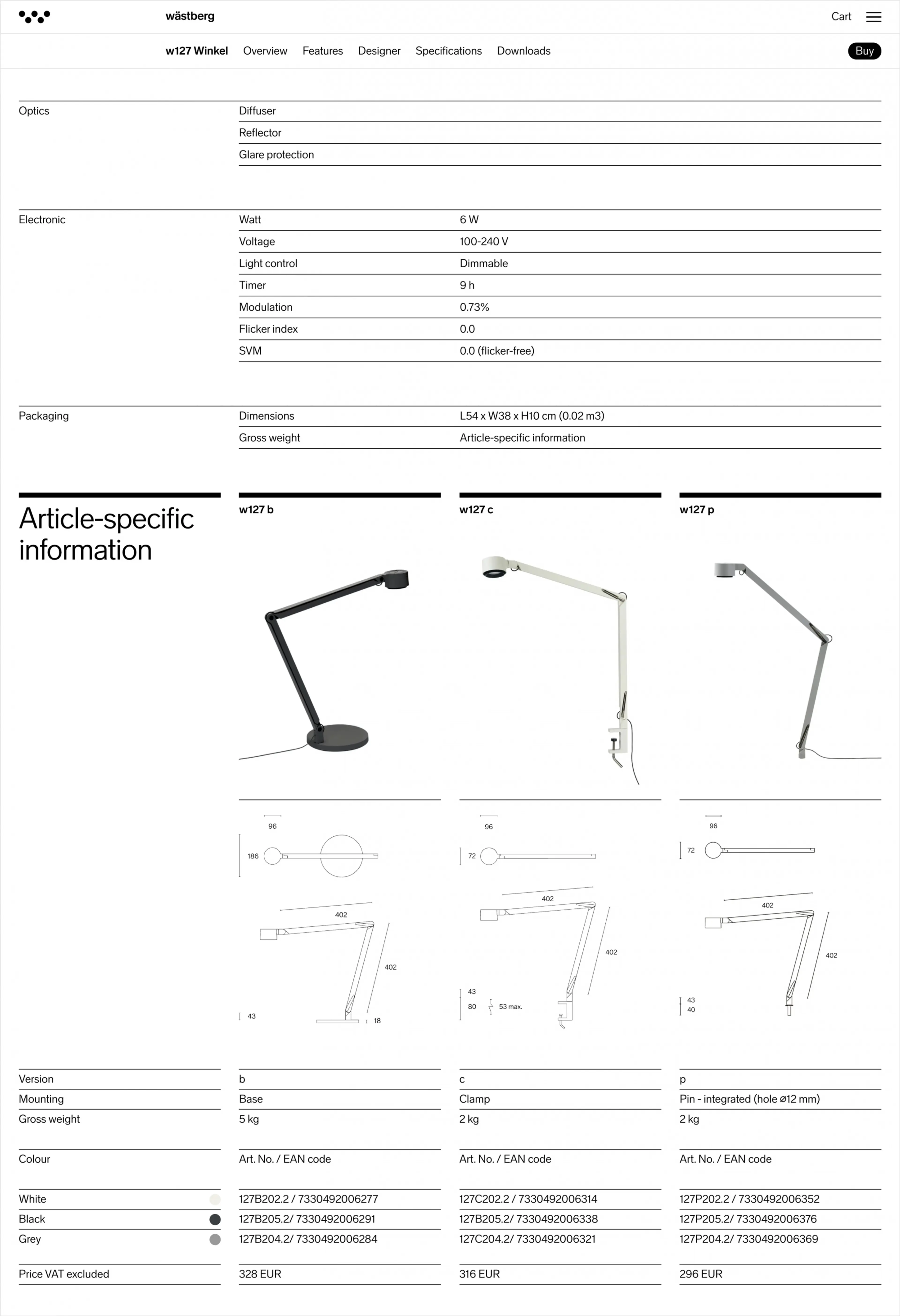
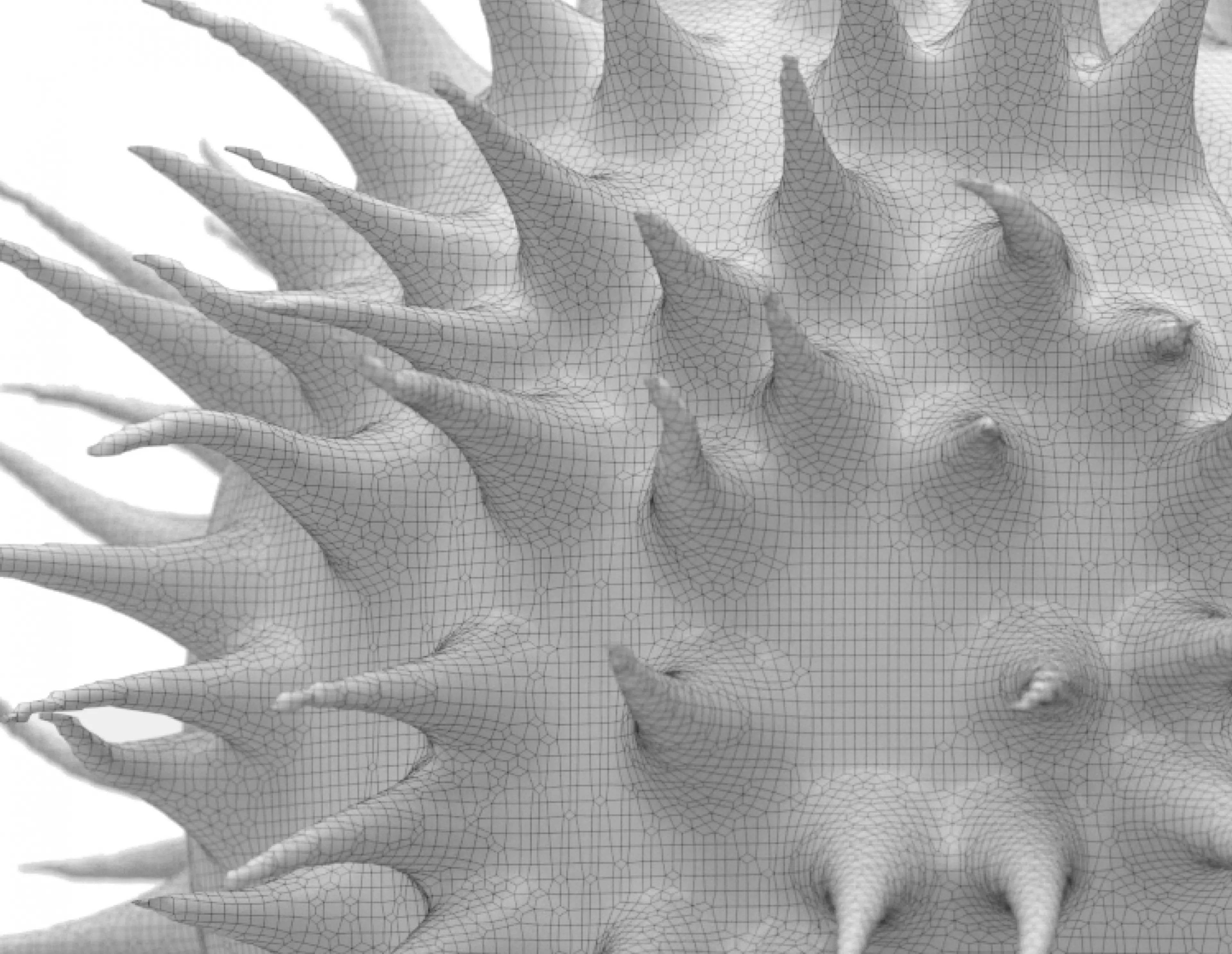
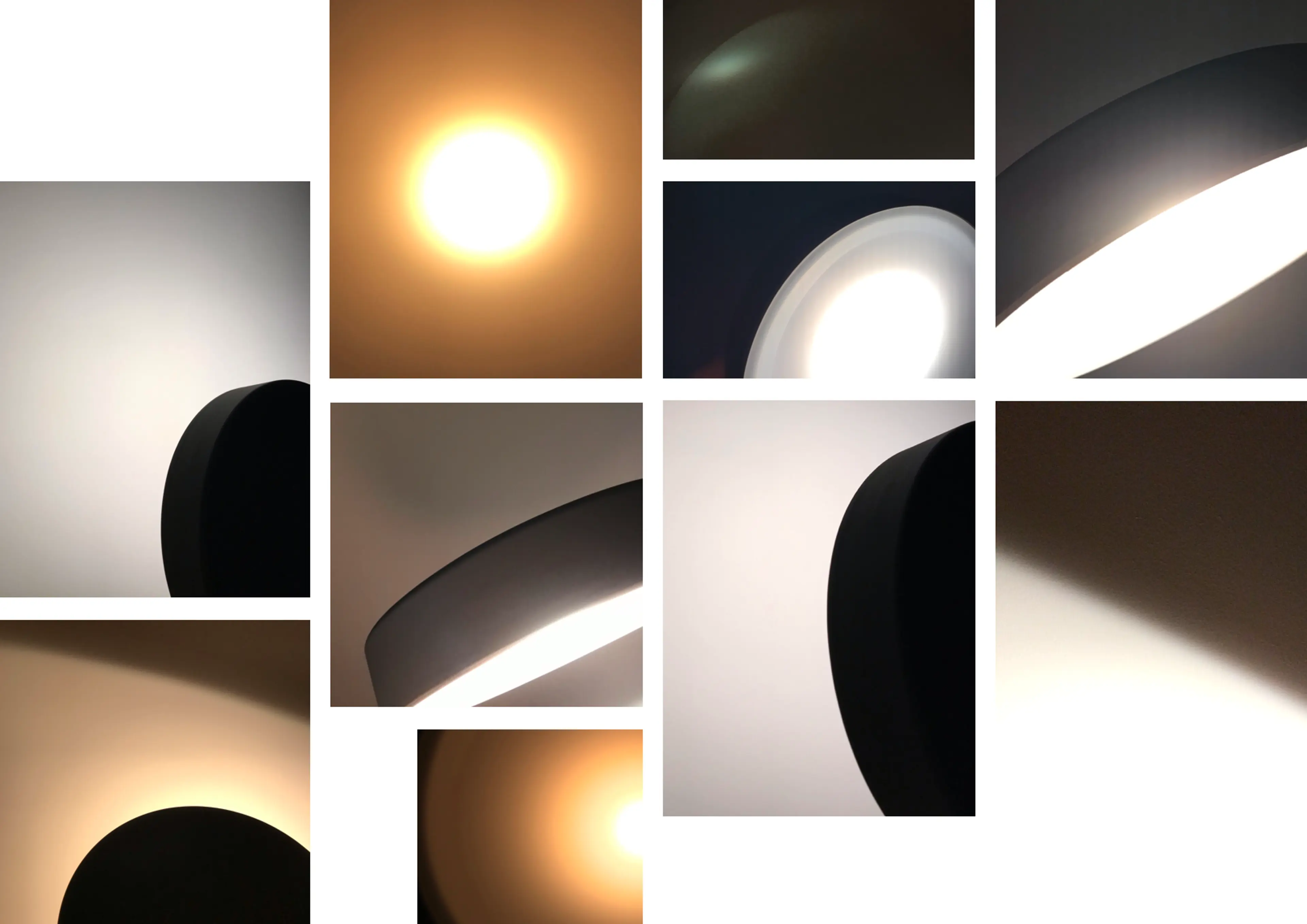
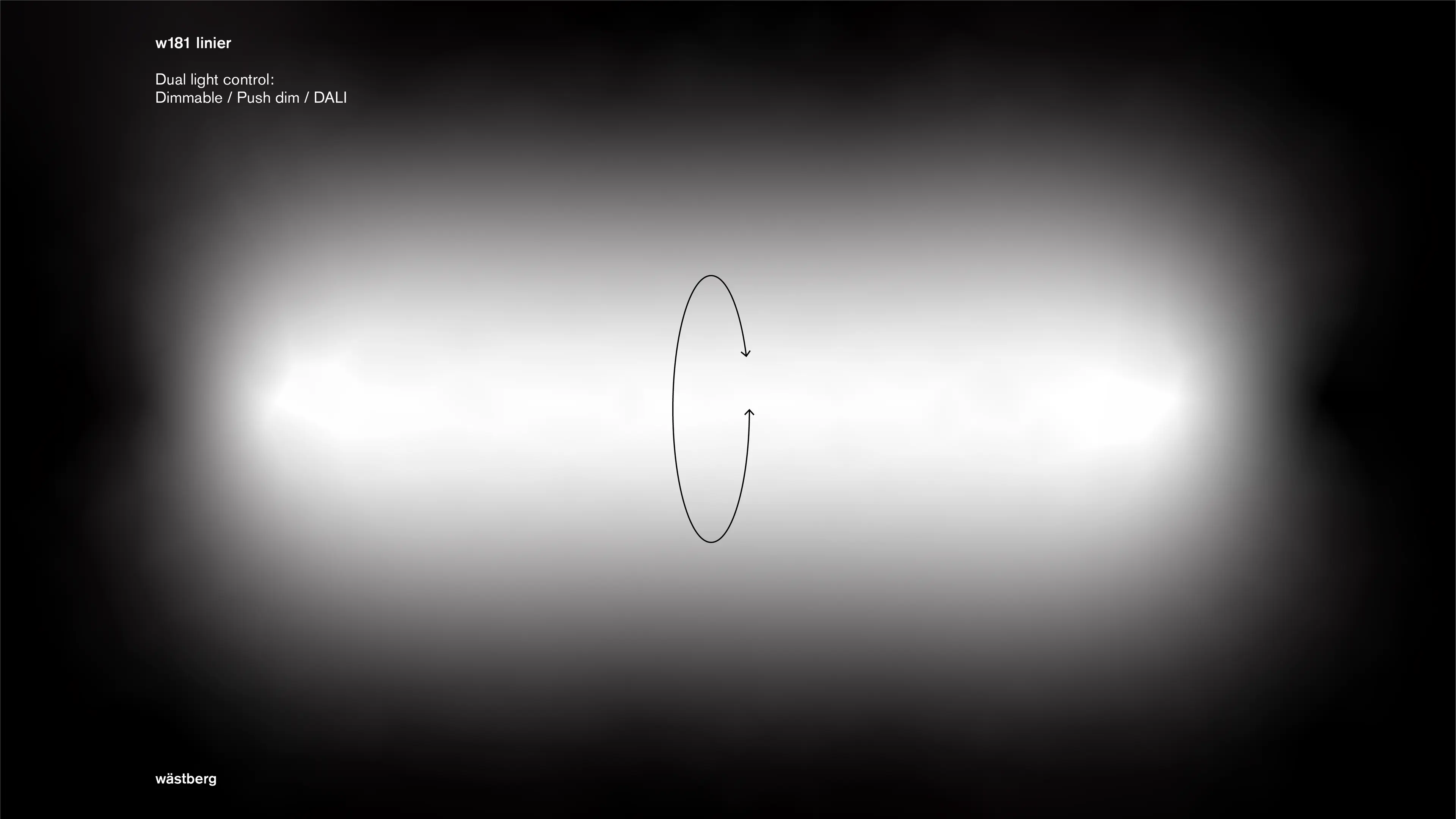
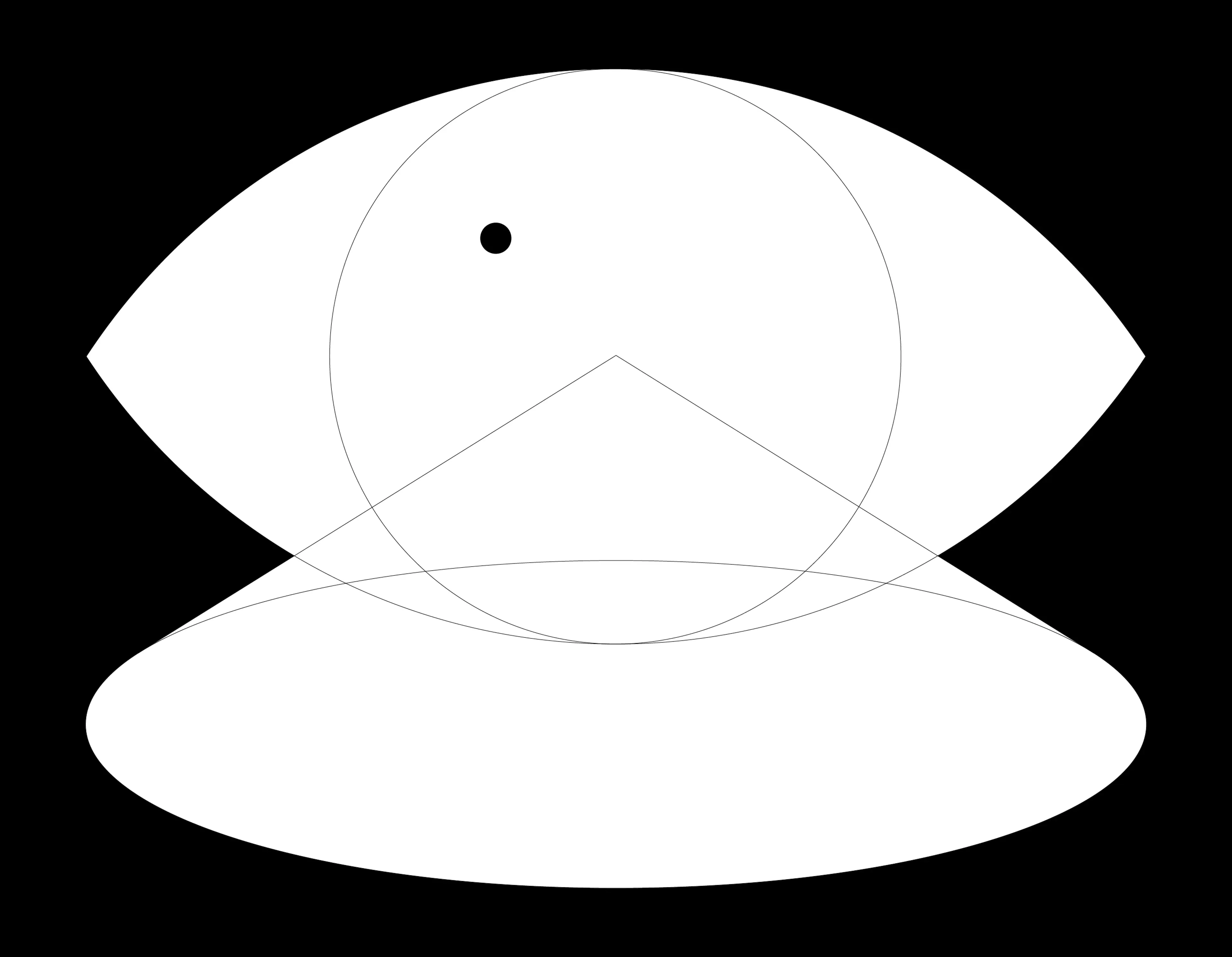
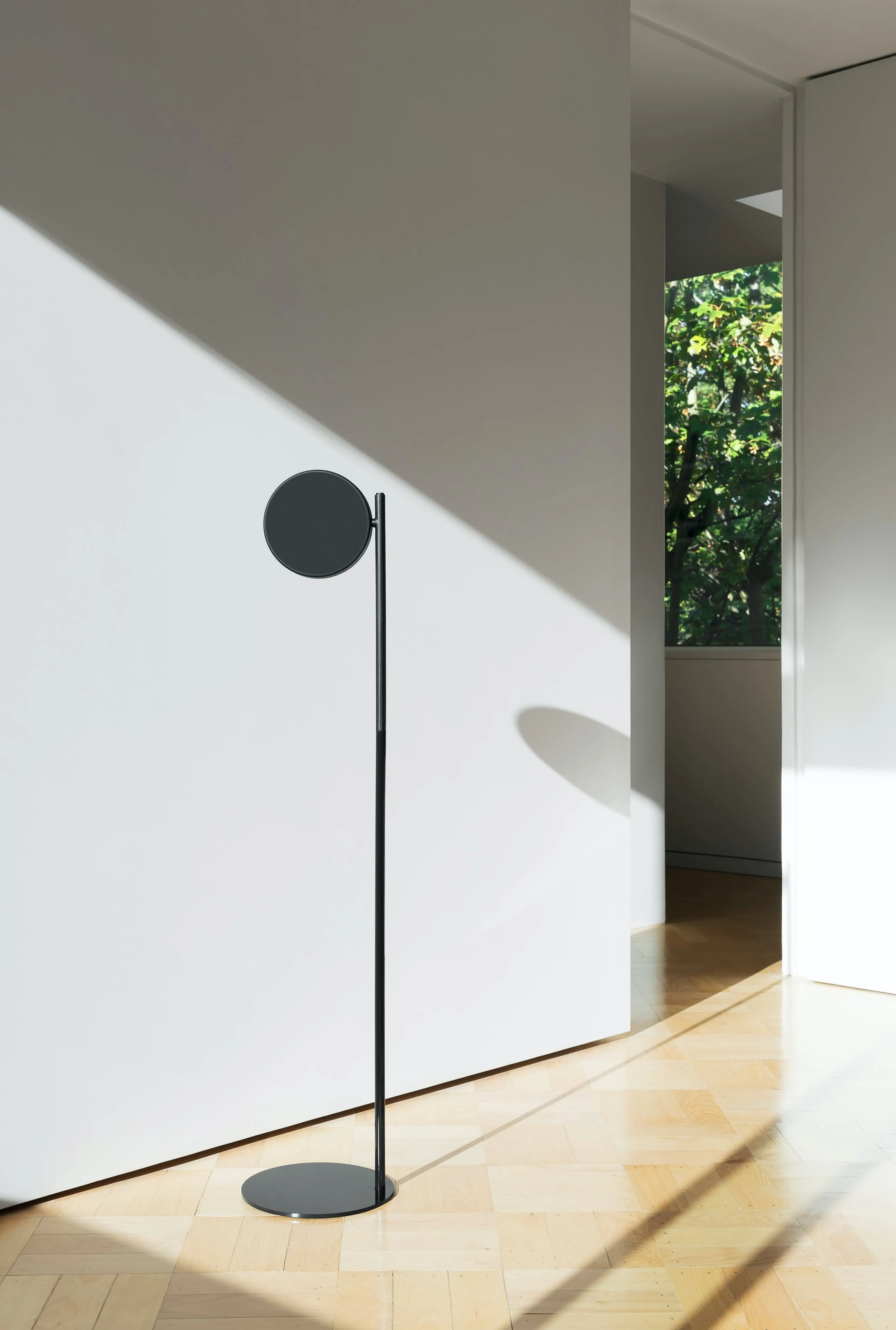
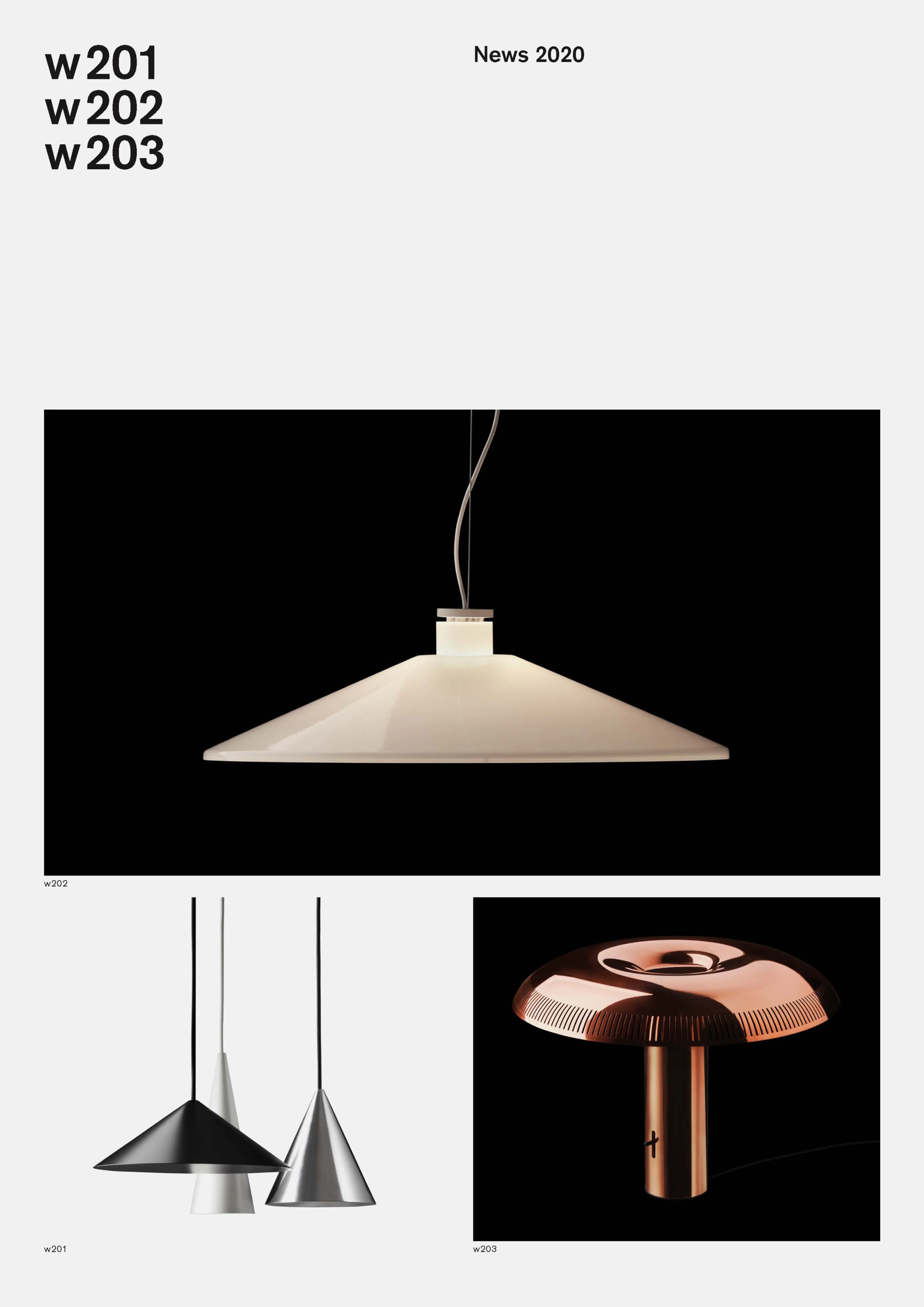
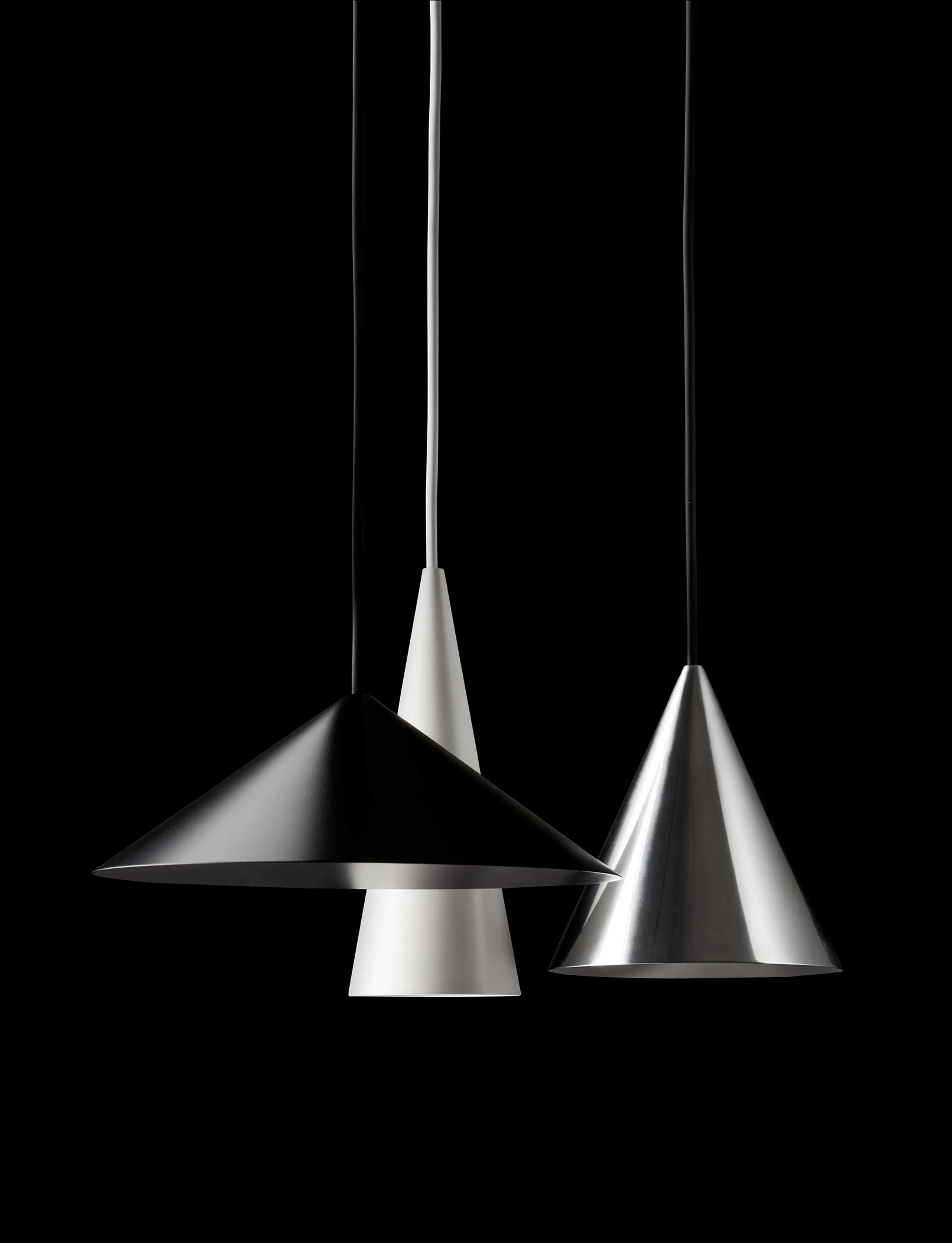
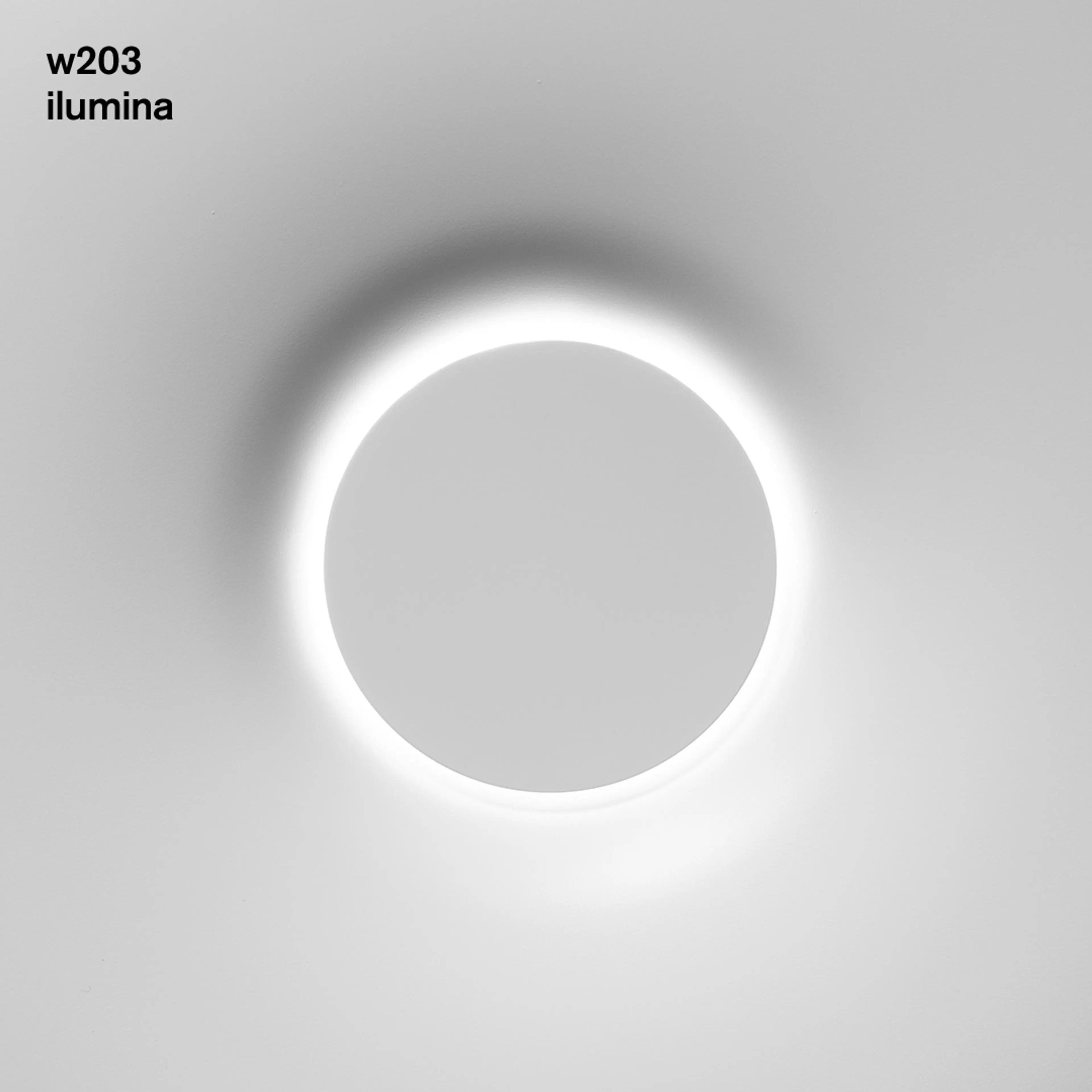
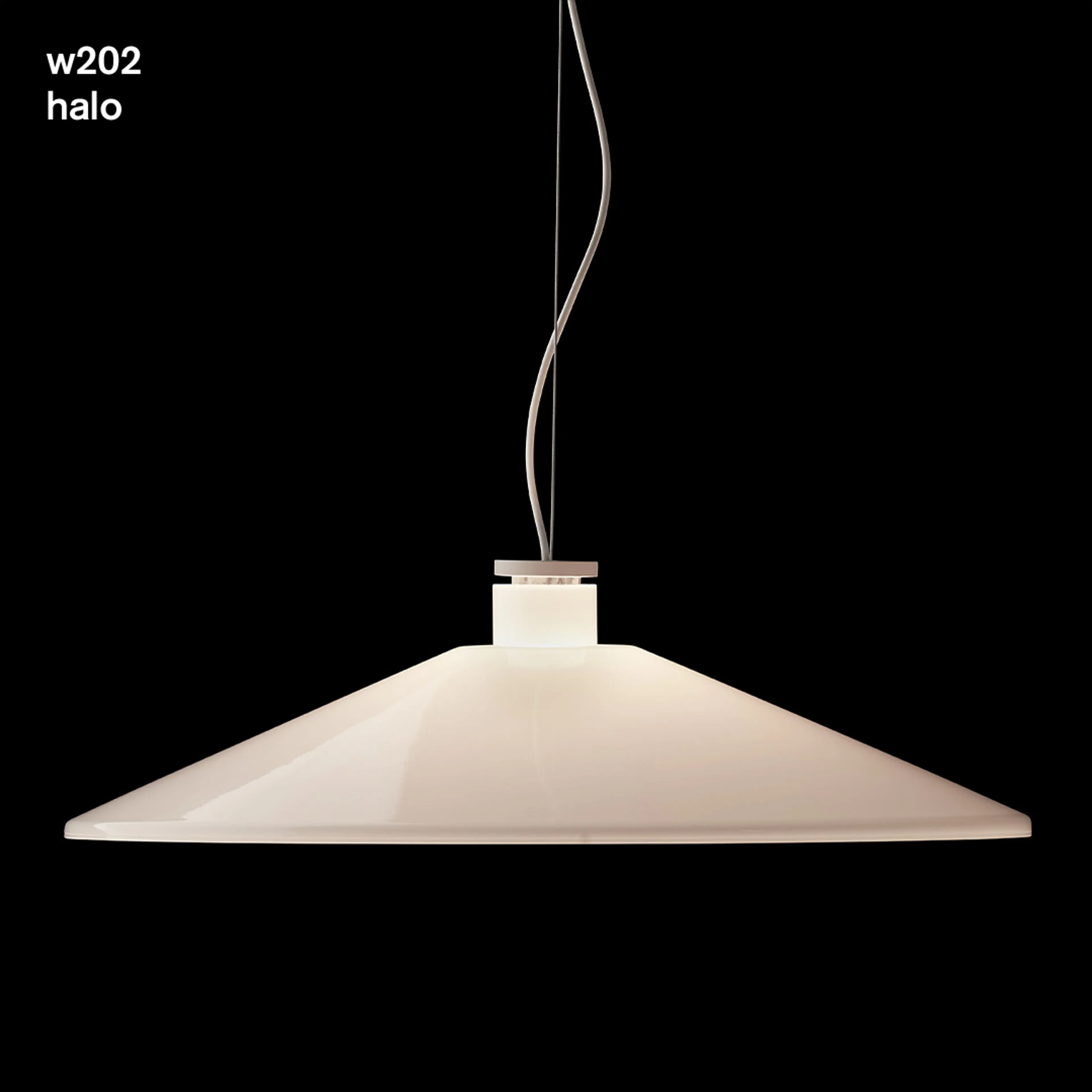
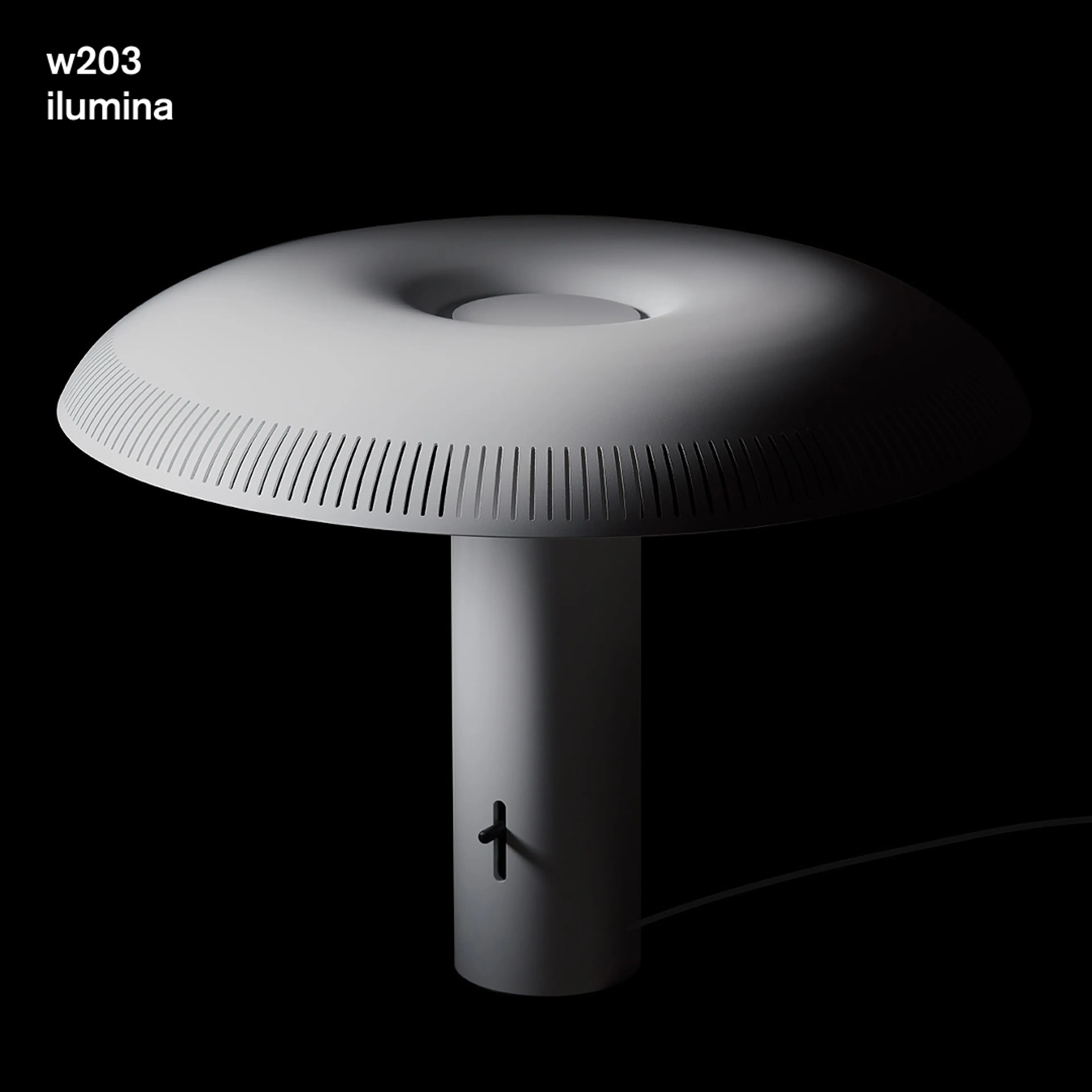
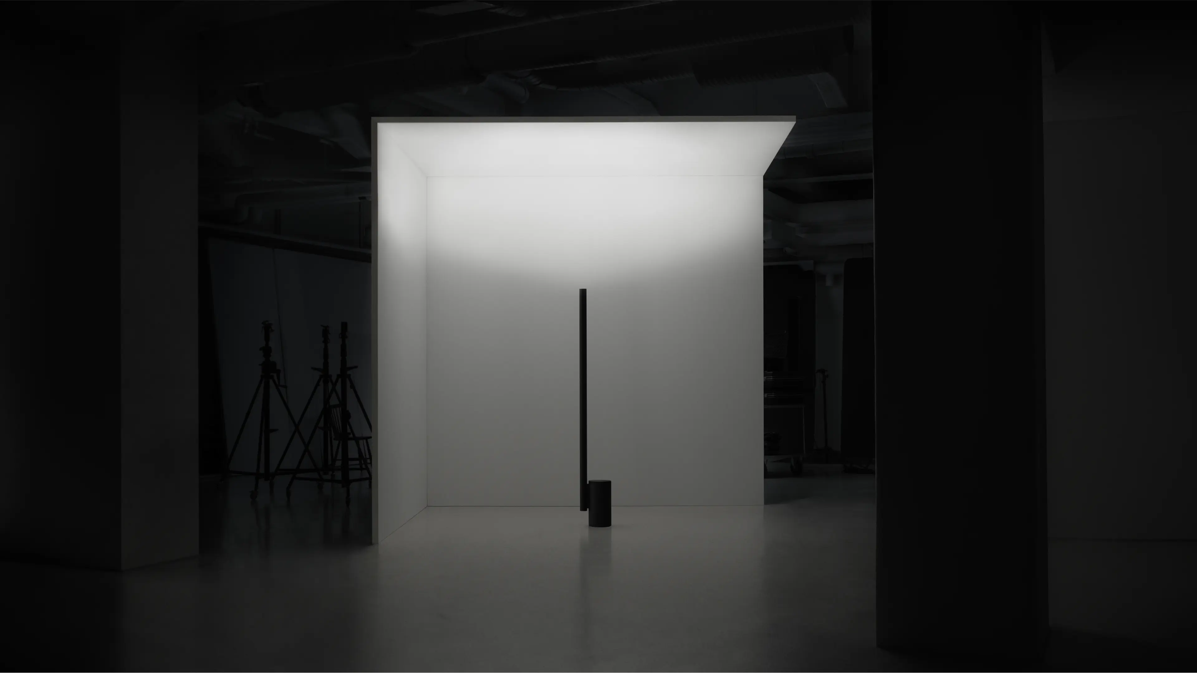
Each lamp is approached with its aesthetics and usage in mind, lifting angles that are important to give the best understanding. Geometry and space are utilised as an advantage to highlight the benefits the products provide.
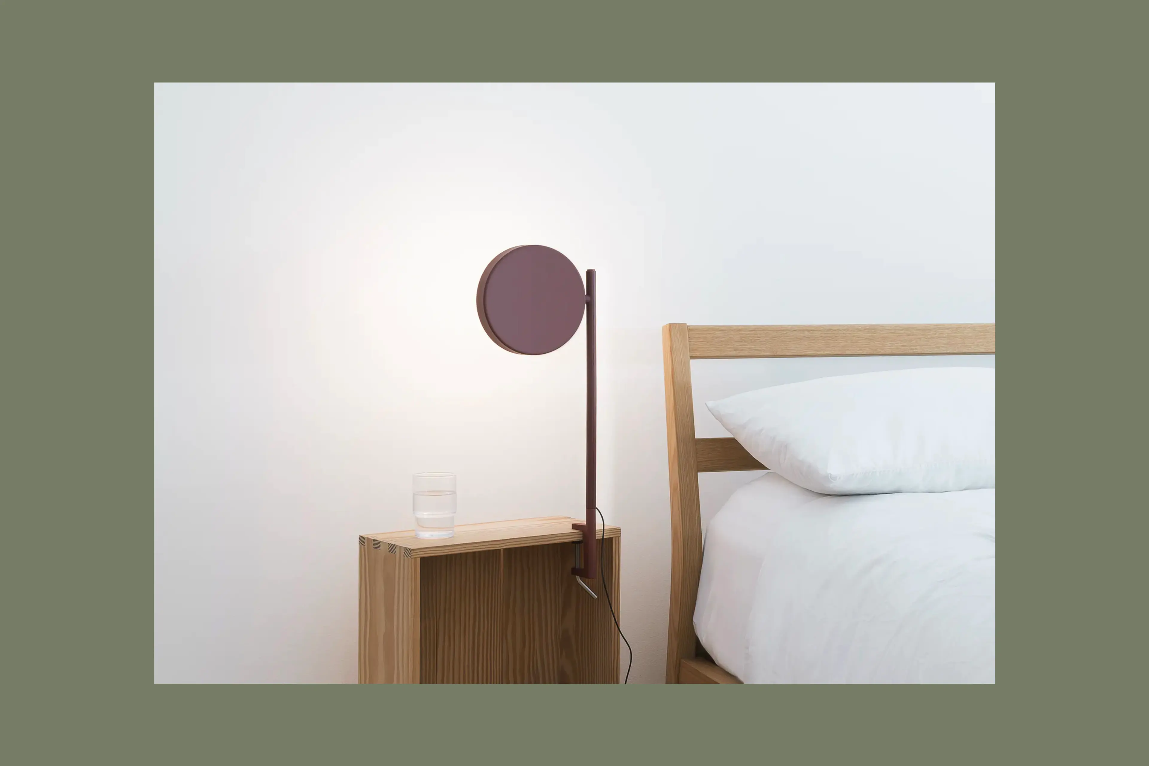
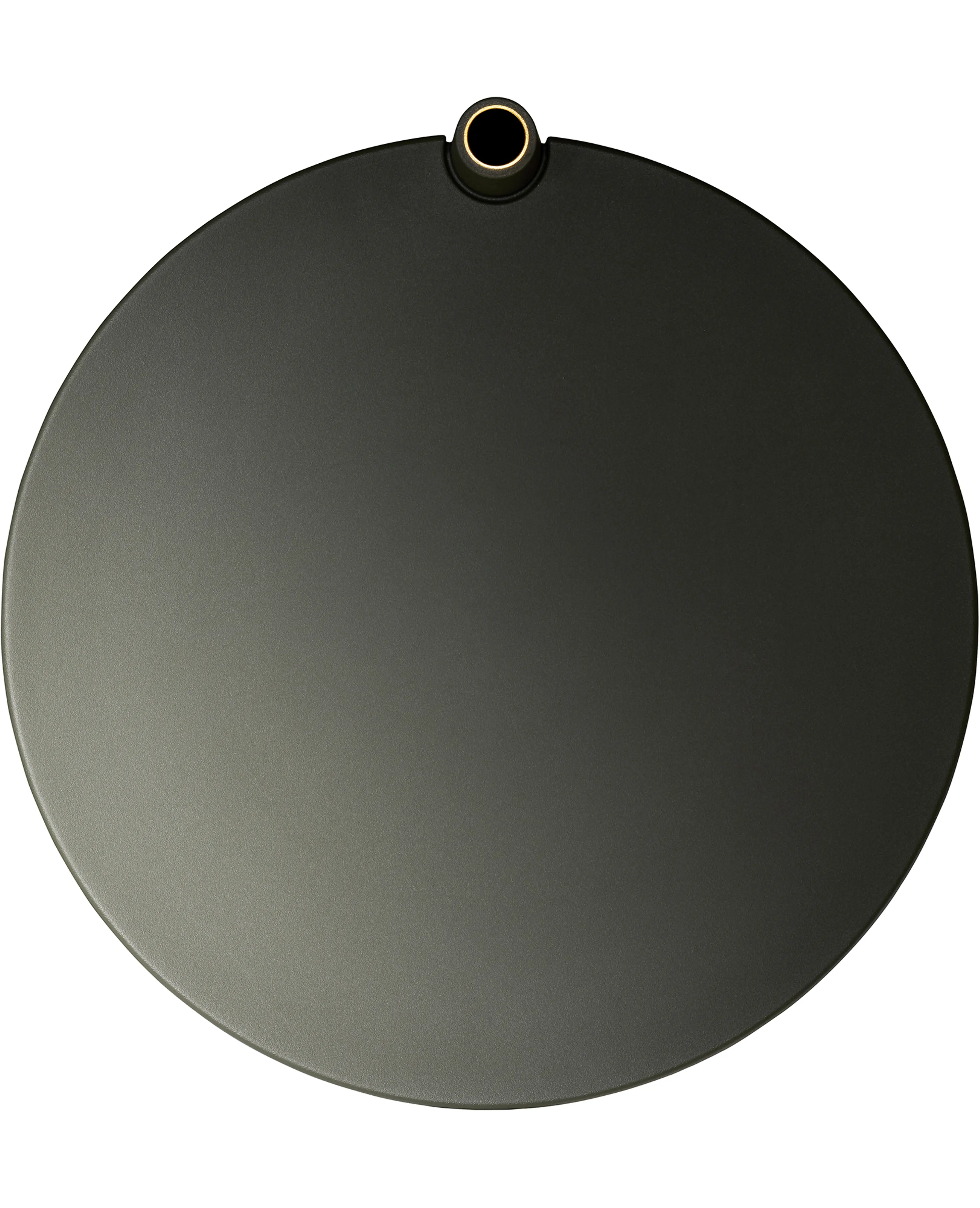
The foundational colour palette creates a natural platform for the products and communications, utilising key accents as functional and technical highlights.

Developed to create intrigue and awareness, social media is a key application to the identity and brand as a whole, extending to product development, storytelling, and real-life usage through a variety of situations.
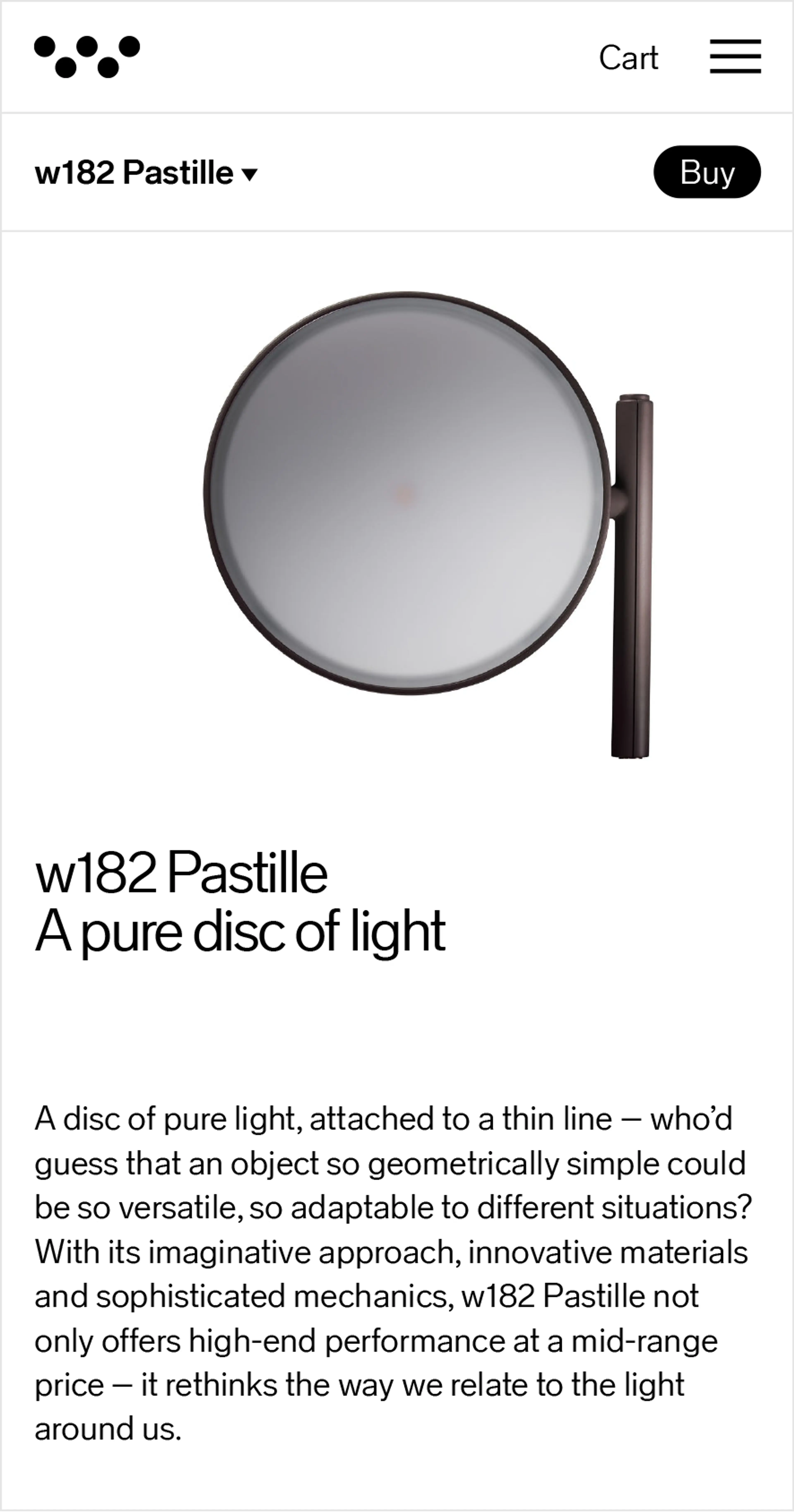
The digital platform created for Wästberg was developed as a central experience where brand and product meet. The solution needed to act on several functionalities such as e-commerce and direct-to-consumer, as well as inspire visitors on the principles of good light.
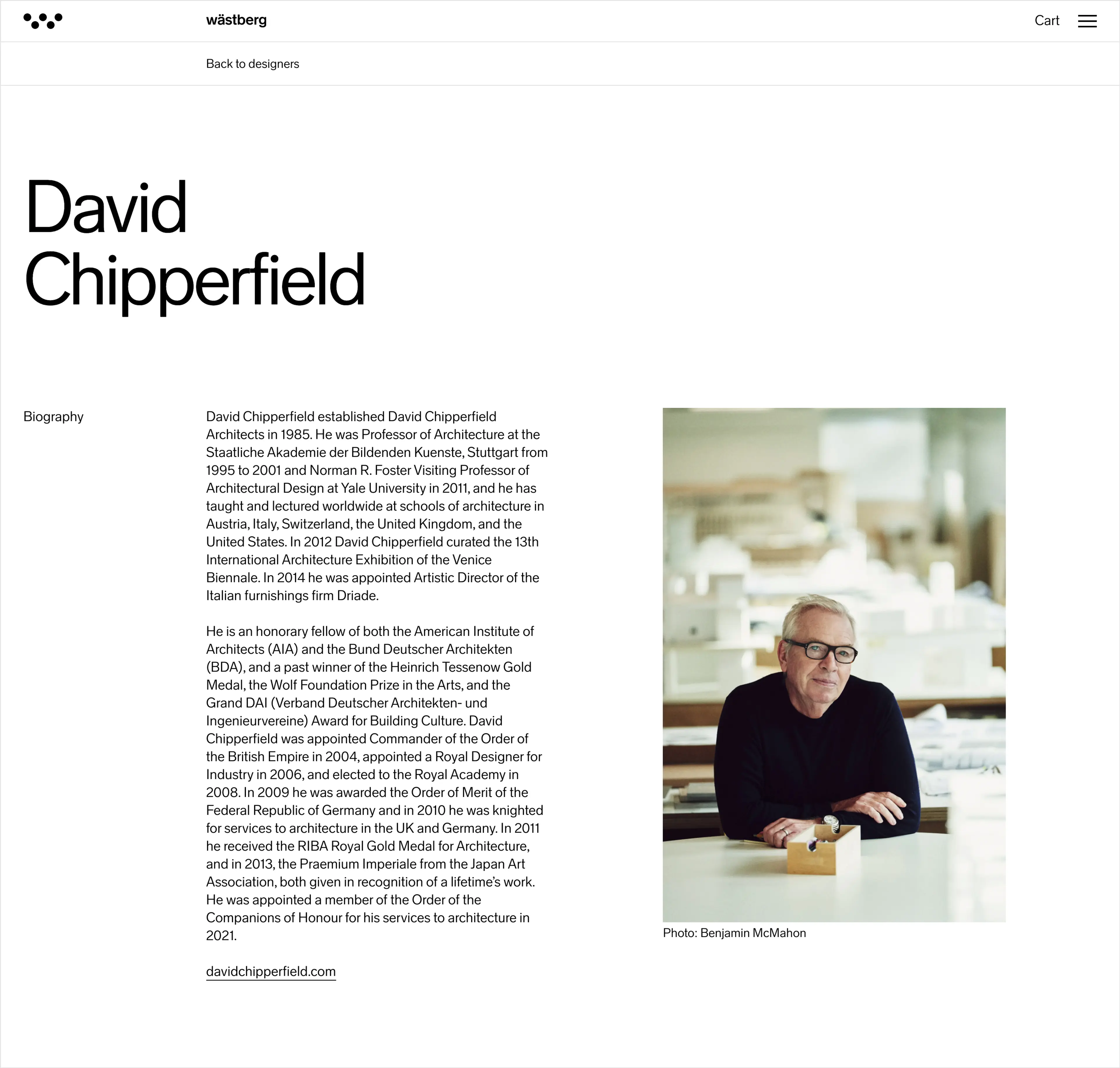
The dynamic layout designed and integrated into the system allows for consistency while also providing specific customisation and individual expression across product and designer pages.
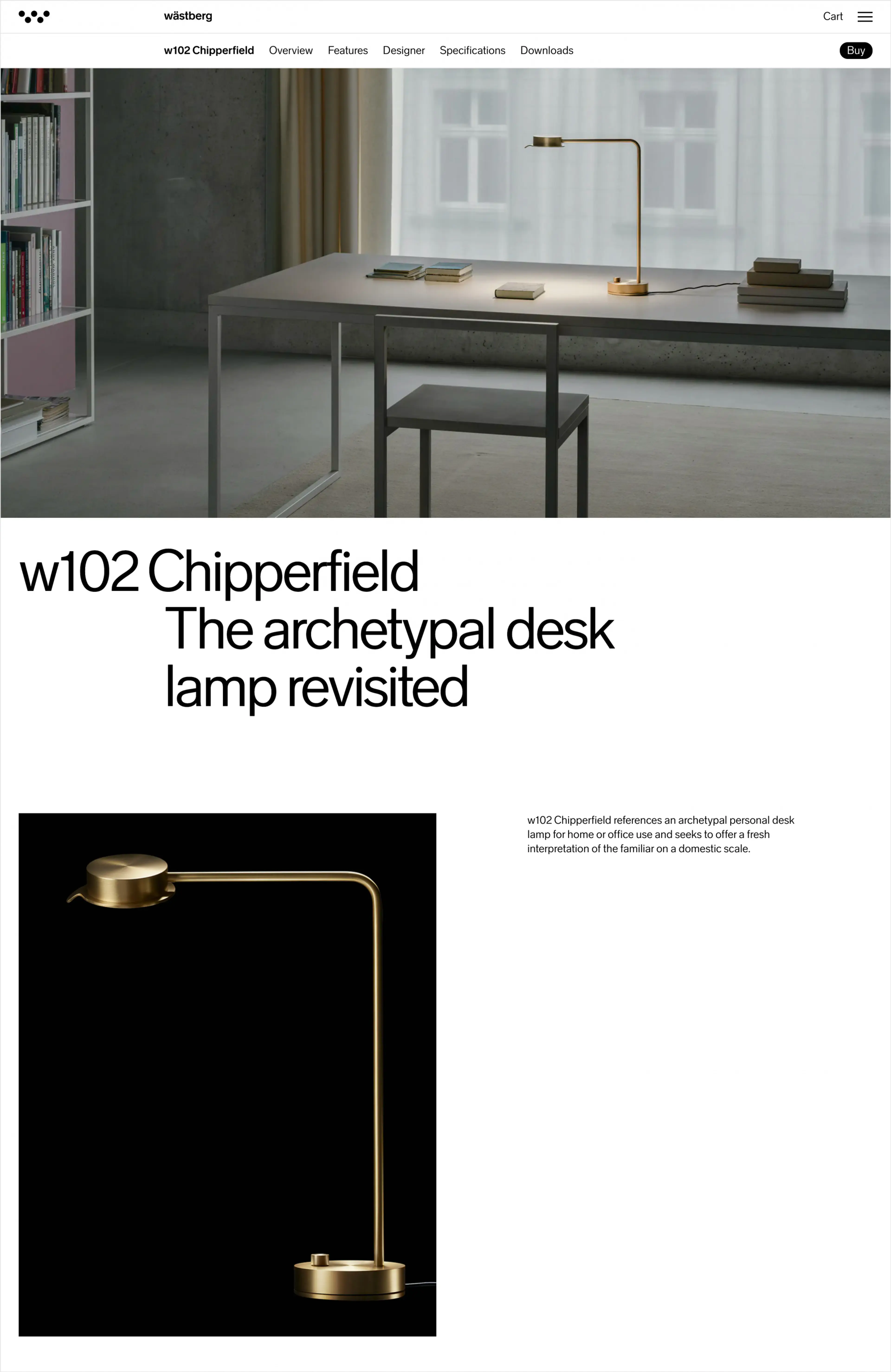
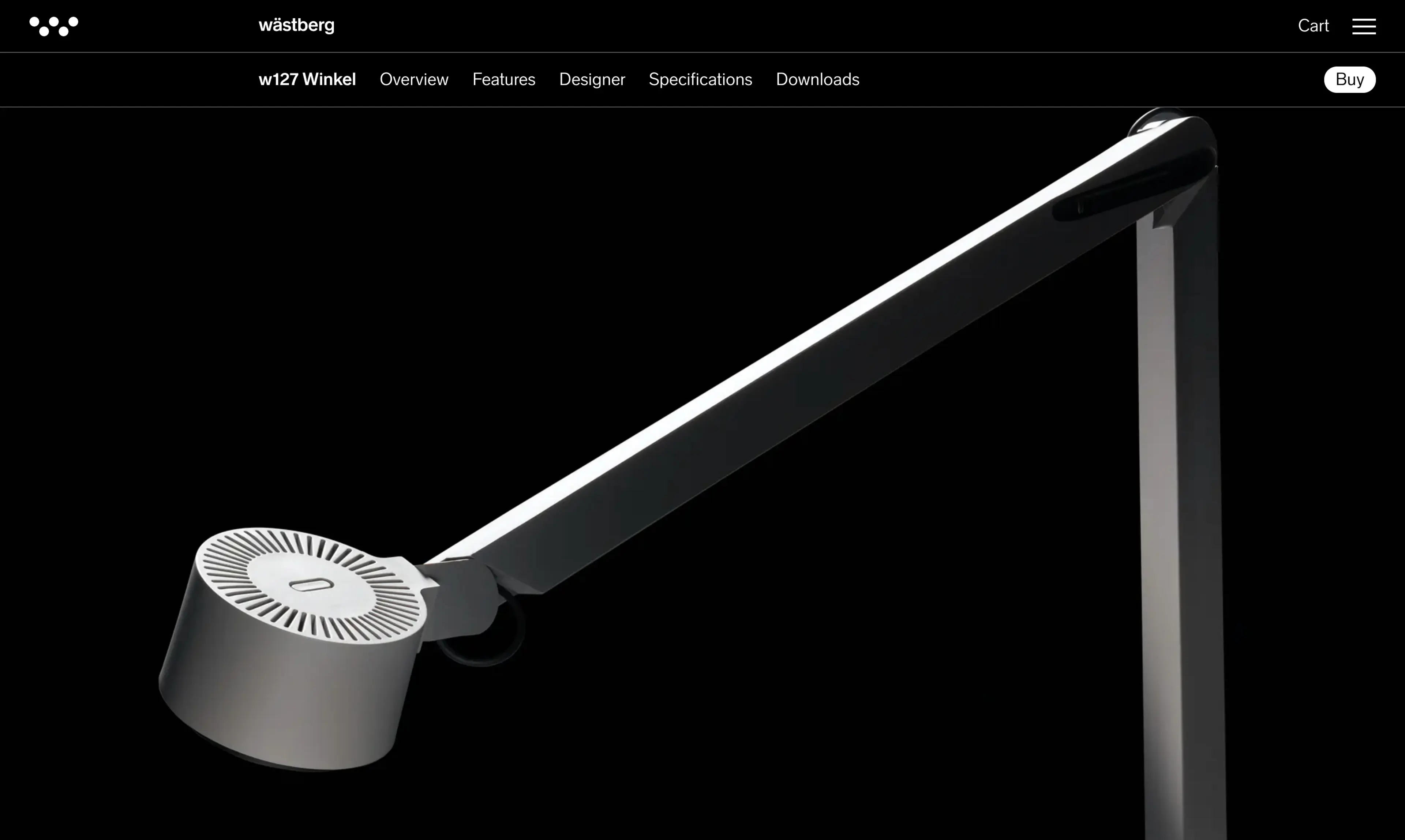
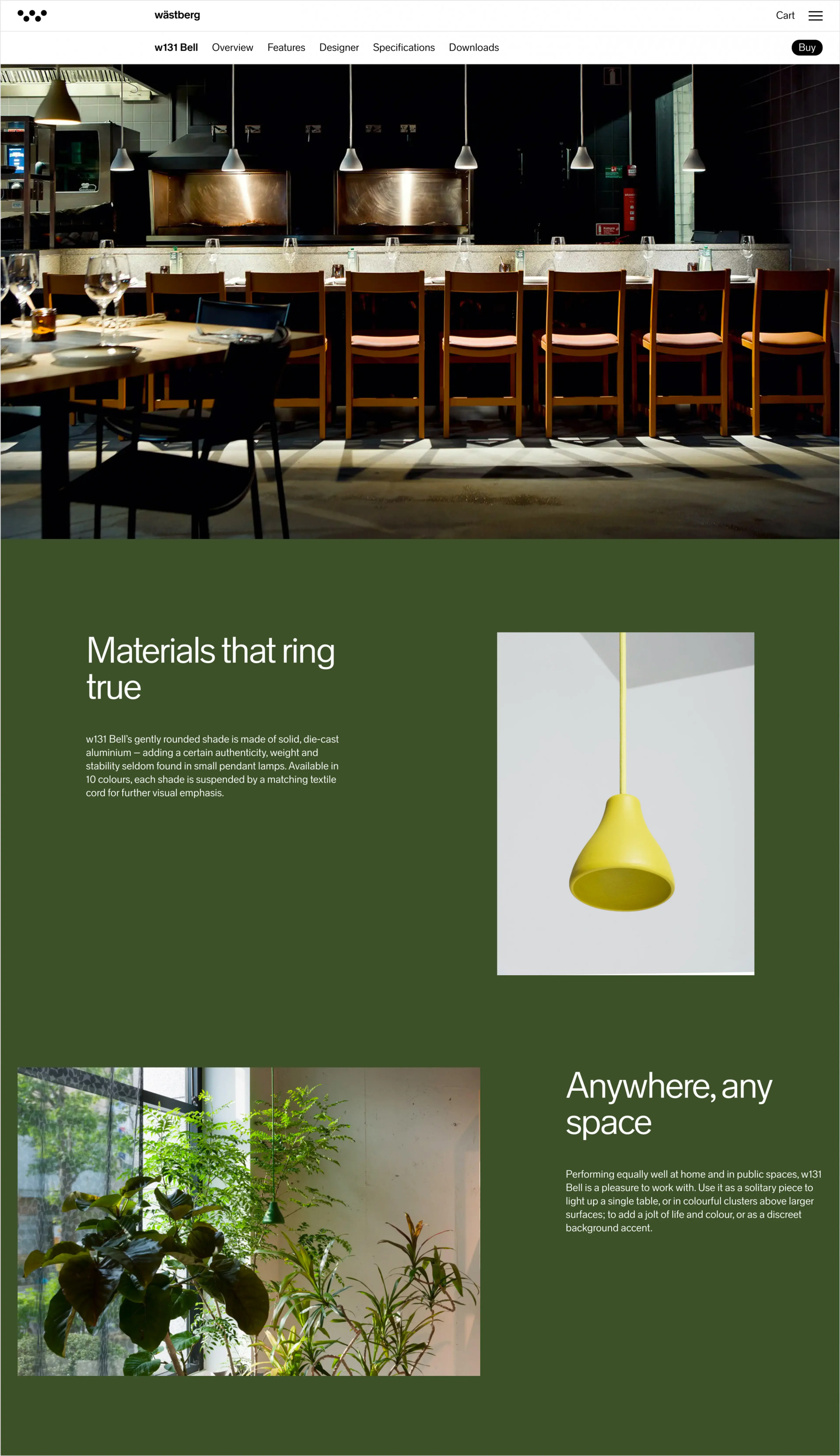
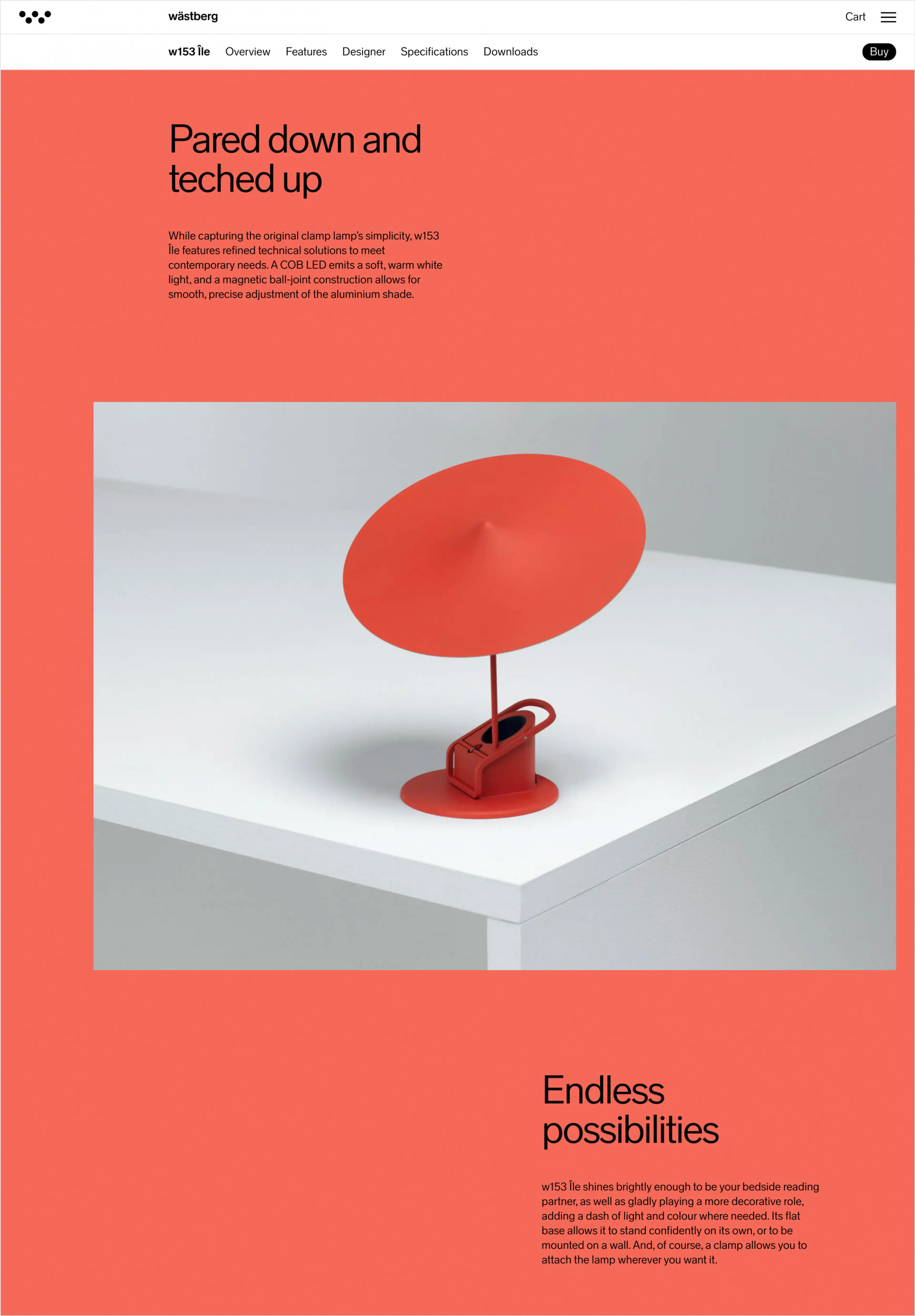
The fully customisable background colours create a deep link between products and the website experience, further enhancing the product pages and extending the identity and expression for usage in other touch-points and applications.
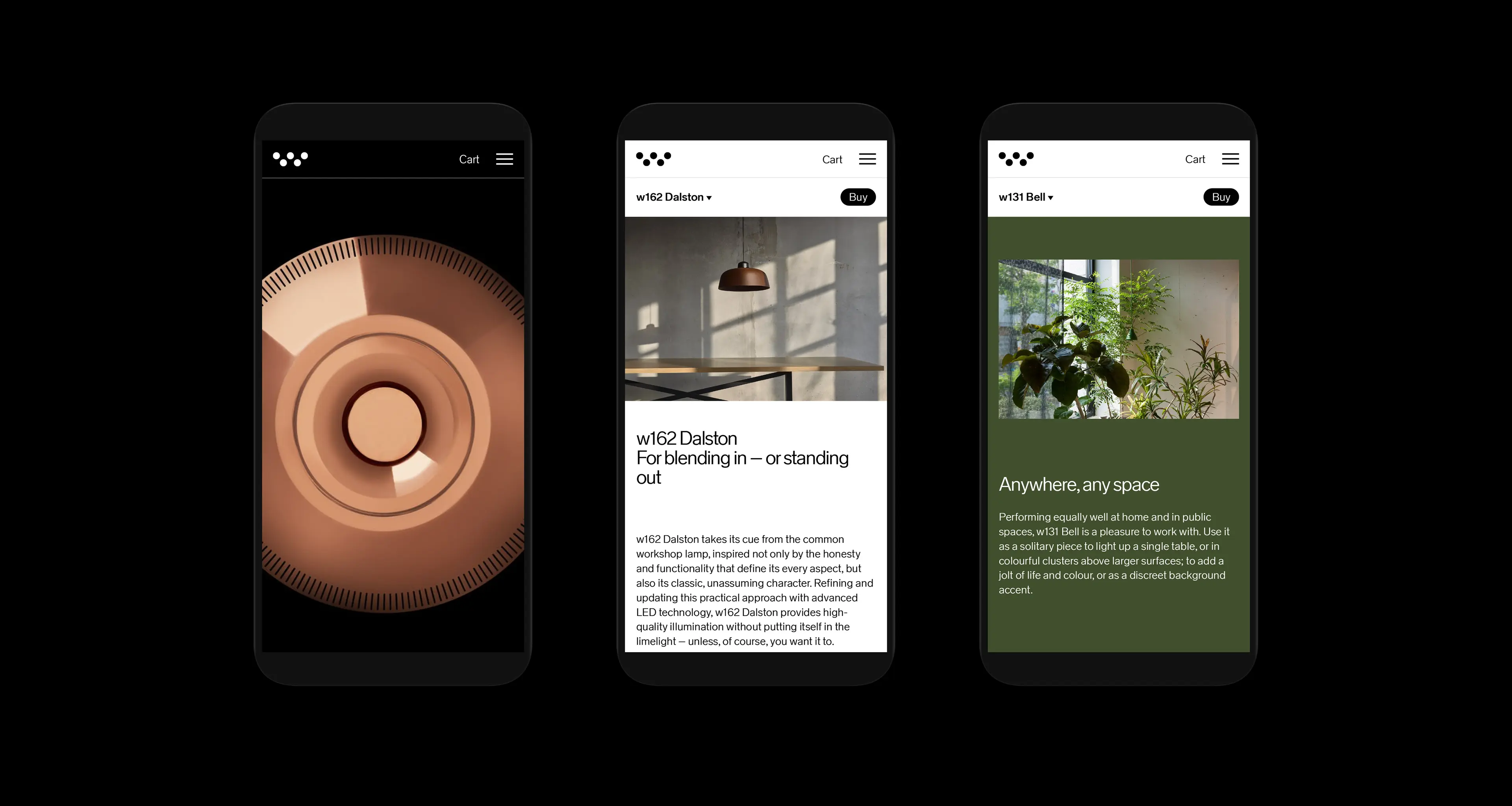
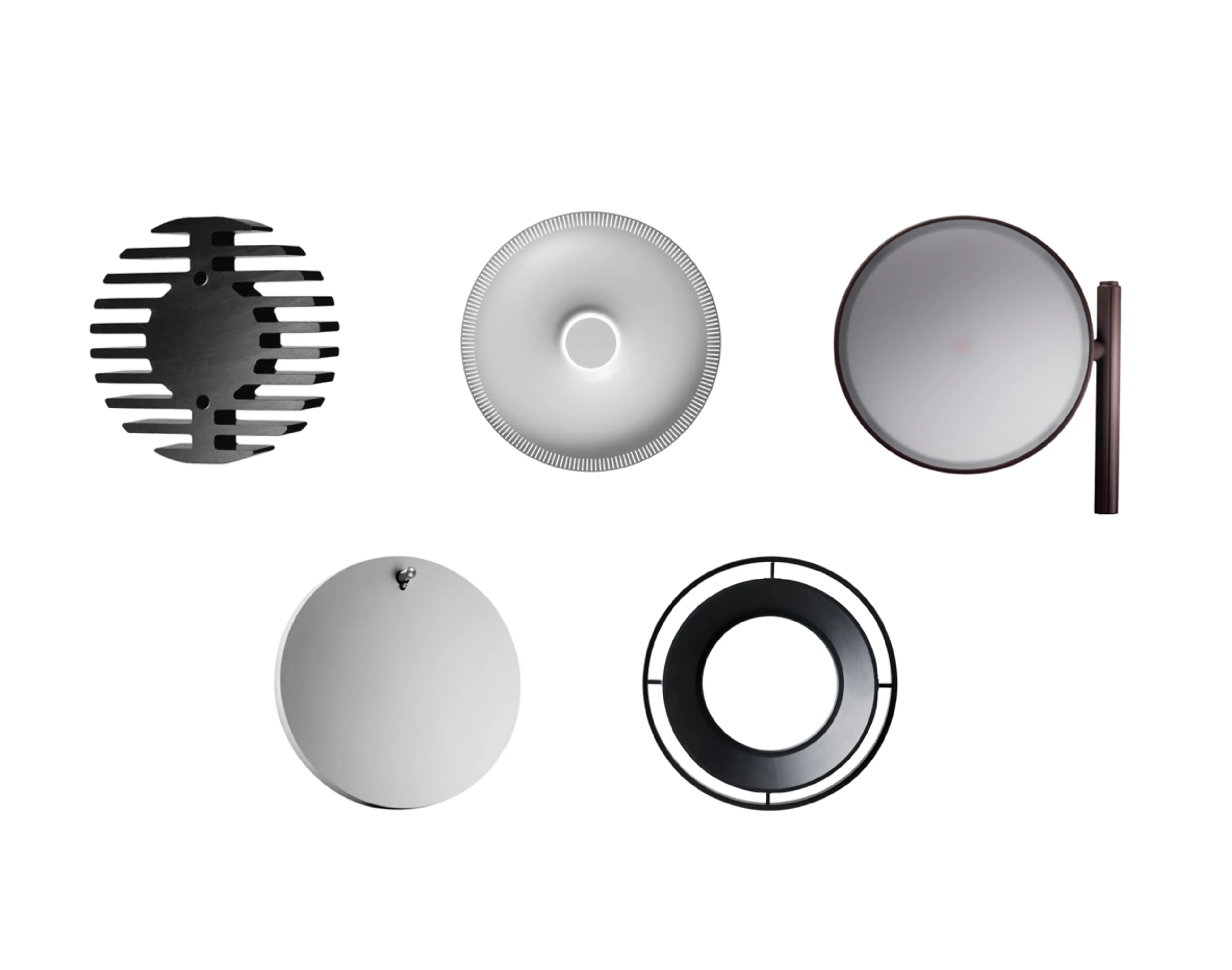
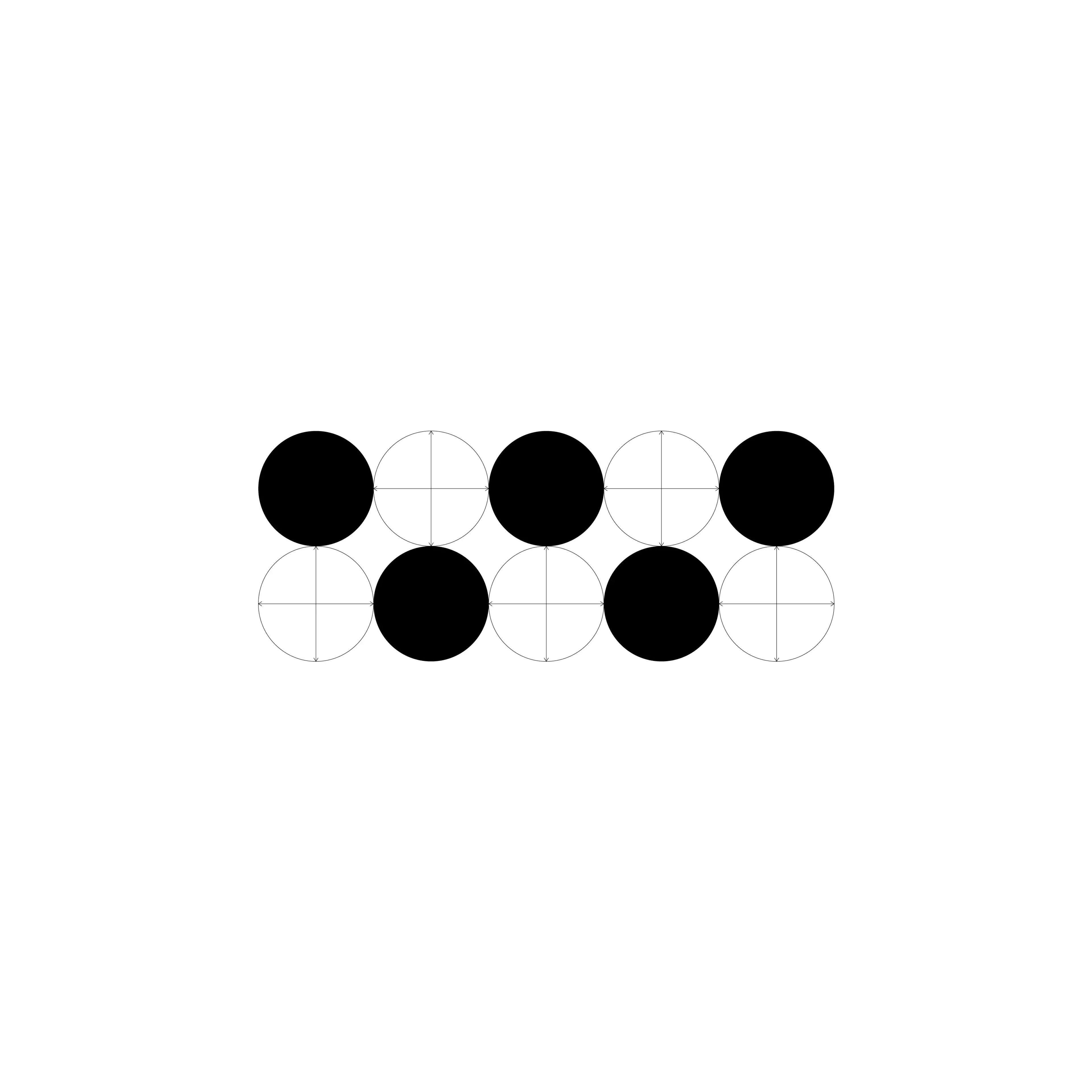
Across the digital platform, macro highlights to the micro details, circles are used throughout the user interface, connecting and referring back to the shape of the Wästberg symbol and the form of many of the physical lamps, subtly connecting the identity holistically.