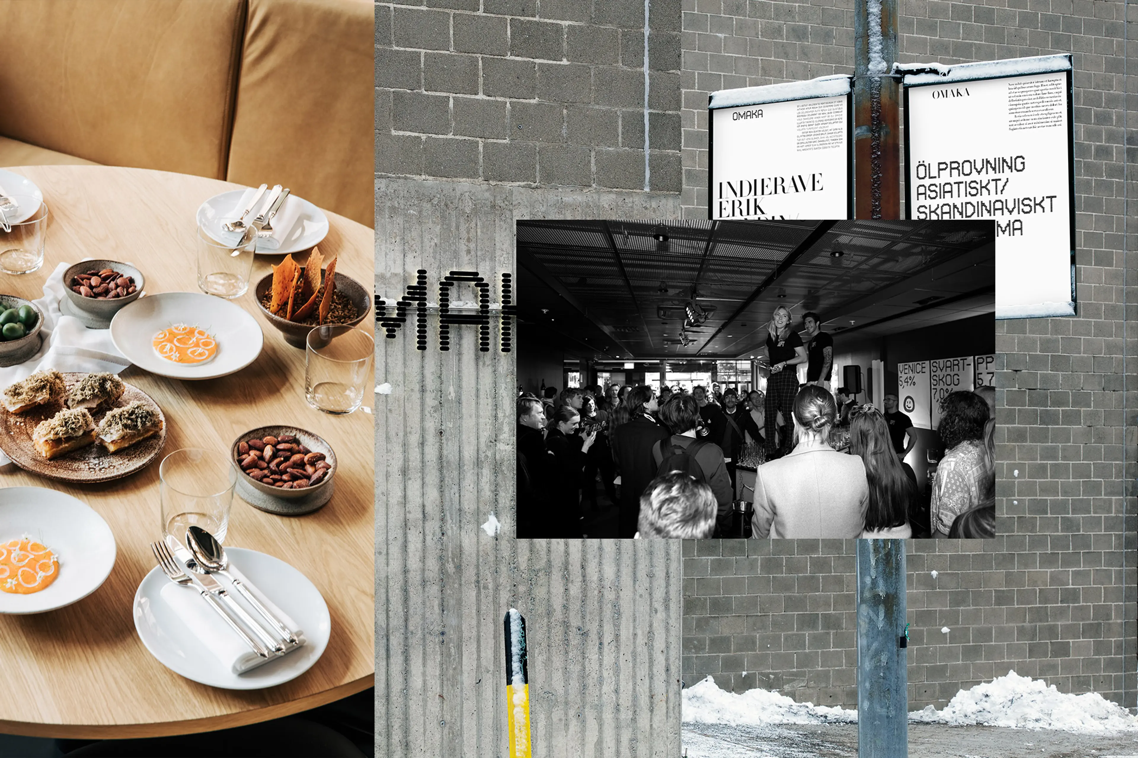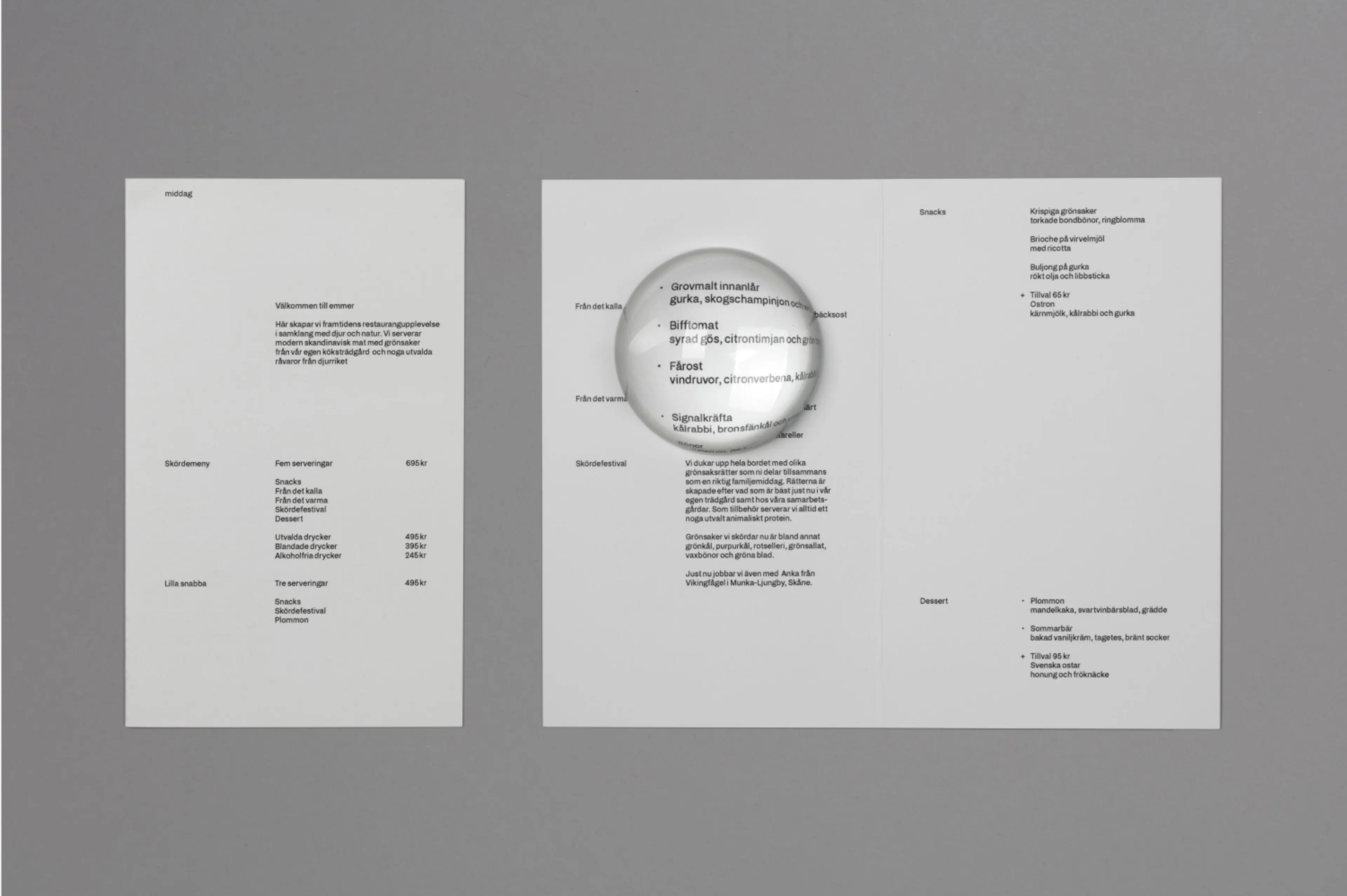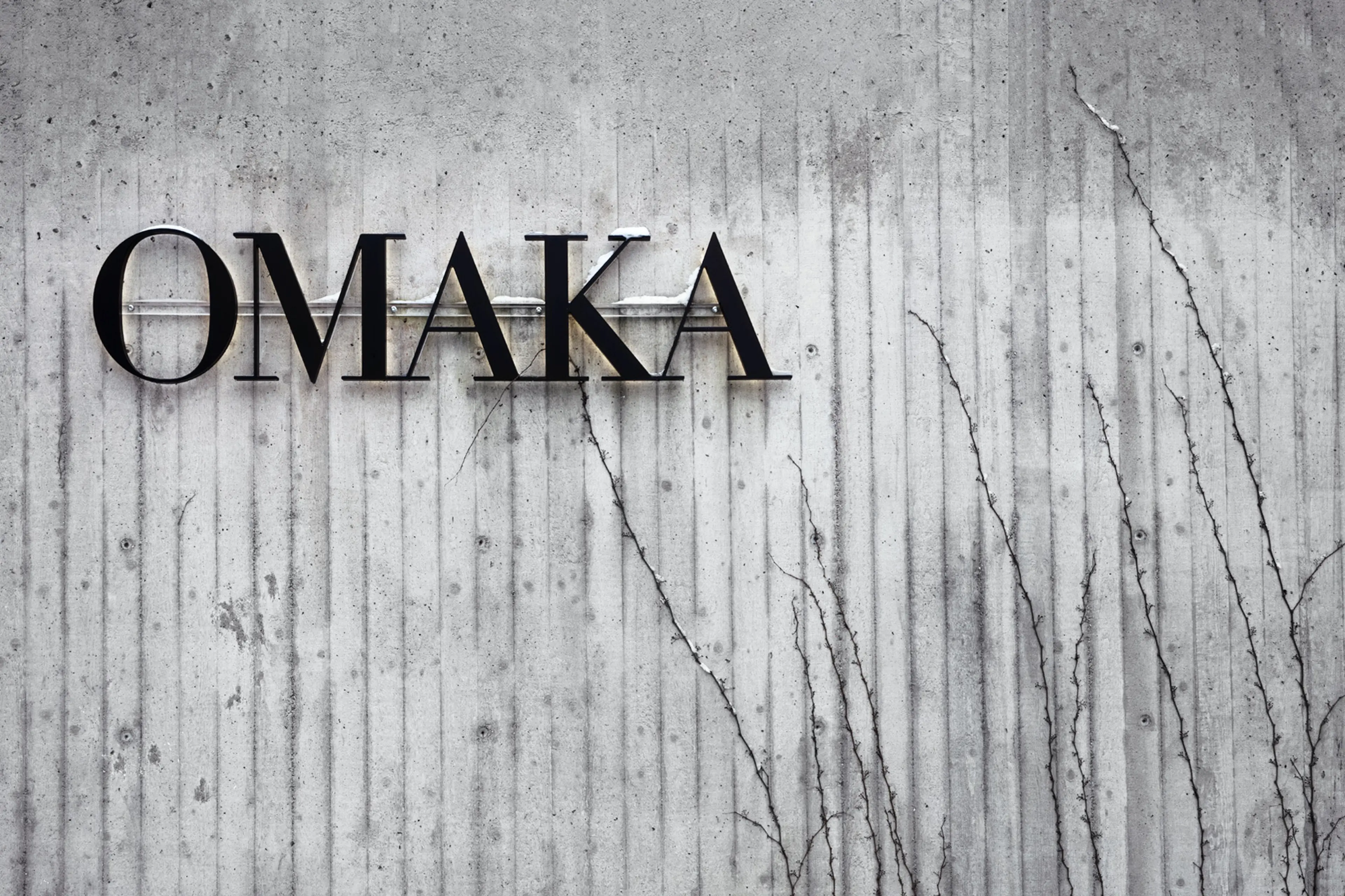
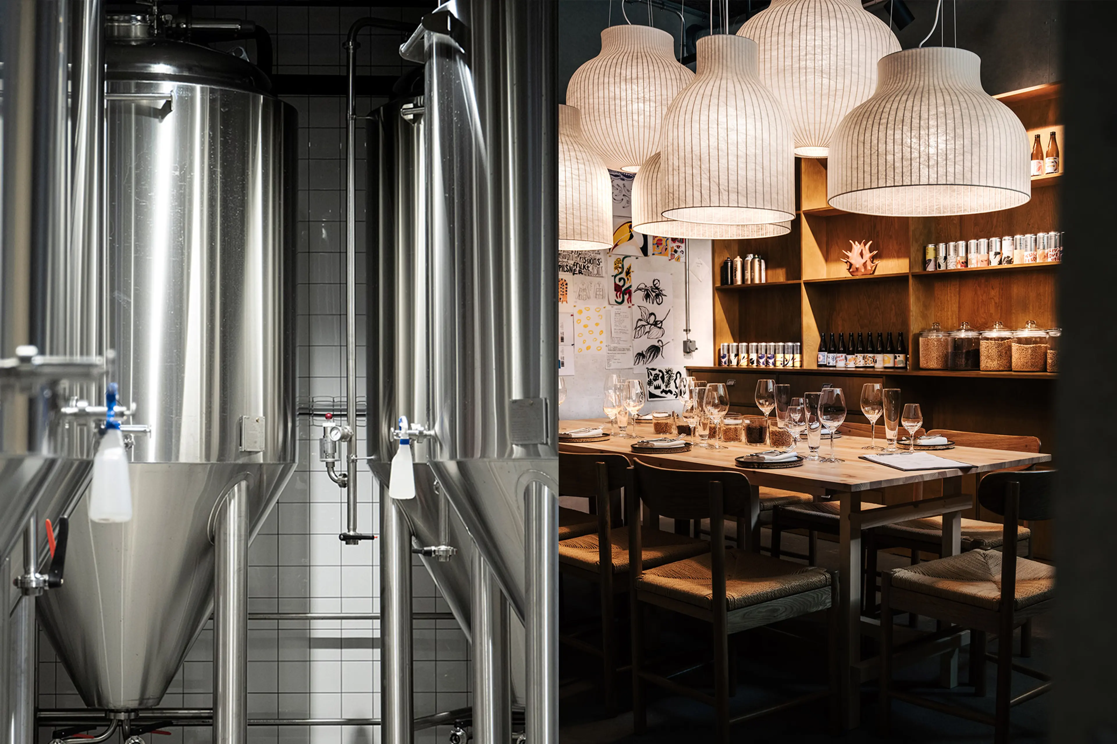
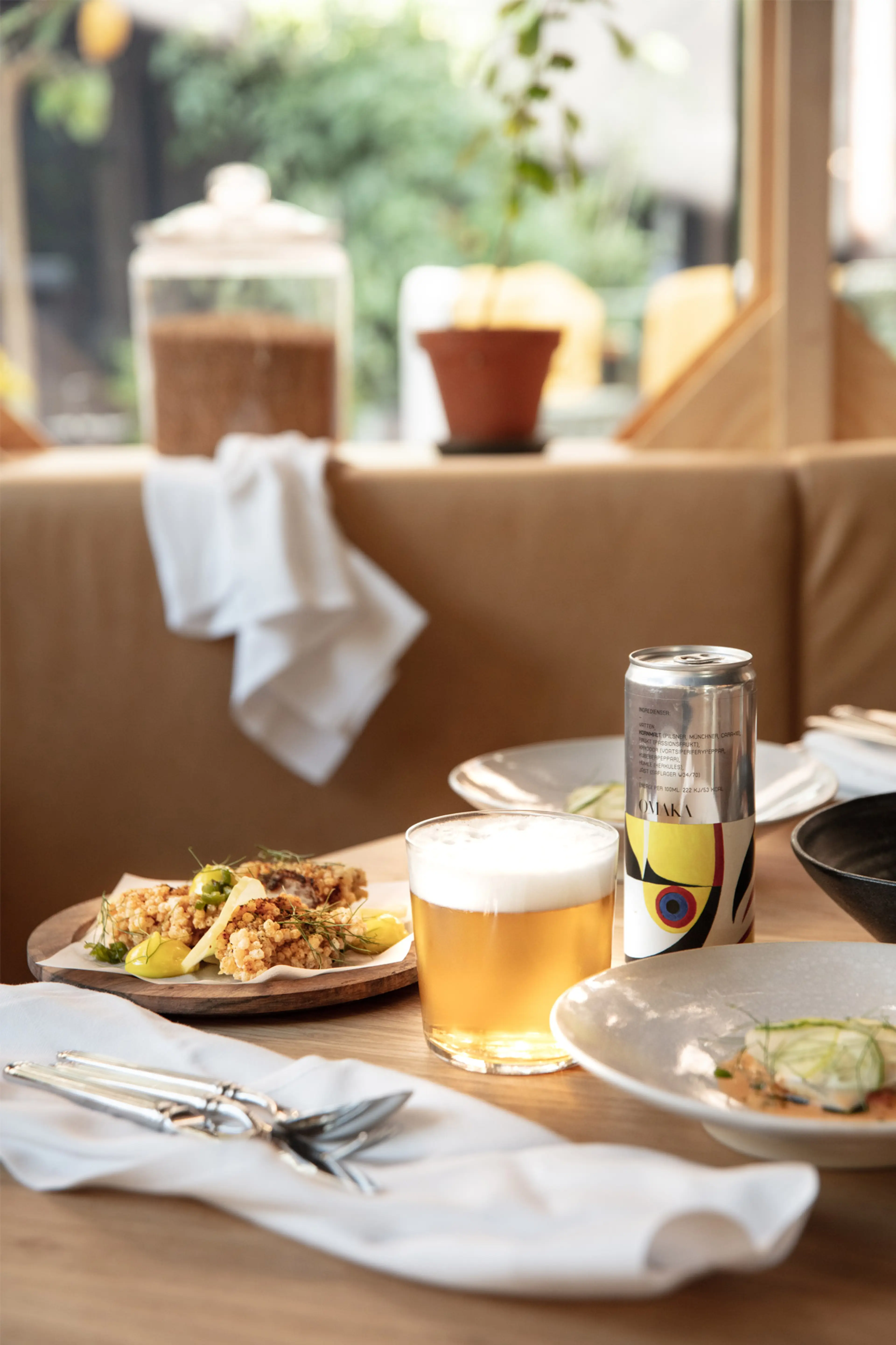
Odd, ill-matched, ill-assorted, incongruous, diverse? No, there is no true translation of the Swedish word Omaka. But the meaning is clear – it’s one of a kind, it doesn’t come as a pair (even though it implies a counterpart) and it’s deviating from the norm. Just like the brewery and restaurant recently established in central Stockholm that carries the name. A leisured and welcoming place, yet with a high level of sophistication when it comes to food and beverage.
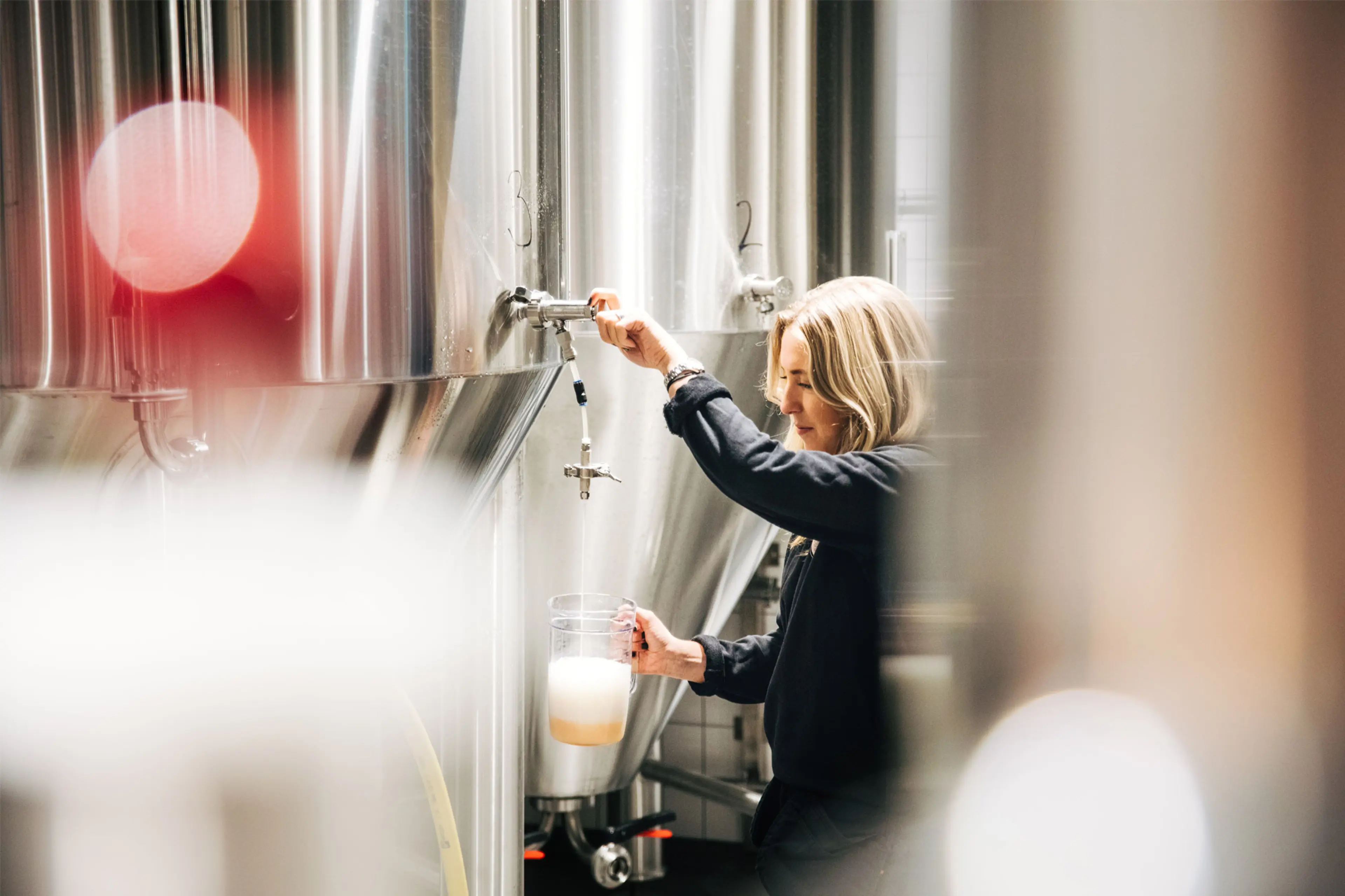
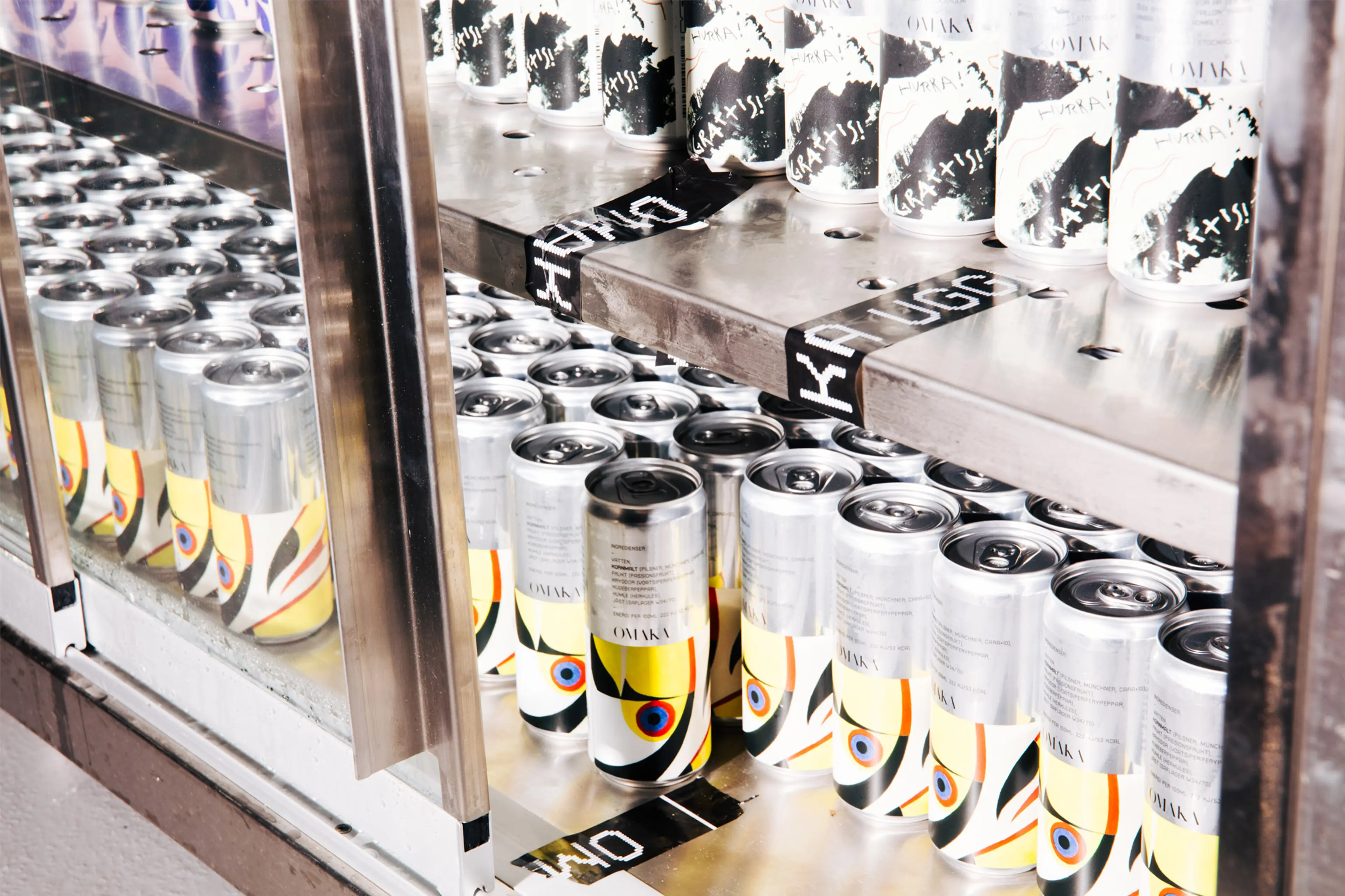
We’ve had the pleasure of working as a strategic partner in close collaboration with brewer Hedda Spendrup and her team in the development and launch of a brand that is not just a hub for beer connoiseur locals, but an innovation site for the entire Spendrups brewery group. The assignment ranged from naming through to brand strategy, visual identity, design system, packaging concept and brand implementations. Work that was rewarded with the prestigious Golden Egg – Sweden’s oldest, largest and most prestigious award for the creative industry. A review of the project from BP&O can be found here.
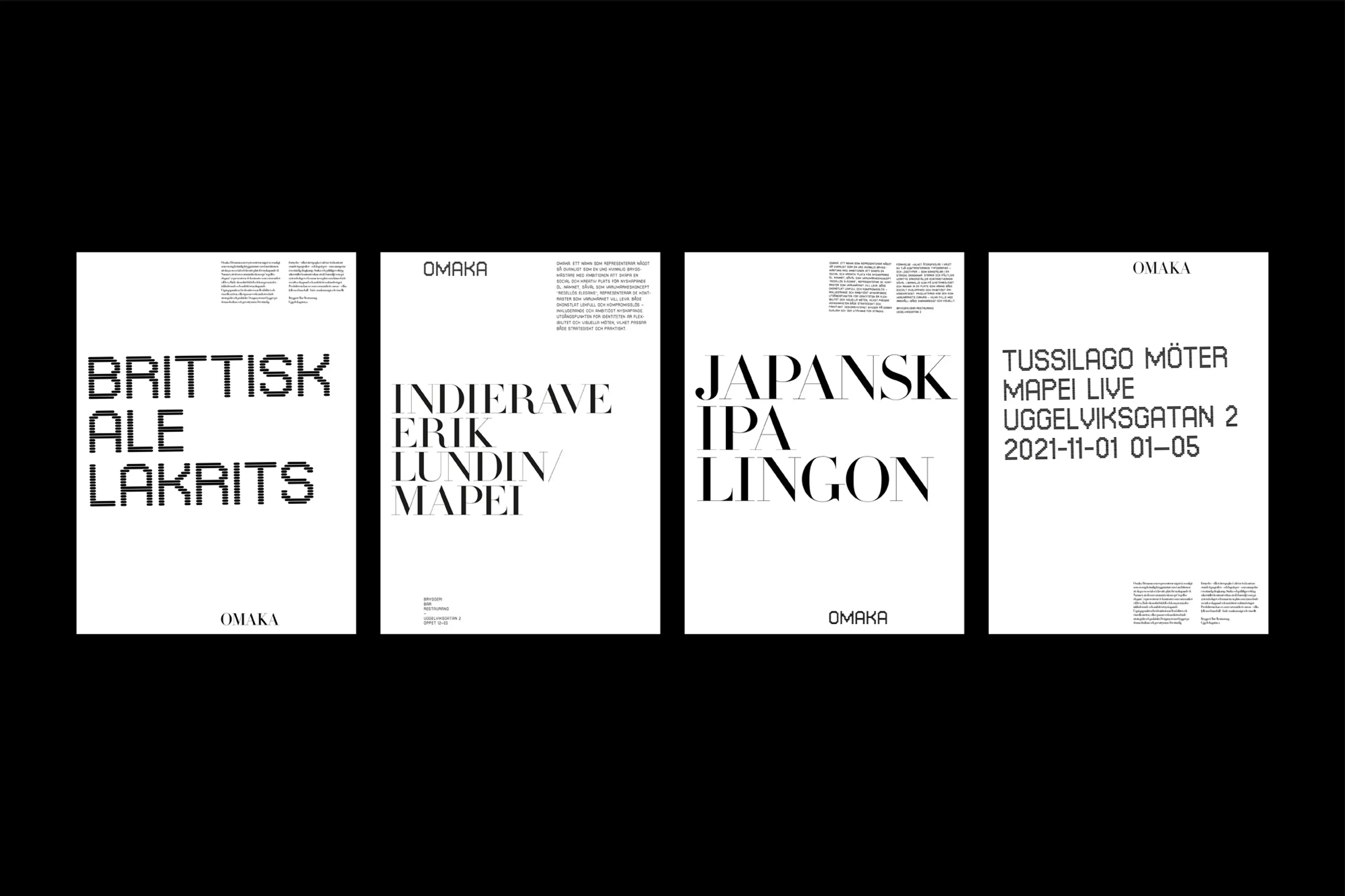
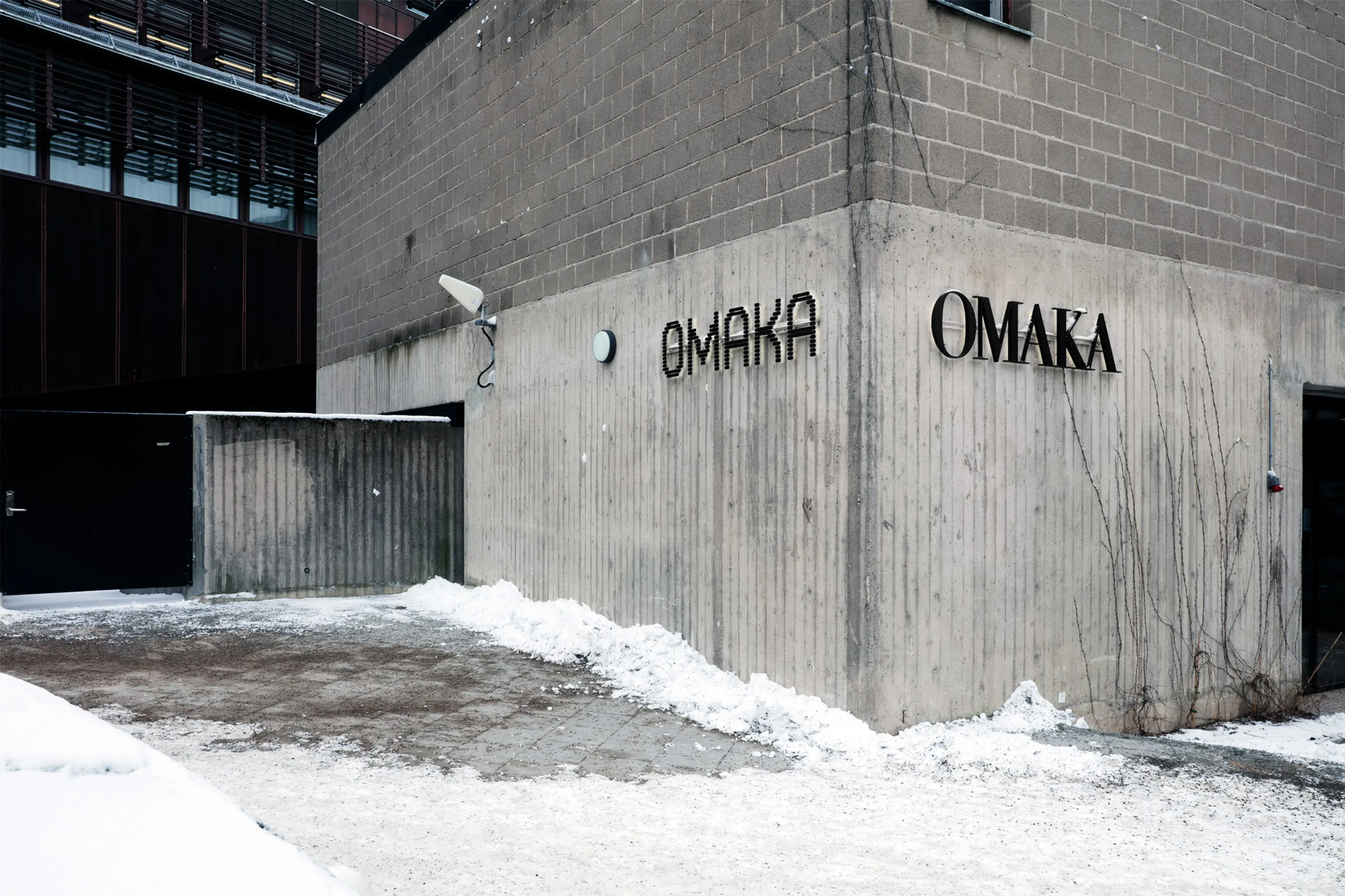
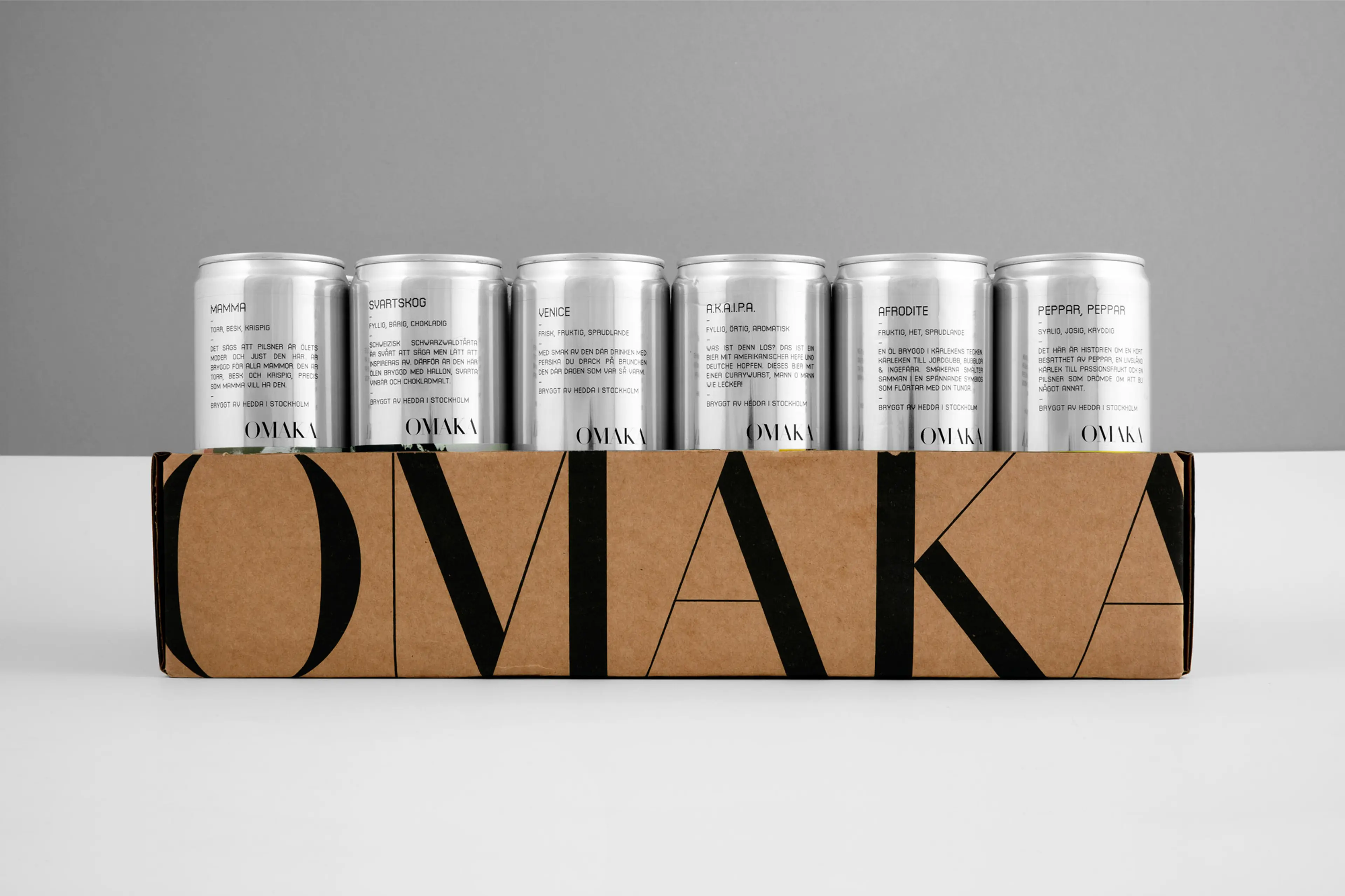
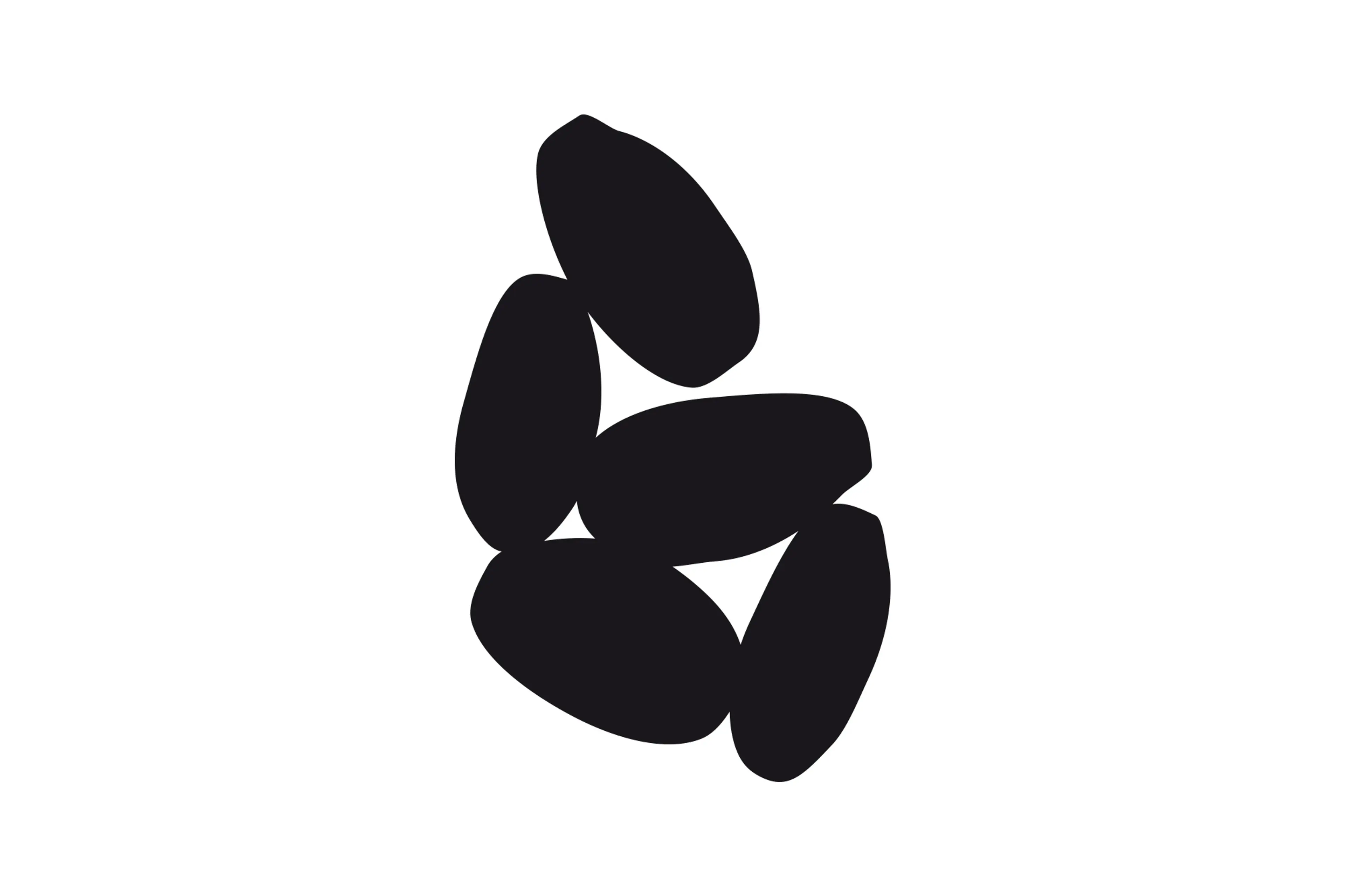
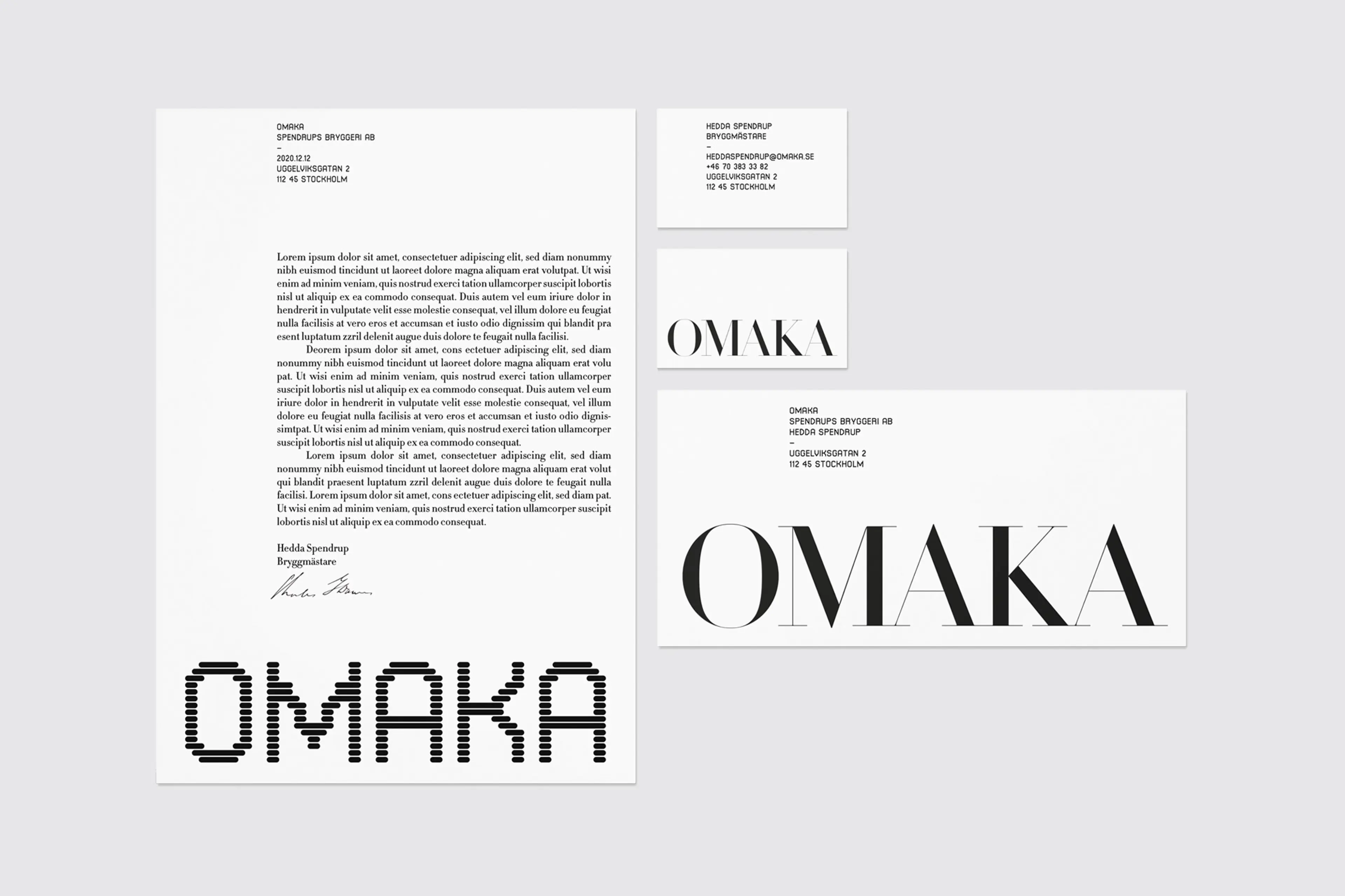
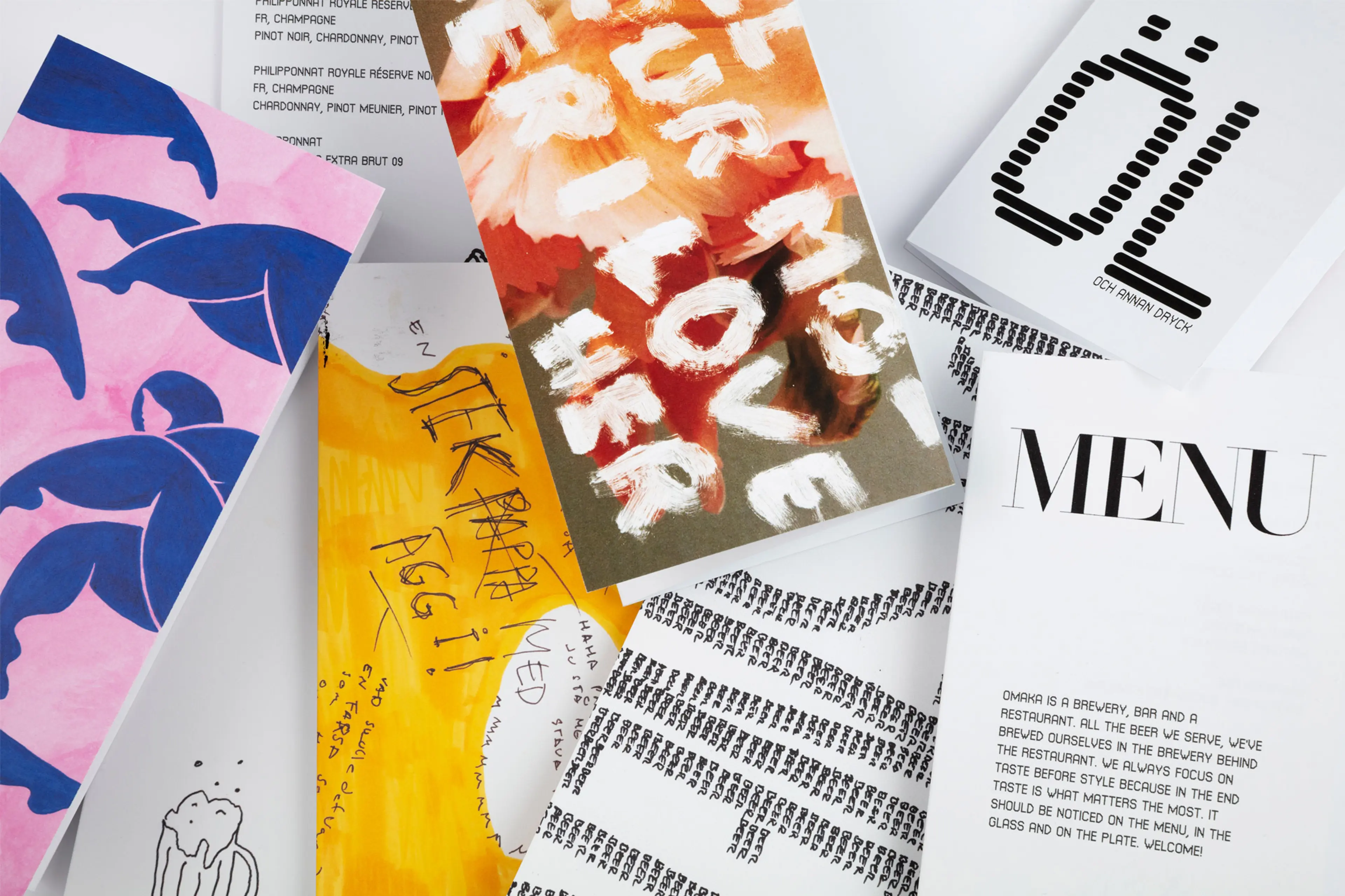
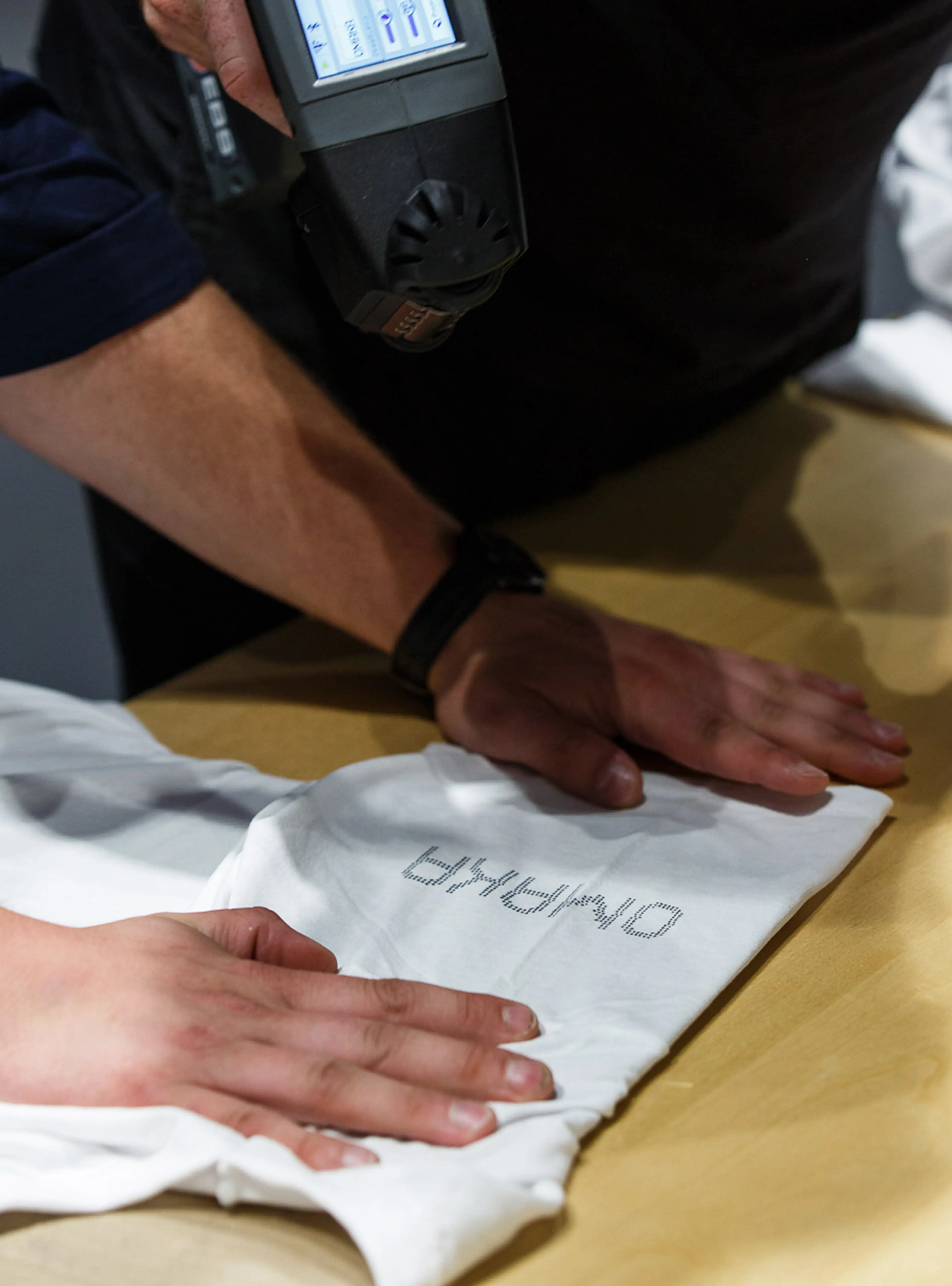
The starting point for the identity is graphic clarity and classic sophistication, paired with the changeable and expressive. This dualism is reflected in the choice of two contrasting fonts, and two logos, with completely different character and origin – which interact in a constant tug of war.
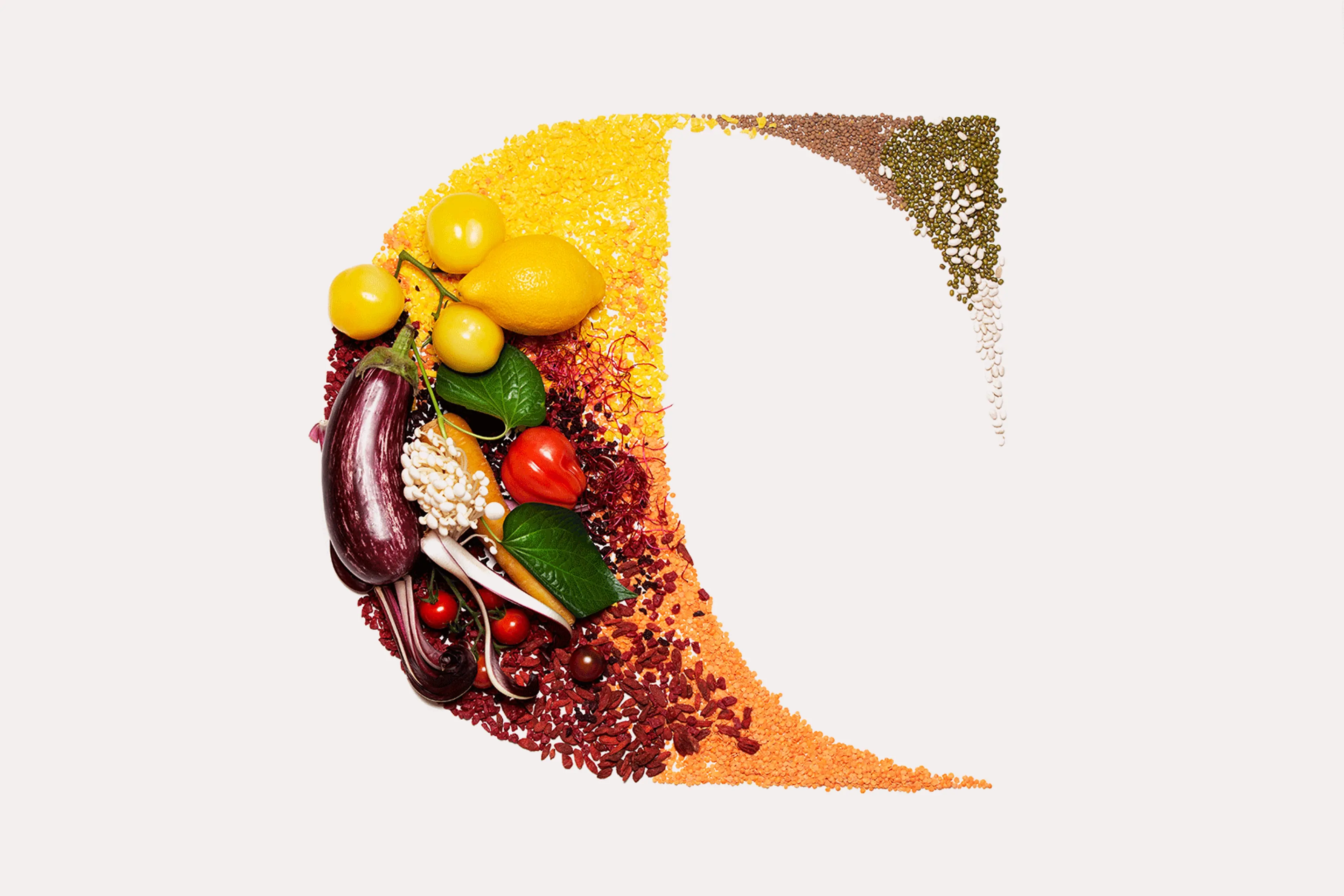
The design system is based on a repeatable basic structure consisting of separated fields which forms a canvas for product differentiation and visual hierarchy in layouts.
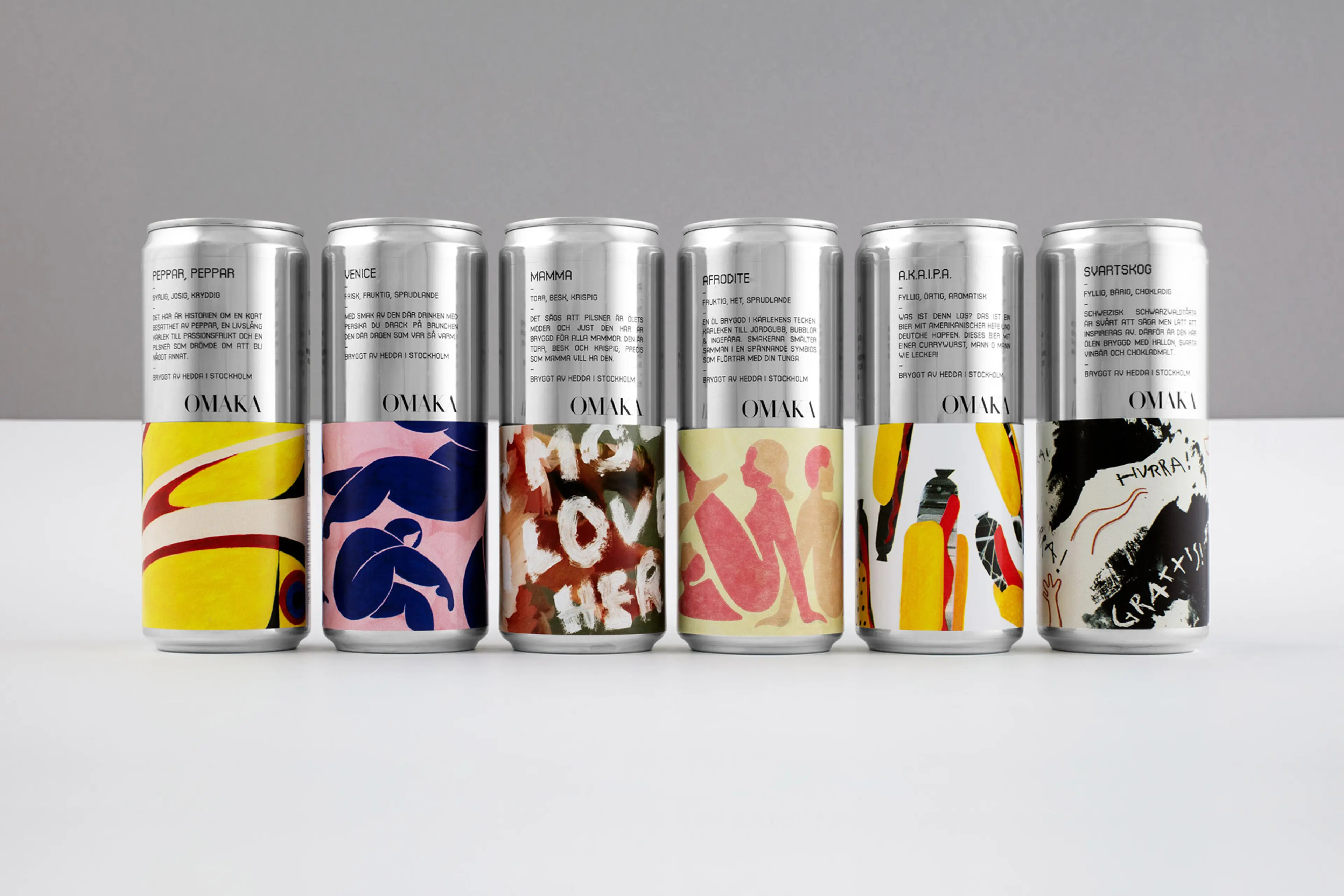

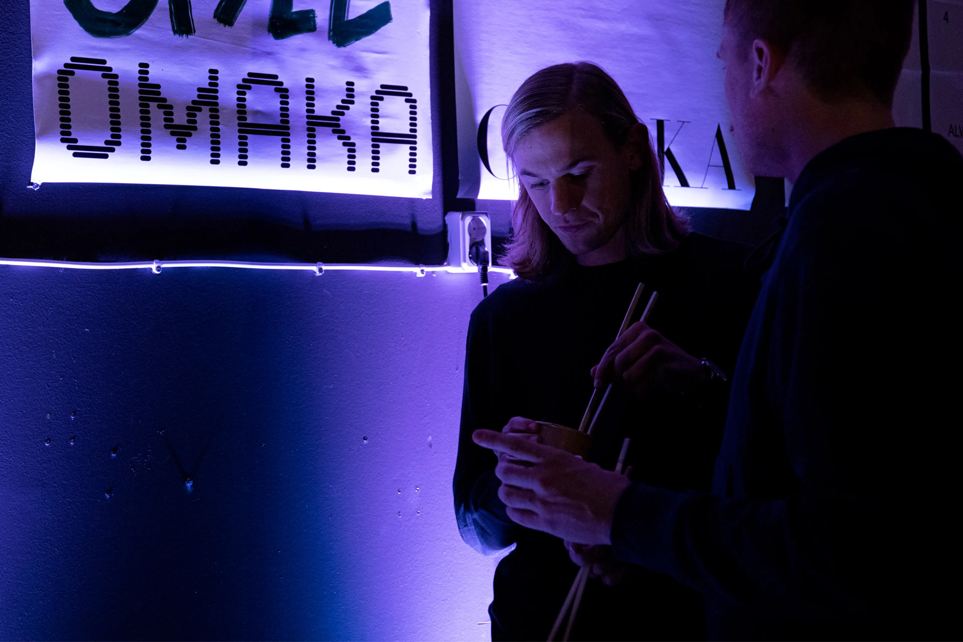
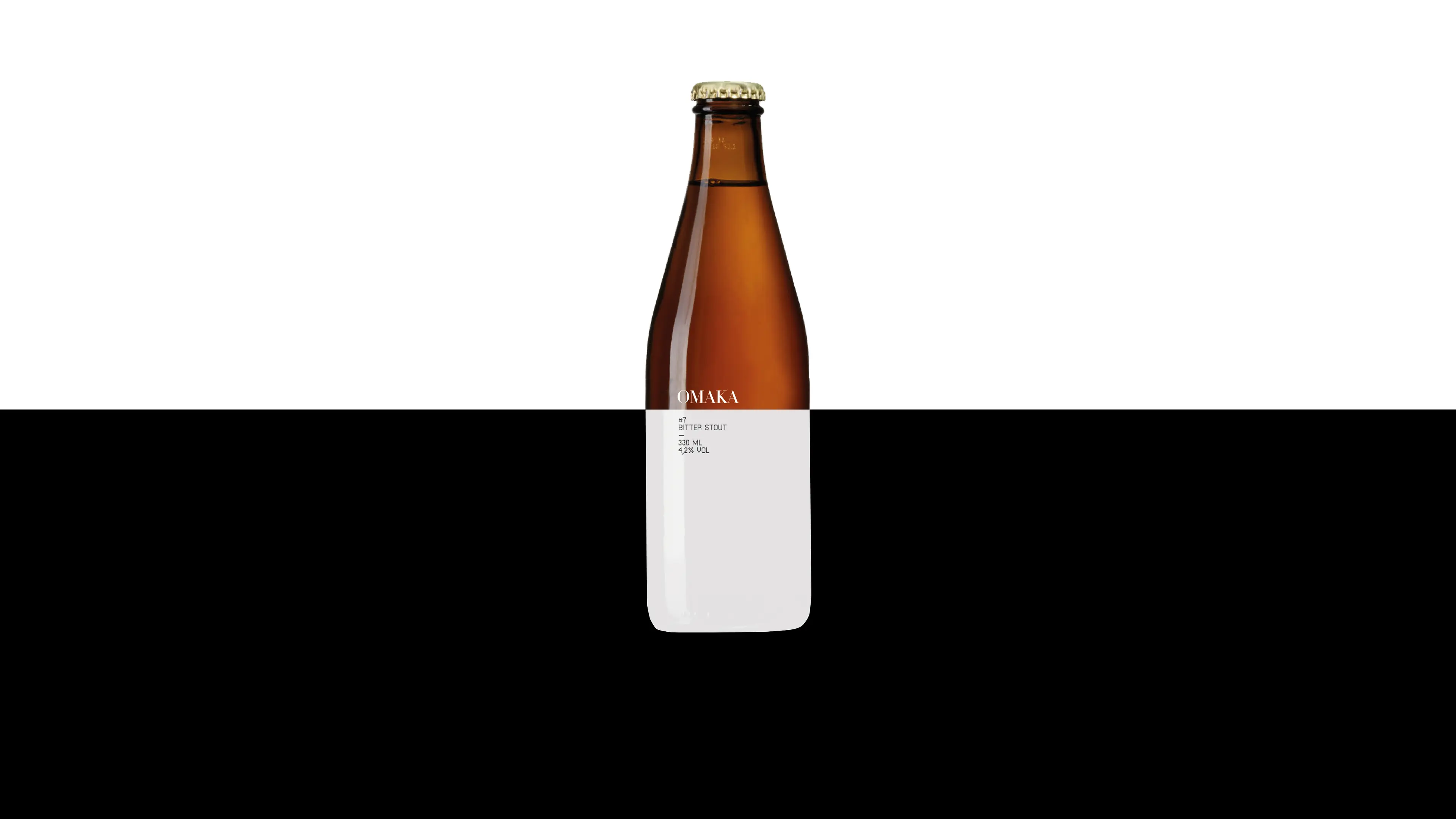
The name, as well as the brand concept “irregular elegance”, represents the ambition and the contrasts that the brand wants to live. Just as playful and inclusive in atmosphere, as uncompromising and ambitious in taste.