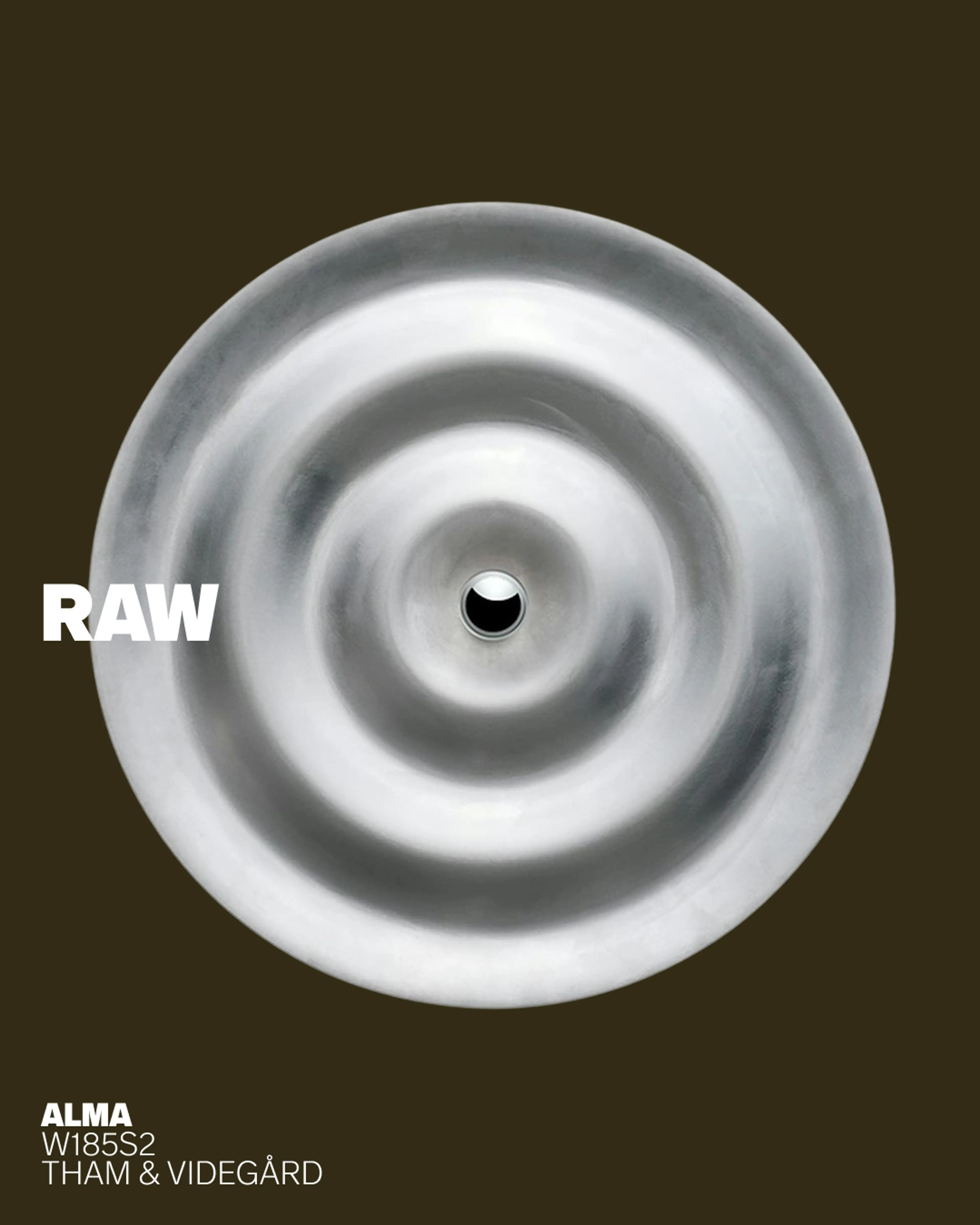
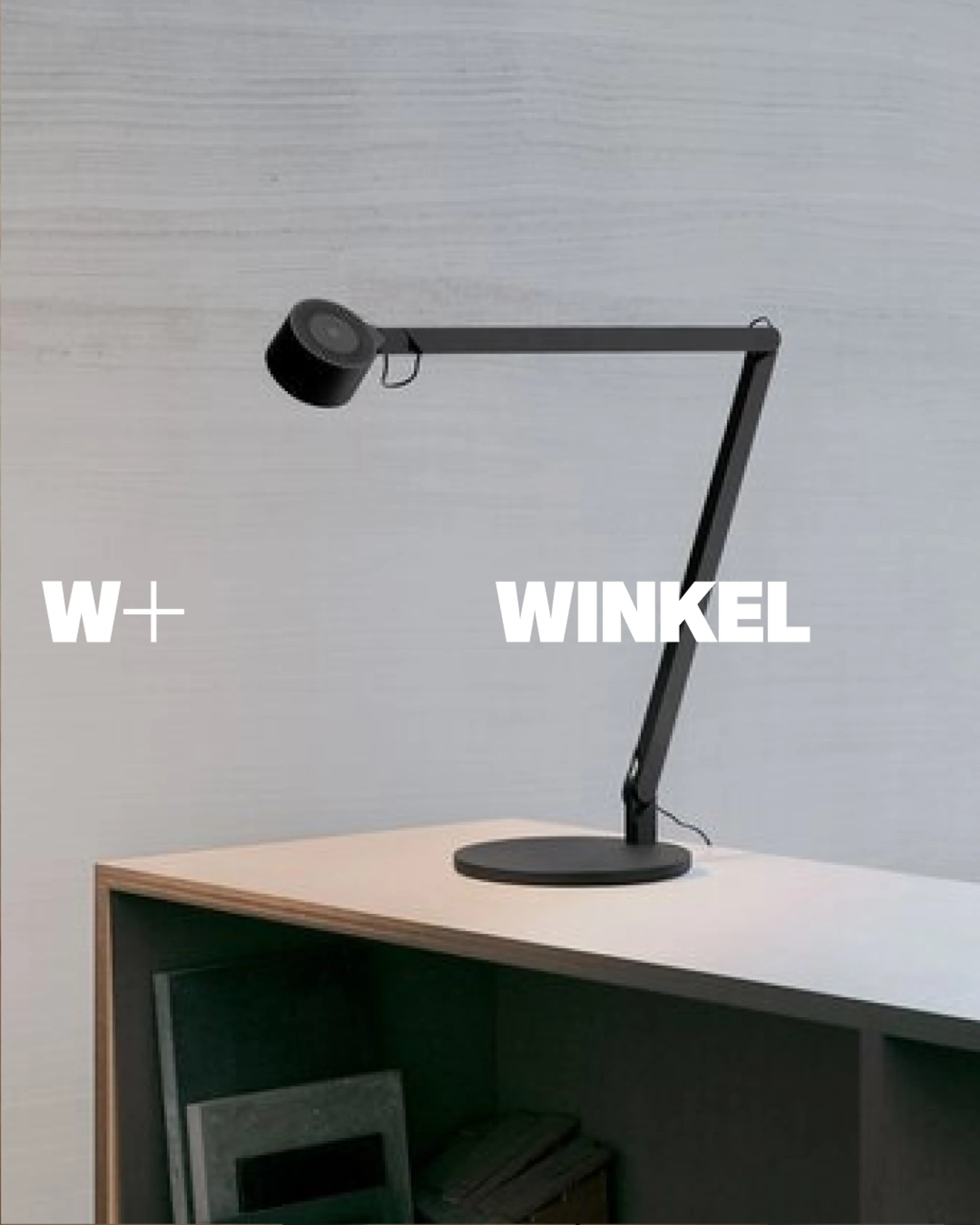
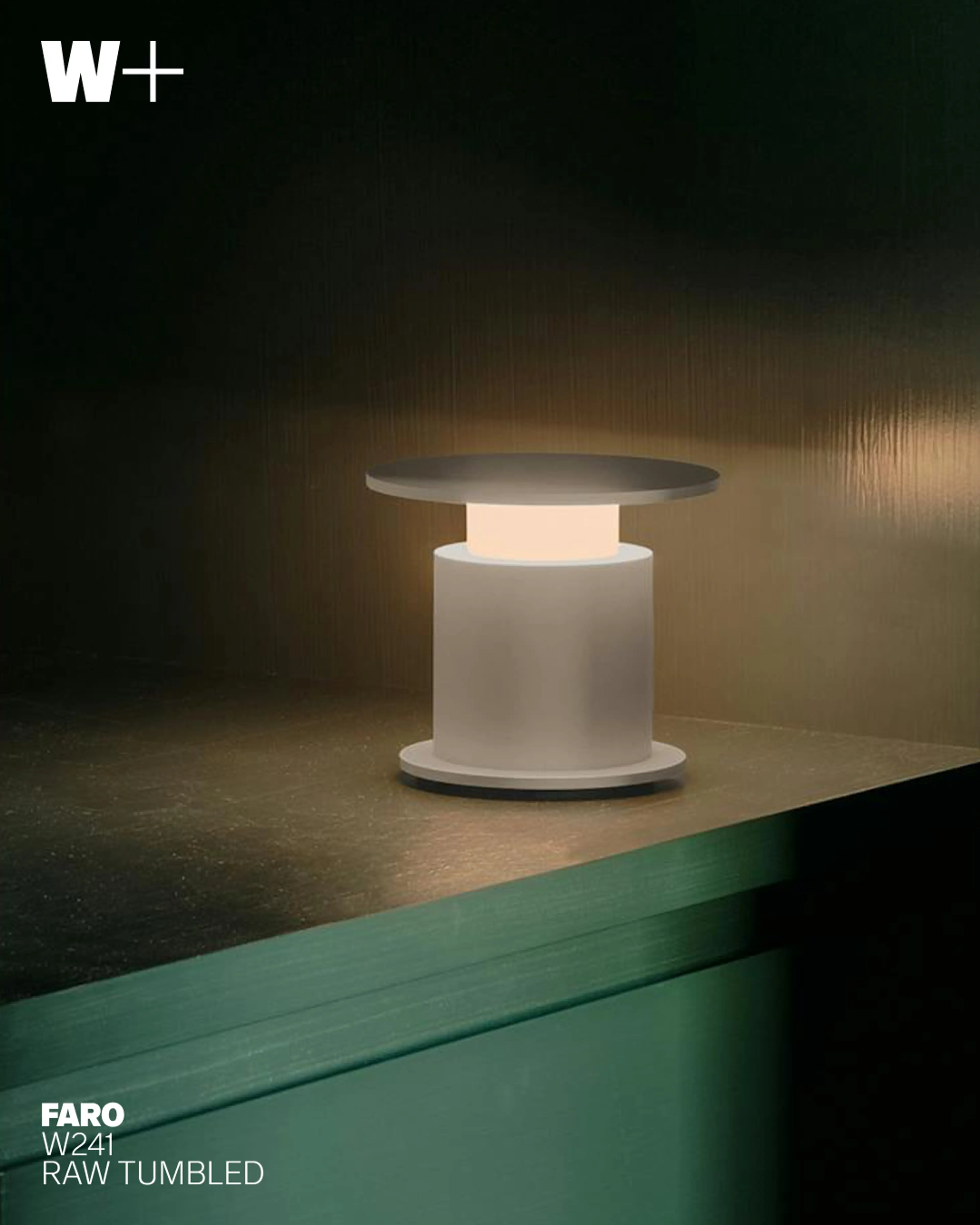
W+ brings together the legacy of Swedish lighting pioneer Wästberg and the technical expertise of XAL Group to create a new standard for contemporary lighting. Supported by close collaboration with leading designers and architects, a family-driven culture and global resources, the brand develops products that balance emotion, function, sustainability, and accessibility – its definition of good light.
SDL’s task was to shape a new brand that feels distinctly contemporary while carrying forward Wästberg’s strong equity, translating two histories into one unified identity with a new creative direction. The ambition was to create a more open, inclusive, and clearly positioned brand that communicates the merger and its added value.
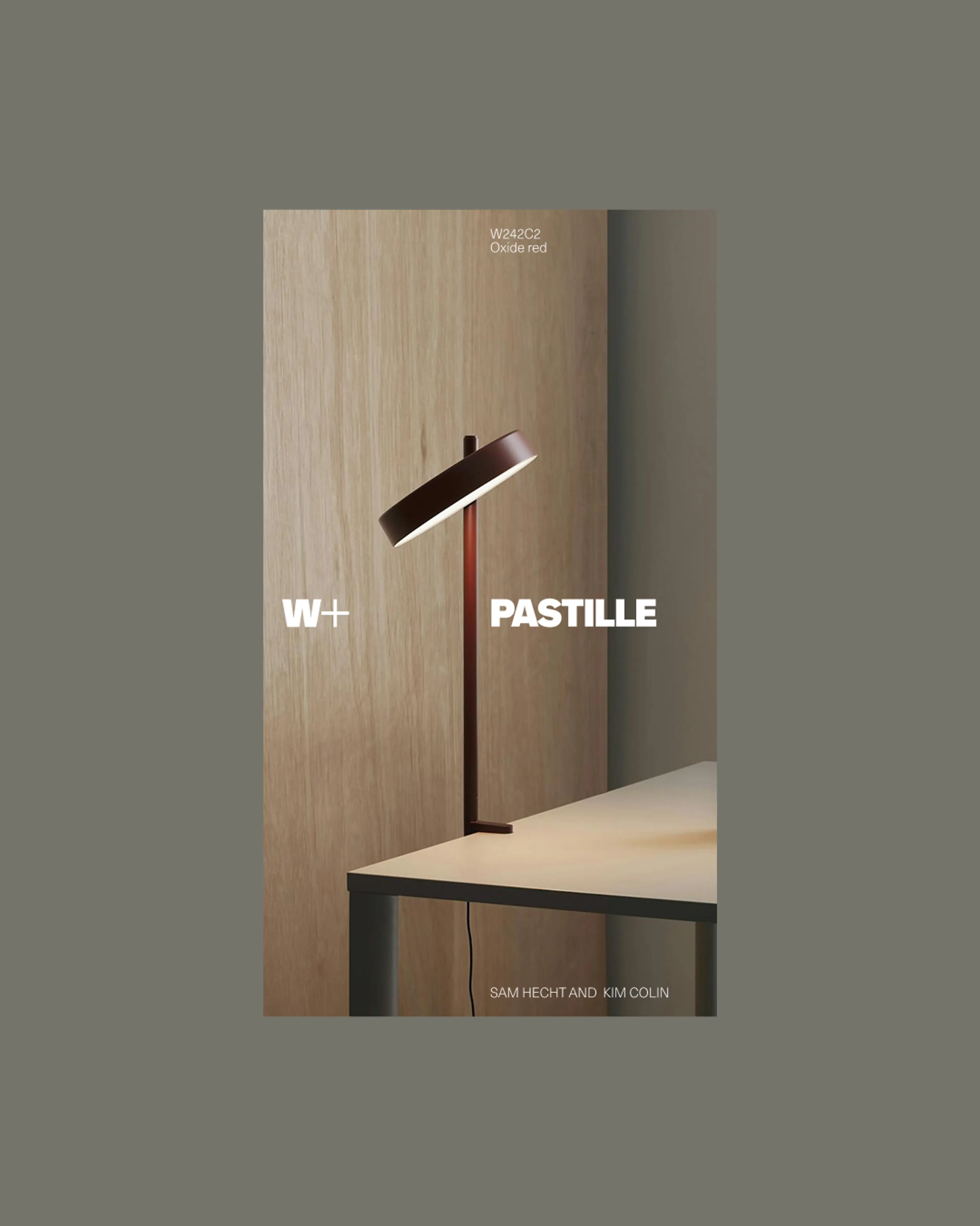
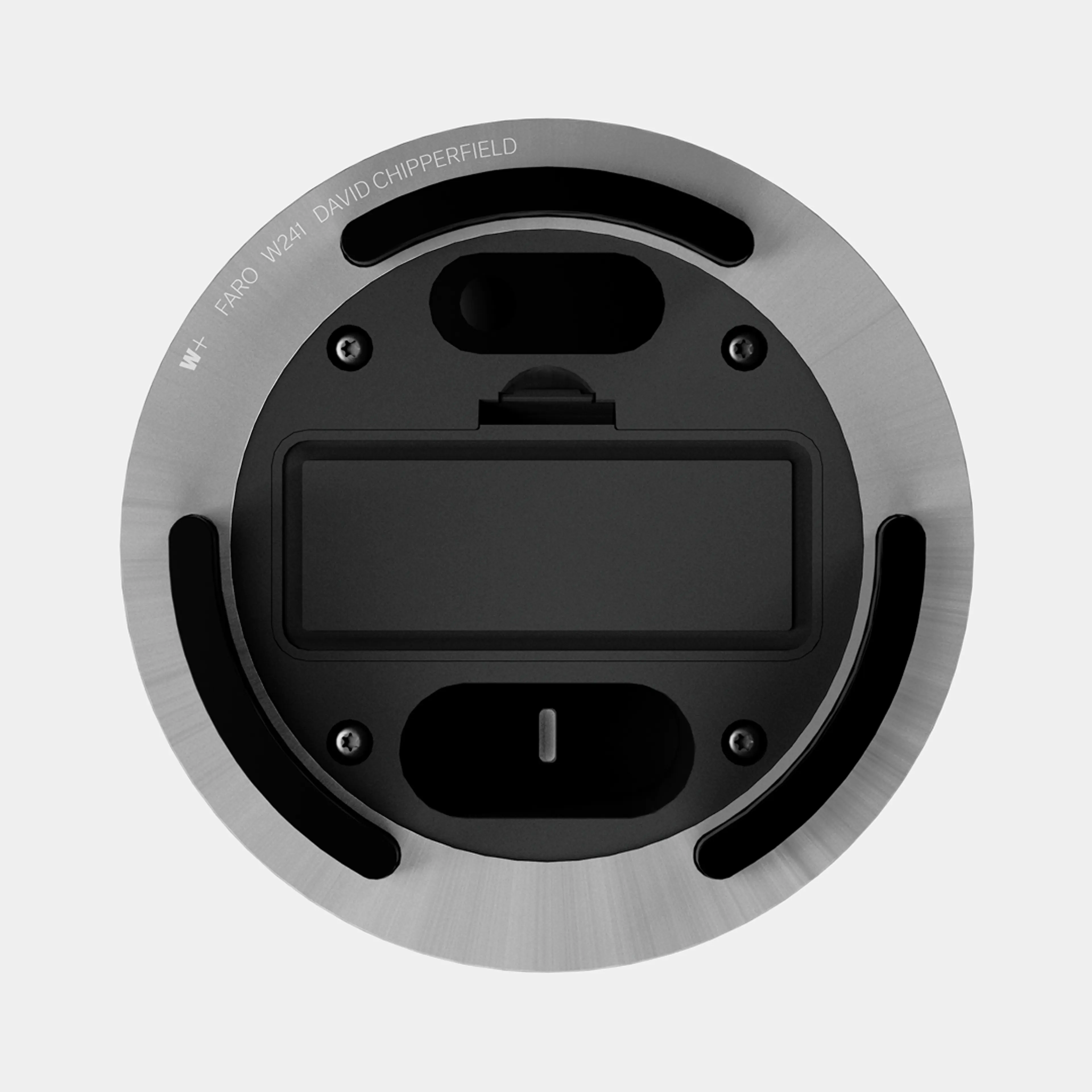
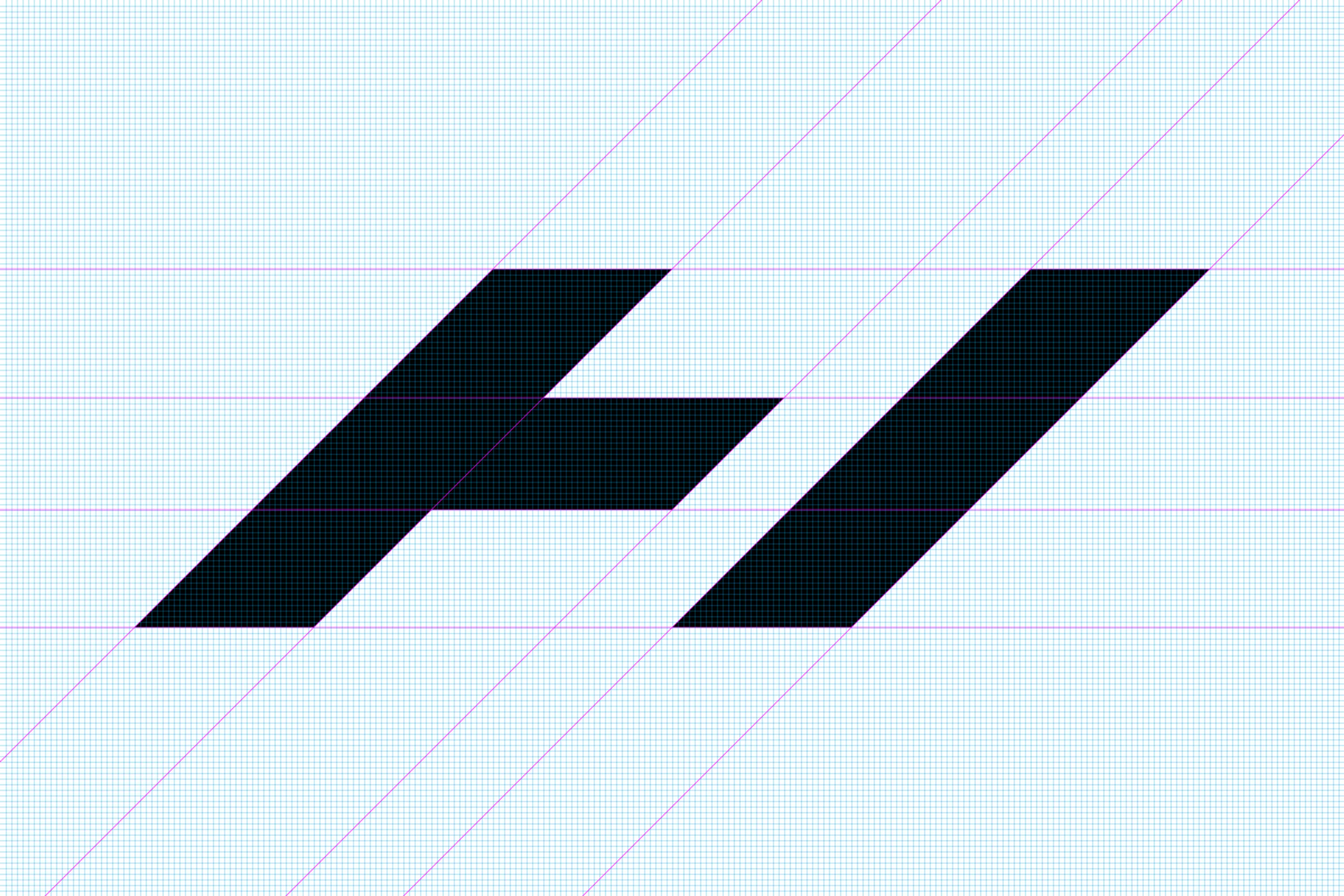
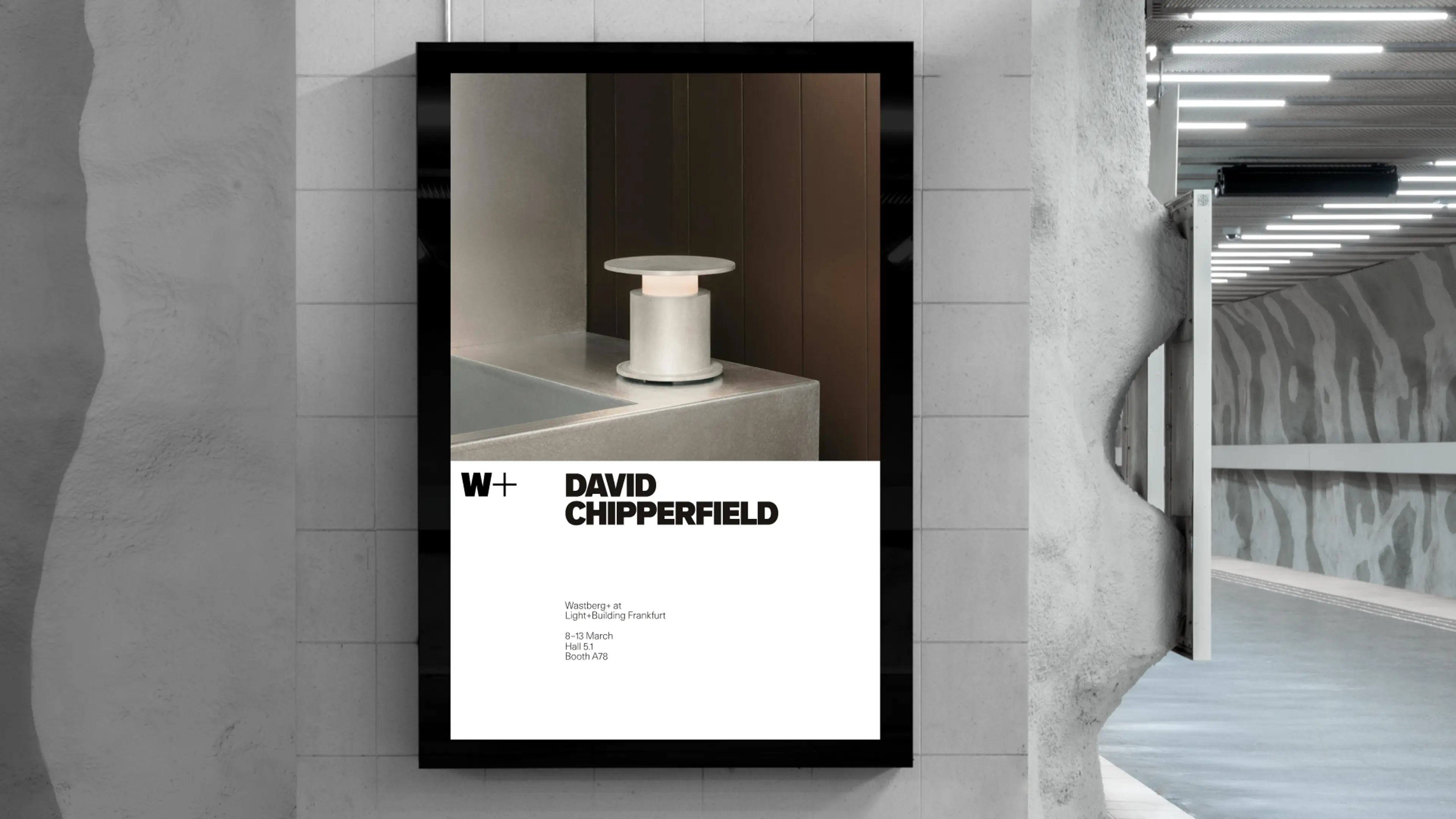
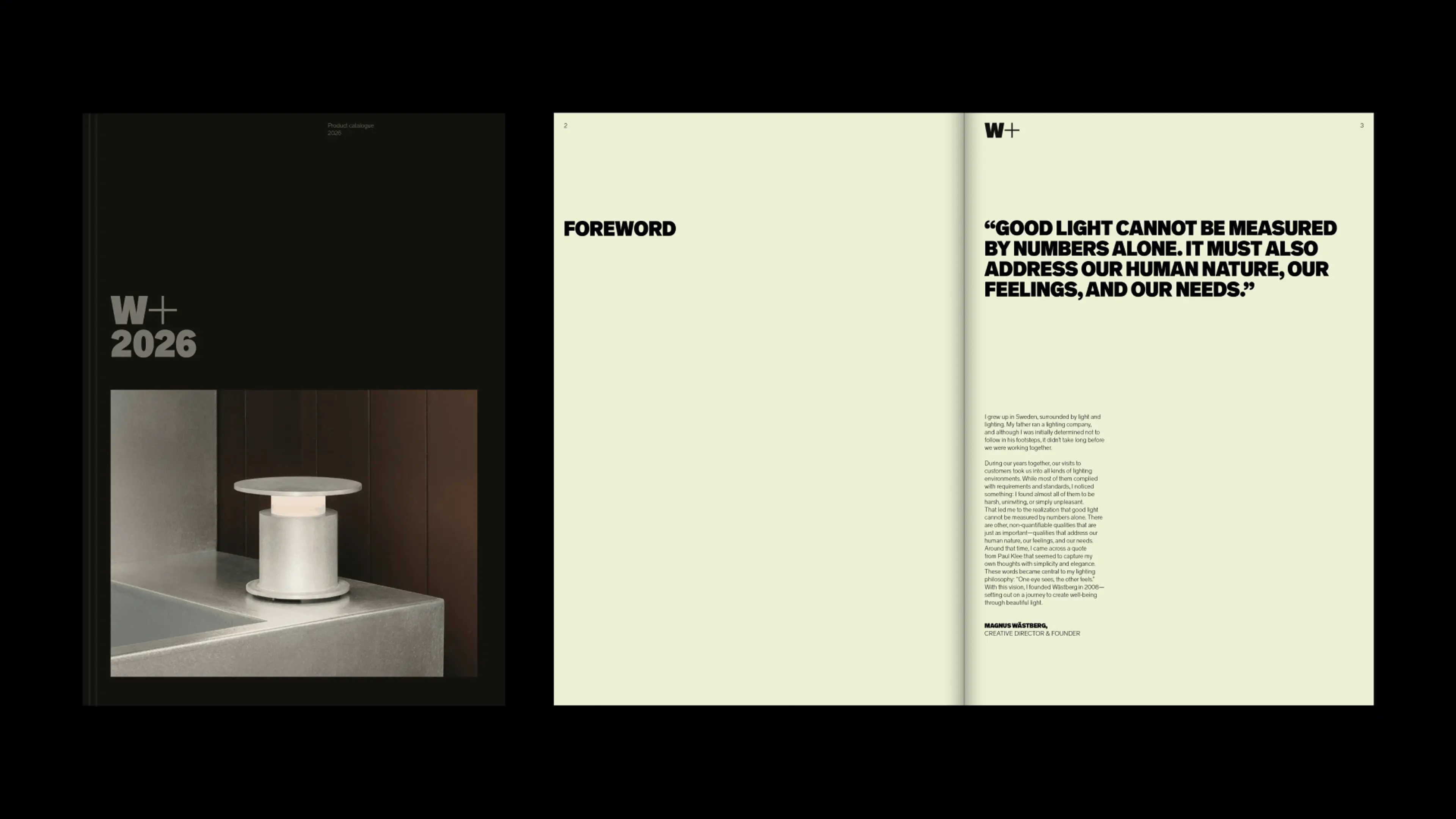
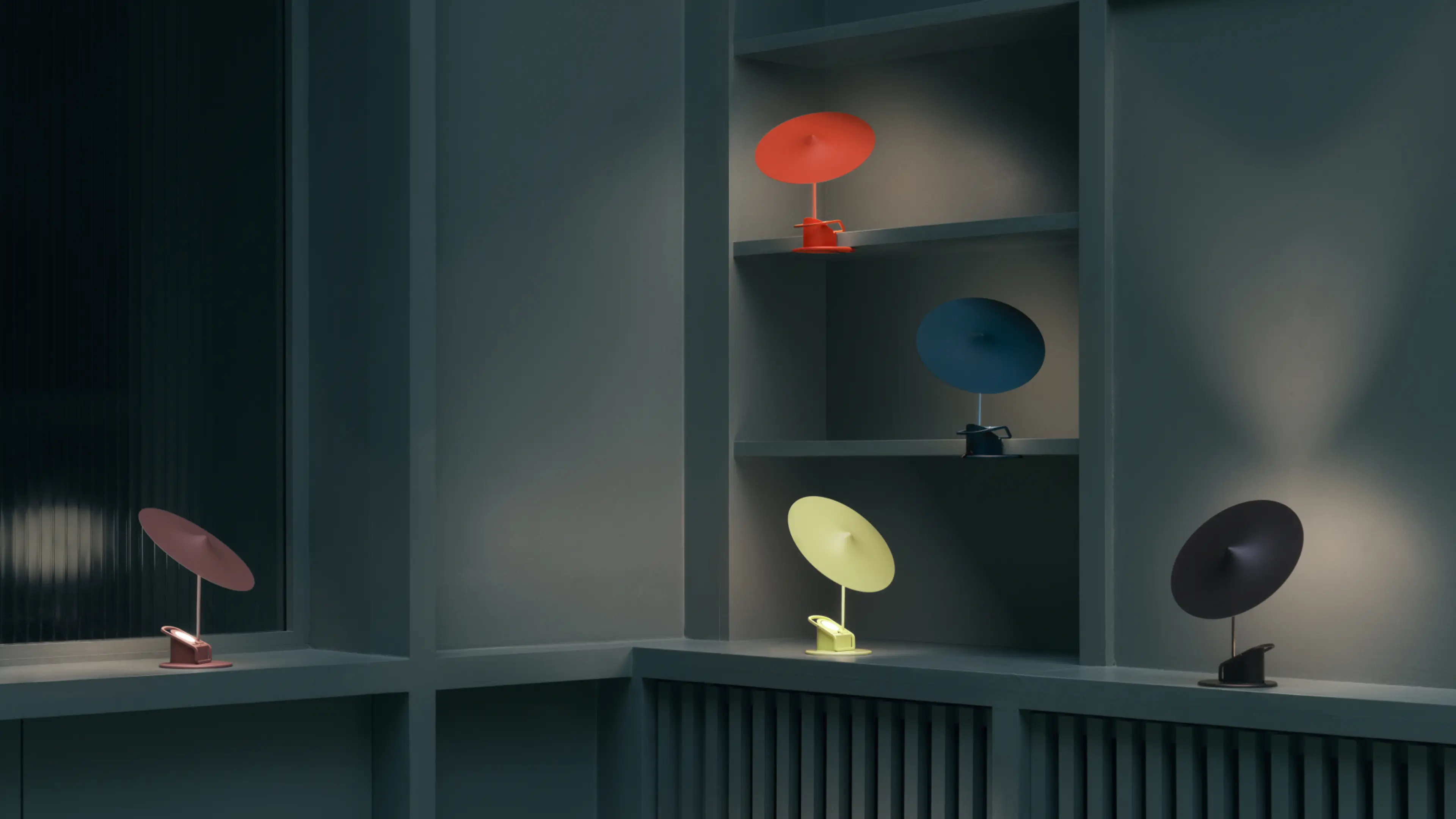
At the heart of the identity is the idea of contrast and connection. The representation of dark and light mirrors the portfolio’s core product benefits and is further echoed within the logotype itself: consisting of one bold, strong, dark element, and one precise, refined and light element. Two distinct units becoming one in Wastberg+ or W+.
The plus sign suggests change, collaboration, and added value, an open-ended mark for a brand and a brand identity that evolves. The result is a flexible, forward-looking brand identity that honors the heritage of both companies while being designed to evolve with the future.
With roots in the early 20th-century grotesks, the Wastberg Grotesk is a contemporary functional sans serif typeface. With four weights, the expression is clean and minimal. The use of Extra Bold and Light in combination visualizes the core idea of contrast between darkness and light.

SDL was tasked with creating a contemporary brand that builds on Wästberg’s strong equity, uniting two legacies into one clear identity. The aim was to express the merger and articulate the added value through a more open and inclusive positioning.
The new symbol marks a shift in narrative. W+ becomes a distilled expression of the brand, while the Wastberg+ wordmark serves as a transitional link between past and future. The plus sign conveys change, collaboration, and added value.
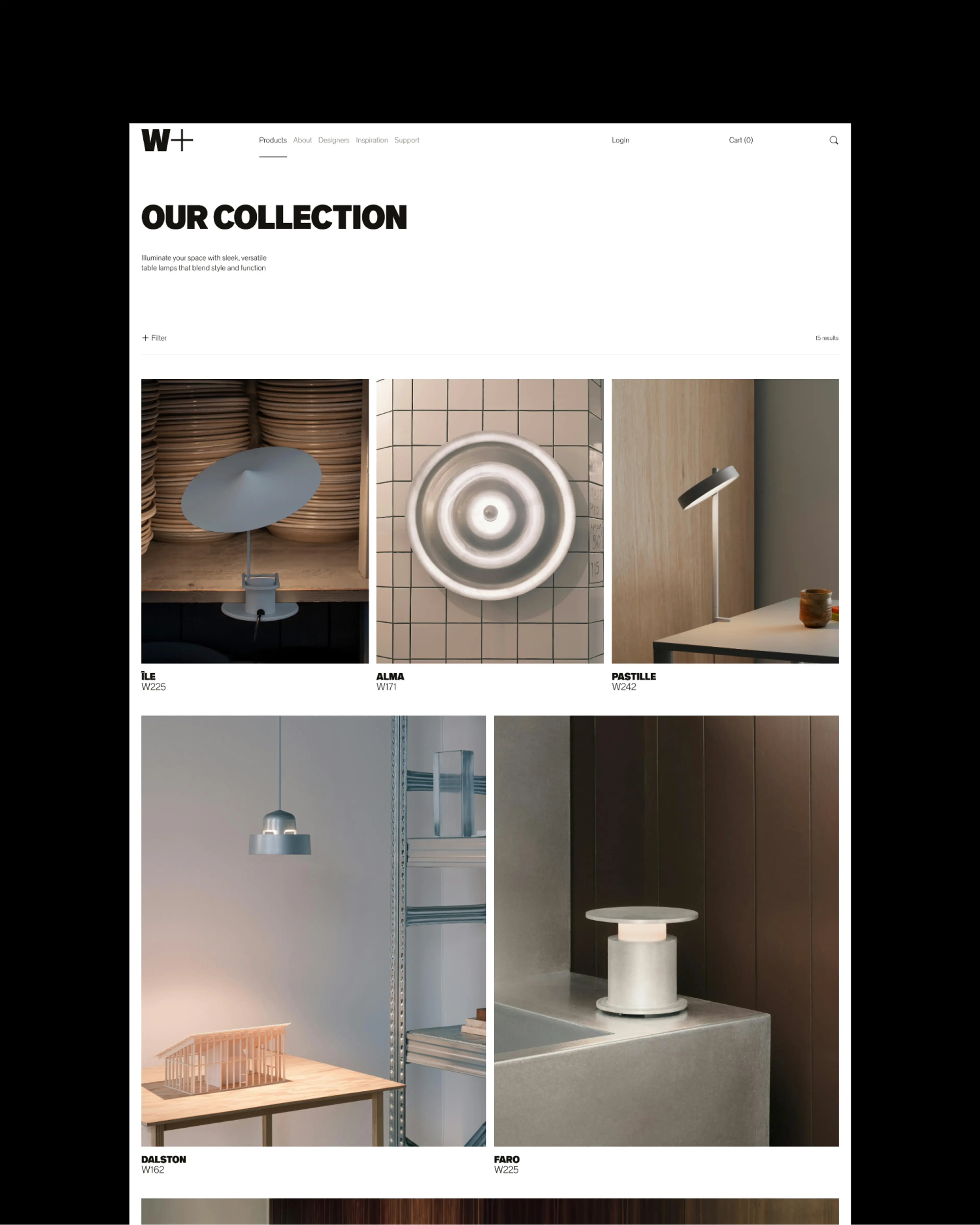
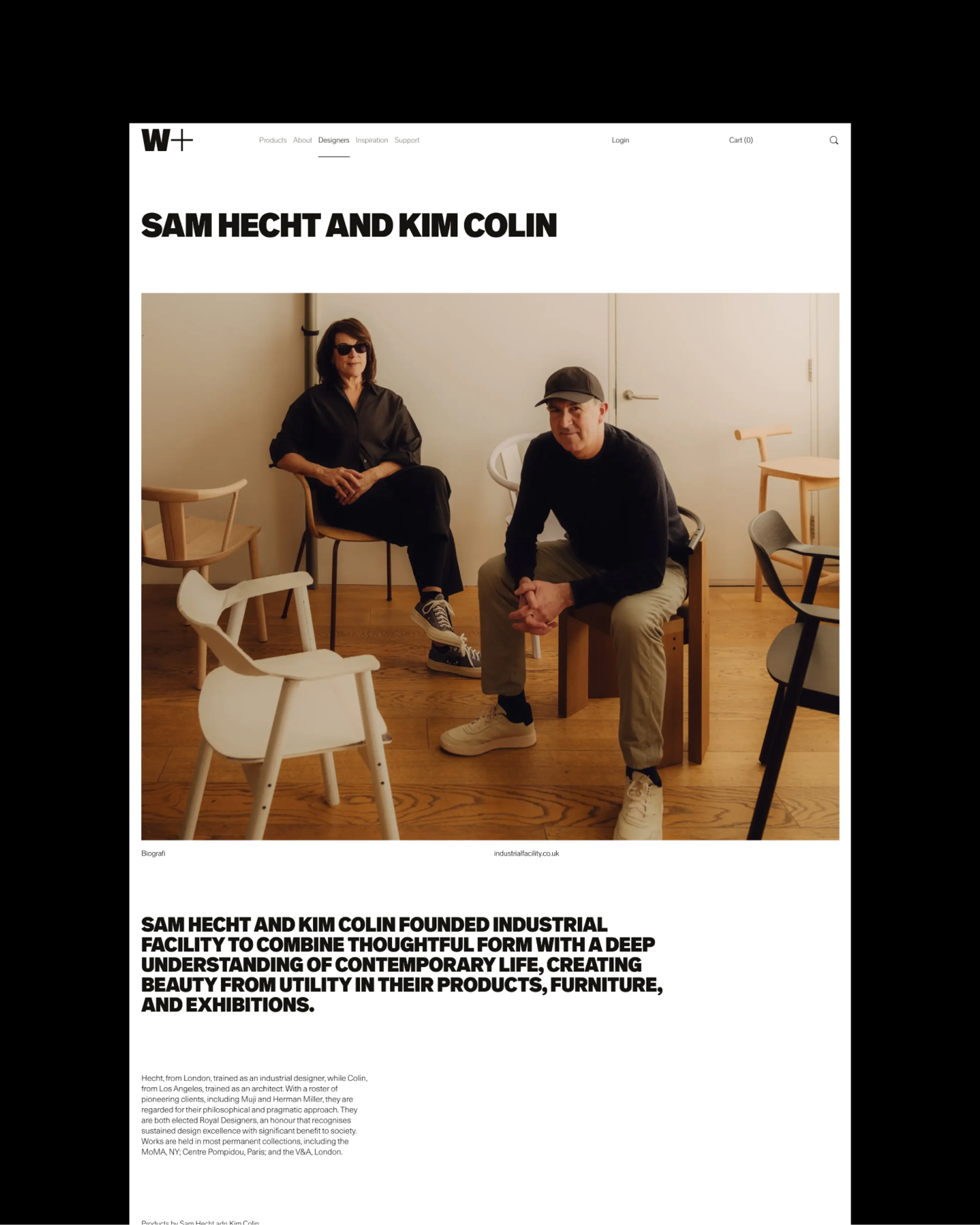
The digital experience is designed to balance clarity with emotion across the entire journey. The information hierarchy ensures guided navigation and effortless discovery, while carefully embedded interactive cues drive engagement. The result is a simple, intuitive interface that reflects the W+ values throughout.